| Image |
Comment |
| 04/13/2003 03:31:54 AM |
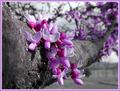
Virginia Redbudby AaronComment: I like the use of the branch (perhaps a little to close on the left). Very good focusing to have the bunch so clear. |
| 04/13/2003 03:28:38 AM |
Blossom in Colourby anon-y-mouseComment: I think the white background is a bit bright. I think I would have liked to see a greater range of colours. |
 Photographer found comment helpful. Photographer found comment helpful. |
| 04/13/2003 03:24:44 AM |
shadeby quicksand84Comment: A little too bright, and the Top/Bottom ballance is out..... Cool concept. Good use of colours. |
| 04/12/2003 11:55:11 PM |
Sugar Magnoliaby akebonoComment: This looks a bit messy for me and there could have been more cropped off the bottom. The title doesn't seem to suit. May I suggest "Soundwaves in Light"? |
| 04/12/2003 11:50:33 PM |
Colors of the Nightby hayabusaComment: May I suggest: "Colours of Evening"
I like the silhouette use of the trees. Perhaps more of the blackness at the bottom could have been cropped. |
| 04/12/2003 11:47:32 PM |
Eye Colorby fyjimoComment: This has a great range of colours. Makes me feel uncomfortable though. |
| Photographer found comment helpful. |
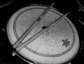
| 04/12/2003 11:21:51 PM |
sobered snareby mjc155Comment: I'm sorry, but I don't see the connection to "Collour", and the subject is not positioned very well. |
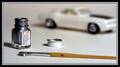
| 04/12/2003 11:20:31 PM |
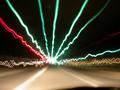
1146 Silverby bamasterComment: Creative. The car is a bit too fuzzy and the flare off the rear wheel stand out too much. I would have also liked to see the complete car. I like the general lighting. |
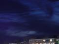
| 04/12/2003 11:16:44 PM |
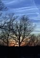
Colors of the Nightby hauntedcrimsonComment: Great shot of the sky. But I don't like the inclusion of the building - its messy, blury, and gives a crooked line to the bottom of the photo. Perhaps a Tree-top Line would have been better. |
| Photographer found comment helpful. |
| 04/12/2003 11:05:53 PM |
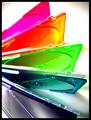
Office Colorsby KathycComment: Excelent coice of subject. Perhaps a bit too much shaddow on the bottom red clip |
Home -
Challenges -
Community -
League -
Photos -
Cameras -
Lenses -
Learn -
Help -
Terms of Use -
Privacy -
Top ^
DPChallenge, and website content and design, Copyright © 2001-2025 Challenging Technologies, LLC.
All digital photo copyrights belong to the photographers and may not be used without permission.
Current Server Time: 08/01/2025 10:25:05 AM EDT.