| Image |
Comment |
| 12/09/2005 06:30:02 PM |
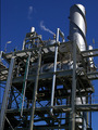
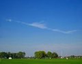
Part of my work place.by Aussie_BlueyComment: Greetings from the Critique Club
Best thing about this image - that blue sky REALLY stands out. The trail of smoke sets it off and gives the viewer something else to look at. It definitely meets the challenge.
Worst thing about the image - I don't like the tilt at all. It doesn't seem tilted for effect, it seems just off balance. I bet this would be a stunning black and white as well. With just a touch of contrast. ooh yeah! :)
happy shooting,
Mav
|
| 12/09/2005 06:28:17 PM |
vrOOmby yourdealerComment: Greetings from the Critique Club
The lighting on this image is fantastic. I like the details all around - but that's my only other real gripe. I wish that it was a tad sharper. Unsharp mask would have definitely improved the machinery feel of this. Machinery seems to me - hard, cold - and sharp. Not soft...if that makes sense.
Not sure the image meets the challenge for industrial. Also - try to use the whole 640 pixels on the long side to make your image as large as possible. If you need help resizing it, search the forums. :)
Happy shooting,
Matt |
| 12/09/2005 09:24:33 AM |
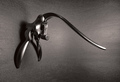
The Decorkerby TommyMoe21Comment: Greetings from the Critique Club
The hardest thing to do in this shot must have been controlling your reflections and you have done a wonderful job. The lighting is spectacular in this shot and I love the contrasts. Smooth metal, rough surface behind it - excellent.
One thing that probably didn't work in the shot is the lack of context. Your title doesn't tell me anything to assist either - it looks like a doorknocker and you have Decorker? I don't understand. That being said - there isn't enough door to see that it's a knocker and there isn't enough cork to "get" the picture.
It's a beautiful picture - I'm just not sure what I'm supposed to get from it - the message - besides the beauty of the knocker.
Happy shooting!
Matt |
| 12/01/2005 05:43:31 PM |
|
| 12/01/2005 05:42:25 PM |
Flag Artby woodseyComment: The lighting is uneven and it's not very original - the angle looks slightly wrong to me and the colors don't pop enough. |
| 12/01/2005 04:58:44 PM |
Exquisite Gazeby librodoComment: Ok, so we know this shot does well on dpc, manny. Give us at least one new look. ;) |
 Photographer found comment helpful. Photographer found comment helpful. |
| 12/01/2005 12:12:46 PM |
Earth Bulbby stare_at_the_sunComment: Good dupe of: //www.dpchallenge.com/image.php?IMAGE_ID=154133
I don't like the color on the hand as much but the Earth inside is great! |
| Photographer found comment helpful. |
| 12/01/2005 12:10:07 PM |
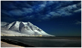
Moonlightby gisliComment: How very David Sidwell of you! :)
Excellent shot and worth the 9 I'm giving it. I like the lights at the base of the mountain. I wonder what this same location looked like an hour later. |
| Photographer found comment helpful. |
| 12/01/2005 11:01:18 AM |
|
| Photographer found comment helpful. |
| 11/23/2005 08:26:56 PM |
|
Home -
Challenges -
Community -
League -
Photos -
Cameras -
Lenses -
Learn -
Help -
Terms of Use -
Privacy -
Top ^
DPChallenge, and website content and design, Copyright © 2001-2025 Challenging Technologies, LLC.
All digital photo copyrights belong to the photographers and may not be used without permission.
Current Server Time: 08/26/2025 11:48:23 PM EDT.