| Image |
Comment |
| 05/04/2007 03:20:57 AM |
4 - Selfby JutildaComment: Judy
I love off centre portraits and this is a stunning example of its kind. Tones and contrast are to perfection
I look at an image like this and then compare it with my day 1 shot and I realise I have sooooo much to learn
Wonderful |
 Photographer found comment helpful. Photographer found comment helpful. |
| 05/04/2007 03:17:34 AM |
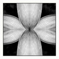
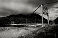
Symmetryby sherpetComment: Wonderful wonderful wonderful wonderful wonderful wonderful wonderful wonderful....Oh and did I mention wonderful
A true and genuine image of beauty |
| Photographer found comment helpful. |
| 05/04/2007 03:16:04 AM |
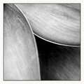
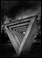
Day 3 - Threeby sherpetComment: I love good abstracts and this is a VERY good abstract, which would not look out of place in any exhibition.
Having said that I have to say that personally I think that symmetry is an even more striking image
Two magnificent shots! |
| Photographer found comment helpful. |
| 05/03/2007 09:16:00 AM |
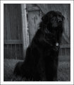
3 -Tagsby JutildaComment: Very nice pet portrait. I love the composition in terms of the 'pose' and angle of the head, only possible change might be in terms of the background as the fence (for me) detracts a touch (especially the white support strut and the diagonal which intersects the dogs head. Not sure if you could have got more Bokeh and kept the image at the quality it is though, but if you couldnt then maybe a background which had a more repetitive 'pattern' to it which (I think) would have made the subject stand out more |
| Photographer found comment helpful. |
| 05/03/2007 09:07:56 AM |
incomingby PhilComment: Hats off for getting something in. I think its good that you are testing yourself like this - I'm in exactly the same boat.
If I am being completely honest this image doesnt really work for me, but that is probably just down to my own particular tastes. For me grain can be great on occasion (for example your first picture in the B&W challenge of the two hands) and at other times it (for me) detracts from the overall effect
Hope you are OK with this comment, not trying to be negative, but its just my thoughts on this particular shot |
| Photographer found comment helpful. |
| 05/03/2007 08:26:46 AM |
Tina'sby RetroesqueComment: A very nice slice of life (although I have to say the hairdressers looks a bit bleak). You have got some lovely vibrant blacks in this picture...Putting the critical hat on it may be that there is almost too much going on in this picture, but that some of it gets lost in the dead space especially towards the top where the ceiling enters the frame
A few possible cropping thoughts for you to take/disgard as you see fit
Crop from top down to the top of the machine on your sons head
Alternatively crop even further down (to the top of the mirror) and from the left to the centre point of the mirror (obviously this would lose your son but MIGHT give a nice image focused on your mum and tina. Tina would probably still hit a rule of third line). If you want to get even more radical then you could also crop a bit of the floor and from the right to Tinas back. Final though go even more tight and focus on your mums head and tinas hands (possibly back to her face)
Having said all this, I do like this pic and am just sticking in my 2ps worth as alternatives
J |
| Photographer found comment helpful. |
| 05/03/2007 03:57:08 AM |
Day 3by TDCollinsComment: OK here is the fun/maddening thing about comments...They often contradict each other...Think its a very striking image, but I dont like the pp effect on the sky. Personally I would crop just above the piece of art |
| Photographer found comment helpful. |
| 05/02/2007 06:59:43 PM |
by boysetsfireComment: For New Zealand read great
Fantastic job great tones |
| Photographer found comment helpful. |
| 05/02/2007 06:32:59 PM |
|
| Photographer found comment helpful. |
| 05/02/2007 05:57:59 PM |
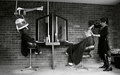
Day 1 - Dialing Handsby ArtysteComment: OK love the concept and the composition. Maybe a slightly larger dof (the panasonic is slightly blurred and no problem but the writing above the earpiece is v blurred and because of its lightness is quite distracting)
Whites a tad blown out on the keypad, but please understand there is a lot more right with this picture than wrong with it. Bottom line...do I wish I had taken one as good as this? Answer, Yes!! |
| Photographer found comment helpful. |
Home -
Challenges -
Community -
League -
Photos -
Cameras -
Lenses -
Learn -
Help -
Terms of Use -
Privacy -
Top ^
DPChallenge, and website content and design, Copyright © 2001-2025 Challenging Technologies, LLC.
All digital photo copyrights belong to the photographers and may not be used without permission.
Current Server Time: 08/05/2025 05:18:54 PM EDT.