| Image |
Comment |
| 04/08/2003 01:56:41 AM |
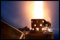
Protectiveby GraciousComment: Very nice work and original!
The contrast is a bit to high though in my opinion and the white is to bright as a result of this. Perhaps this could have been avoided with another backdrop color.
// 6 // |
 Photographer found comment helpful. Photographer found comment helpful. |
| 04/04/2003 01:48:15 PM |
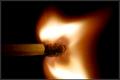
Flame On! by joebarComment: Very, very cool !
I would give it a ten if I could vote, to bad I'm not a member ..
|
| Photographer found comment helpful. |
| 04/04/2003 01:21:27 PM |
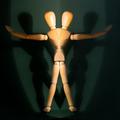
A perfect match.by SharQComment: Technically perfect!
Deserves numero 1 in my opinion. I wonder how you did it though ..
..and how many matches it took to get it right d:c) |
| 04/01/2003 02:39:00 PM |
|
| 04/01/2003 02:38:42 PM |
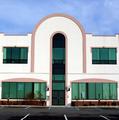
Architecture Symmetryby ladpupmoeComment: Nice shot
distracting though that the house is a bit tilted. could be improved by photoshop rotating + cropping |
| Photographer found comment helpful. |
| 03/31/2003 07:23:30 AM |
|
| Photographer found comment helpful. |
| 03/31/2003 07:21:58 AM |
|
| Photographer found comment helpful. |
| 03/31/2003 07:20:32 AM |
|
| Photographer found comment helpful. |
| 03/31/2003 07:18:46 AM |
|
| 03/31/2003 07:17:14 AM |
|
Home -
Challenges -
Community -
League -
Photos -
Cameras -
Lenses -
Learn -
Help -
Terms of Use -
Privacy -
Top ^
DPChallenge, and website content and design, Copyright © 2001-2025 Challenging Technologies, LLC.
All digital photo copyrights belong to the photographers and may not be used without permission.
Current Server Time: 08/02/2025 12:30:27 AM EDT.