| Image |
Comment |
| 01/22/2003 02:09:48 PM |
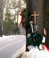
Seventeenby emorgan49Comment: that is sad, but everything else in the photo is not in focus or sharp |
 Photographer found comment helpful. Photographer found comment helpful. |
| 01/22/2003 02:06:04 PM |
|
| 01/22/2003 02:04:47 PM |
|
| Photographer found comment helpful. |
| 01/22/2003 02:04:28 PM |
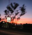
Drive 55?by r_sandlerComment: sign looks too "out there"...the lack of focus everywhere else in the picture also isn't my favorite although i understand it is meant to show motion |
| 01/22/2003 02:02:28 PM |
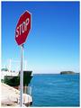
The Obvious!by GraciousComment: like the other stop signs set against the sky, i like how you sest the contrast. the sky almost looks like a gradient filter. it's amazing |
| Photographer found comment helpful. |
| 01/22/2003 02:00:57 PM |
|
| 01/22/2003 01:58:03 PM |
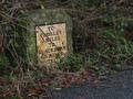
Vintageby auroraComment: cool sign. the overgrowth helps present the feeling of age in the picture. nice clarity also |
| 01/22/2003 01:54:10 PM |
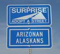
Go Away!by myqylComment: too simplistically put together..there is nothing that is special here |
| 01/22/2003 01:53:34 PM |
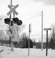
at the end of the tunnelby BeeGeeComment: looks photoshopped even though it's not..but in any case why choose to do that, why not just do a tigher crop. the tunnel really takes away from an otherwise good pic |
| Photographer found comment helpful. |
| 01/22/2003 01:52:35 PM |
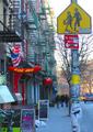
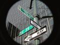
At the Corner of Charles and Mapleby karmatComment: you can't even read the signs, so i guess we have to trust you. this doesn't work because the shadow is just too much in the foreground. everything else is right on |
| Photographer found comment helpful. |
Home -
Challenges -
Community -
League -
Photos -
Cameras -
Lenses -
Learn -
Help -
Terms of Use -
Privacy -
Top ^
DPChallenge, and website content and design, Copyright © 2001-2025 Challenging Technologies, LLC.
All digital photo copyrights belong to the photographers and may not be used without permission.
Current Server Time: 08/28/2025 03:48:17 PM EDT.