| Image |
Comment |
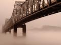
| 03/21/2003 10:57:21 AM |
Into The Mystic by sherComment: i love the focus on this photo, that must have been pretty tought to pull off with all the fog. nice job |
 Photographer found comment helpful. Photographer found comment helpful. |
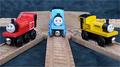
| 03/12/2003 08:02:38 PM |
Childhood Friendsby OneSweetSinComment: hello from the critique club
This is a cute photo, one that brings back memories of when I used to watch the show on TV. As for the photo, I think much has already been said. There is an overall soft feel to the focus. Your aperture was 3.5, which seems to be a tad too shallow. The higher iso might have also led to the softer feel. I personally don't like the cloth pattern background. I think it takes away a lot from the photo. Having a solid color would have helped the viewer focus on the middle train much easier. The lines are good, I think they would be improved by taking more of a track level perspective shot. Did you consider trying to just focus on the middle train and crop out or leave out the other trains all together? I think that would make an interesting photo. And it would do a better job of simulating actual railroad track, if that's what your intent was. Anyway, not a bad photo, but one that could be easily improved to make it even better. Good luck in the future.
Josh |
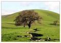
| 03/10/2003 10:16:37 AM |
Primary Oak by TarbiniComment: this has got to be one of my all time favorites on this site, absolutely beautiful |
| Photographer found comment helpful. |
| 03/03/2003 12:13:26 AM |
In The Roughby jimmythefishComment: after browsing the photos this week, i like this one the best. the dof is right on and it is an extremely creative idea, which was somewhat lacking this week. great job |
| Photographer found comment helpful. |
| 02/27/2003 12:13:58 PM |
Houseworkby muckpondComment: critique club
composition
this is a very well composed photo. the placement of the bucket in the perspective draws the viewers eyes towards your subject and eventually to the yellow wall, which is great. the perspective itself is wonderful, and when combined with the angle really bring out the yellow of the gloves and wall.
technical
you did a great job here as well, the yellows are right where they need to be, and the whole photo seems to have a yellow feel, so in that sense you succeeded. the photo is also very clear and isn't to dark or light in my opinion.
overall
i suspect that this photo didn't do as well as it did because the yellow theme may not be totally evident to some voters. also people tend to downgrade shots like this of women. i really like it though. i didn't vote on this set of photos but i would have most likely given it a 7 for its originality and technical strength |
| Photographer found comment helpful. |
| 02/25/2003 11:04:31 AM |
|
| Photographer found comment helpful. |
| 02/25/2003 10:59:48 AM |
El Tenedorby jenaromComment: you'll have to excuse my ignorance, but how would this picture be used as a stock photo? i like it a lot anyway but i'm not seeing the stock part |
| 02/25/2003 10:58:53 AM |
|
| 02/25/2003 10:58:29 AM |
Communicate hereby vjozComment: i like what you are doing in this pic...the numbers need to be clearer i think, and crop out that spot would have been better |
| Photographer found comment helpful. |
| 02/25/2003 10:57:28 AM |
|
Home -
Challenges -
Community -
League -
Photos -
Cameras -
Lenses -
Learn -
Help -
Terms of Use -
Privacy -
Top ^
DPChallenge, and website content and design, Copyright © 2001-2025 Challenging Technologies, LLC.
All digital photo copyrights belong to the photographers and may not be used without permission.
Current Server Time: 08/28/2025 04:14:21 AM EDT.