| Image |
Comment |
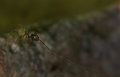
| 06/01/2008 11:50:03 AM |
Along Came A Spider Editedby TCGuruComment: Cool shot! Great job isolating and enhancing the spider. I think I might have left a bit more space on the left and bottom sides of the image. Spidey feels a bit cramped on the left side, and the spider web makes a lovely leading line that could be emphasized. Overall though, nice. |
 Photographer found comment helpful. Photographer found comment helpful. |
| 05/31/2008 04:25:03 PM |
spiderflower_edit.jpgby yankoComment: hmmmm....I agree that the original needs more contrast, but I'm not sure I like the edit, either. I love the shot, btw, and I like how the increased contrast gives the image depth. I think my problem is the color shift to a cooler yellow. I think I preferred the slightly warmer, more orangey yellow. Just my opinion, though. |
| Photographer found comment helpful. |
| 05/31/2008 04:20:19 PM |
|
| Photographer found comment helpful. |
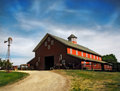
| 05/31/2008 11:39:31 AM |
Afterby timfythetooComment: Nice work. It looks like my grandfather's old barn. I especially like the detail you got on the front side of the barn. If I'm going to quibble, I'm not sure like the color of the cattle. They seem to blend into the front of the barn more than before, and I think I'd prefer the opposite. |
| Photographer found comment helpful. |
| 05/31/2008 11:30:15 AM |
midhurst 3-June.jpgby wehrmacherComment: Holy cow! Nice work. You should write a cloning tutorial. A question though. While you were at it, why didn't you remove the red signs? |
| Photographer found comment helpful. |
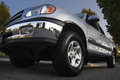
| 05/31/2008 11:27:15 AM |
2000Tundra_01b.jpgby NullixComment: Love it. Nothing I can say to improve it, except possibly to clone out the houses reflected in the bumper. The tree reflections are cool. I really like how you changed the shape of the front end to make it more macho. |
| Photographer found comment helpful. |
| 05/31/2008 11:20:13 AM |
aDSC_0179.jpgby JakerComment: All my personal opinion, of course....overall, it's a vast improvement over the original.
I like the dark, brooding clouds, you've done a nice job on that.
I think the main thing I personally do would be to leave a little more of the beach. It feels a bit cramped at the bottom, and I think a little more beach wold open it up and make it a bit more desolate. The other thing would be to lighten up on the burning of the water and the beach. I want to see the scene, not the editing, and right now, I notice the burning of the water. Just my opinion, of course. |
| Photographer found comment helpful. |
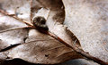
| 05/30/2008 01:12:55 PM |
Worm Friend Editedby TCGuruComment: Much improved, definitely. I like the crop, increased contrast, and the color shift towards the warmer colors, and the sharpening is good. I'm not convinced the vignette adds anything. My eye is drawn to the vignette, instead of the worm and leaf. Maybe a more gradual tonal shift on the right side of the image, or darken all of the concrete instead of just the right edge. |
| Photographer found comment helpful. |
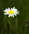
| 05/29/2008 02:41:56 PM |
Daisy Editedby TCGuruComment: Definitely an improvement. I like the improved contrast. It has a lot more depth. I would like to have seen more detail in the flower petals, but I think the petals are probably a little blown out in the original shot, so that isn't really resolvable in editing.
I'm not sure I like the squarish crop. I think cropping the top off was good, but I'm wondering if a skinnier crop (cut some off the right side) would work better, since the lines in the shot are all vertical. |
| Photographer found comment helpful. |
| 05/28/2008 10:46:49 AM |
|
| Photographer found comment helpful. |
Home -
Challenges -
Community -
League -
Photos -
Cameras -
Lenses -
Learn -
Help -
Terms of Use -
Privacy -
Top ^
DPChallenge, and website content and design, Copyright © 2001-2025 Challenging Technologies, LLC.
All digital photo copyrights belong to the photographers and may not be used without permission.
Current Server Time: 08/14/2025 02:56:57 PM EDT.