| Image |
Comment |
| 02/08/2003 04:45:10 PM |
Say Noby AllenComment: Composition: Nice central subject that uses lines to draw your eye to it.
Technical: The negative seems to have made noise in the pic more obvious, especially in the pink sign.
Meets challenge: Not sure this would be a cliche in photography.
Overall impression: Ok pic but iffy regarding the challenge. 4 |
| 02/08/2003 04:42:57 PM |
What is this?by christybenhoffComment: Composition: Could possibly have been a bit 'higher' moving the cat's eyes lower down in the pic.
Technical: Focus let this down big time. I'd suggest moving further away and having a smaller pic if necessary to get better quality. The focus of the b/g is excellent, which would have been great if it the cat was at that distance.
Overall impression:Could have been a good one focus lets it down a lot. 4 |
| 02/08/2003 04:40:24 PM |
Decaying Beautyby stephanComment: Composition: I like the size of the subject and pic itself.
Technical: This comes out very dark on my monitor. Was this the effect you were going for? If so, the amount of negative space leaves the pic a little empty.
Overall impression: I think the subject had a lot going for it, for me it was possibly let down by lighting. 6 |
 Photographer found comment helpful. Photographer found comment helpful. |
| 02/08/2003 04:26:13 PM |
Erlaby IceRockComment: I love the pic, but I'm not sure about the border (-1). 7 |
| 02/08/2003 01:39:38 PM |
Wildlife - Peregrine Falconby pstuhrComment: Composition: Colours join into simple shapes which seems to support the subject. If possible I'd prefer it without the blue cloth.
Technical: Lovely DOF and colour. Nice use of the full 640 too.
Overall impression: Might have prefered it with a border. 7 |
| Photographer found comment helpful. |
| 02/08/2003 01:37:31 PM |
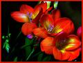
Pretty as a Pictureby RLSComment: Composition: I like the green thing in the bottom left, but I would be very tempted to crop it out and make the flowers more central.
Technical: Excellent focus and colour. I really like the border too, although it seems to have a different width on each edge?
Overall impression: Lacking slightly on the above for me personally but excellent technically. 8 |
| Photographer found comment helpful. |
| 02/08/2003 01:35:16 PM |
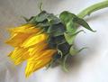
Cliche' Sunflower Shot # 73by boyte1Comment: Composition: Nice position and size.
Technical: I like the lighting and vibrancy. Might have chosen a flatter and possibly less grainy background.
Overall impression: Slightly boring for me, but technically great. 7 |
| 02/08/2003 01:33:53 PM |
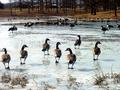
Mighty Ducksby VelocityComment: Composition: Spot on apart from the very left-hand duck looking a bit too far out.
Technical: I really like the contrast in the pic. The gradient of colour looks excellent.
Overall impression:Quite a painting-like quality. 9 |
| Photographer found comment helpful. |
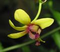
| 02/08/2003 01:30:40 PM |
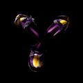
Singapore Orchidby KateComment: Composition: Nice use of small number of leaves/branch in the background.
Technical: Really like the DOF.
Overall impression: Might have tried a border myself, but looks excellent as it is. 8 |
| Photographer found comment helpful. |
| 02/08/2003 01:29:03 PM |
Camelliaby Geo_GriffinComment: Composition: Position is good but the flower seems to 'lean' slightly to the left.
Technical: Did you try reducing the DOF? Seems a little cluttered atm.
Overall impression: Nice pic well framed with a good border. 7 |
Home -
Challenges -
Community -
League -
Photos -
Cameras -
Lenses -
Learn -
Help -
Terms of Use -
Privacy -
Top ^
DPChallenge, and website content and design, Copyright © 2001-2025 Challenging Technologies, LLC.
All digital photo copyrights belong to the photographers and may not be used without permission.
Current Server Time: 08/26/2025 08:24:59 PM EDT.