| Author | Thread |
|
|
02/14/2003 10:34:48 PM |
...from Critique Club...
Hi Christy
FIRST IMPRESSION:
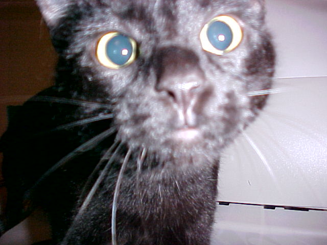
It's the attack of the killer cat :)
COMPOSITION:
Pretty good...perhaps cropped too tight..background choice could have been better. :)
TECHNICAL:
I'll just repeat what everyone has already told you. You were too close to the cat, and therefore your DOF put the cat's face out of focus (BTW, I find your comment on the picture really cute)...the lighting is too harsh. :(
ARTISTIC:
Cliche? of course. But I think this could have been a better shot. I find it hysterical though, the look on the cat's face is priceless. (I'm starting to have mixed feeling about the photo :)
Cheers...and good luck in your future entries. |
|
Comments Made During the Challenge  |
|
|
02/09/2003 08:00:02 PM |
|
what a cute kitty ... i just wish it was in focus ... but it certainly is an "in your face" shot :) |
|
|
|
02/08/2003 04:42:57 PM |
Composition: Could possibly have been a bit 'higher' moving the cat's eyes lower down in the pic.
Technical: Focus let this down big time. I'd suggest moving further away and having a smaller pic if necessary to get better quality. The focus of the b/g is excellent, which would have been great if it the cat was at that distance.
Overall impression:Could have been a good one focus lets it down a lot. 4 |
|
|
|
02/08/2003 06:39:56 AM |
|
cute cat. needs to be darker on the face and in focus |
|
|
|
02/07/2003 04:46:06 AM |
|
Sorry, but this shot doesn't look very nice to me. O.K., your cropping is IMHO well done and thereby you are dirceting the attention of the viewer to the face / eyes of your cat. But unfortunately the face is extremely out of focus. Personally I think, that it is impossible to achieve an interesting lighting by using the cameras flash. Nevertheless, good luck with your next submission :-) |
|
|
|
02/06/2003 06:20:33 PM |
|
I just love this shot. The focus is pretty bad, but guess what? This is one of my favourite shots this week. It is just too funny. I just love the look on his face ... looks like he's wearing glasses or something. Thanks for the chuckles. Jacko. 10 |
|
|
|
02/06/2003 10:31:31 AM |
|
I'm sorry but this photo doesn't apeal to me. AT ALL. The face of the cat is VERY overexposed ( use less flash, or stand back more). It also looks like the focus point is beoynd the cat (the white wall infact). To aliveate this, you could turn on the macro function (if your camera has it), or you could hold a magnifing glass next to your lens to "focus" on the subject. 1 |
|
|
|
02/06/2003 06:28:48 AM |
|
lol! That's the funnniest expression I've ever seen on a cat! Real shame that the focus is on the cat's body. |
|
|
|
02/05/2003 04:37:35 PM |
|
Bizzare, it looks half cat and half mouse (ironic). |
|
|
|
02/04/2003 08:20:26 PM |
|
Out of focus and outright scary. |
|
|
|
02/04/2003 05:19:36 PM |
|
I know that cats (and especially black cats) are hard to get a good photo of, but surely you could have gotten a better photo, per the challenge. |
|
|
|
02/04/2003 02:10:14 PM |
|
the cats face is blurry. big eyes. |
|
|
|
02/04/2003 02:40:08 AM |
|
LOL. looks just like my cat! cookie points for you!! |
|
|
|
02/04/2003 12:56:57 AM |
|
I like the expression on the cat's face but the flash over powered the shot and it looks like it was too close for the camera to focus. This is just my opinion but I like the pet photos that are taken with natural light, the flash can ruin an otherwise good photo. |
|
|
|
02/03/2003 11:48:42 PM |
|
That's what I'm asking you. Forget the obvious problem, the white background has two distinct seams that are distracting. The background on the left top side is another color and too dark. I think you might have a cute cat here, but can't tell from this photo. |
|
|
|
02/03/2003 12:40:22 PM |
|
too close. that`s what it is |
|
|
|
02/03/2003 10:16:27 AM |
|
Subject out of focus, backgound is in focus. Would have been much better if you focused on the cat. |
|
Home -
Challenges -
Community -
League -
Photos -
Cameras -
Lenses -
Learn -
Help -
Terms of Use -
Privacy -
Top ^
DPChallenge, and website content and design, Copyright © 2001-2026 Challenging Technologies, LLC.
All digital photo copyrights belong to the photographers and may not be used without permission.
Current Server Time: 06/29/2026 05:00:45 AM EDT.