| Image |
Comment |
| 06/04/2003 03:41:33 PM |
Dairy Queen by crabappl3Comment: this awesome. Very Cadbury's Dairy milk. The milk crown is pretty cliched but you've done a good version of it and the background colour makes it work for me (being a Brit) |
 Photographer found comment helpful. Photographer found comment helpful. |
| 05/28/2003 09:48:34 AM |
Neck Plug: Interface Detail by GordonComment: Well - it was an egg separator really but it seemed spoon-like enough to be apt. All credit for the set-up/ style to scab-lab who does this much better than I ever do.
Took a screen shot of a screen saver, boosted the contrast/ saturation in photoshop then set it on full display. Placed black card over the keyboard to simplify the background and put the spoon on there and almost closed the lid.
Shot in from the side, with 100mm macro on a tripod, mirror lock-up, shutter release cable and really closed down aperture (f29) to get lots of depth of field. Manually focused on the edge of the slot in the spoon for max detail on that edge.
Thanks for all the comments. |
| 05/28/2003 08:43:44 AM |
Two Flamesby pinbackComment: CC: The two flames make a good complementary colour choice. The harder part is then making it in to an interesting subject. The main problem is getting the lighting interesting on the subject matter and I don't know that you've really achieved that too well here. The overall feeling is drab and dark, particularly with the white/ yelllowish candle.
however, I'm not sure I can suggest an approach that would make these subjects more lively or interesting. Perhaps a more interesting candle choice could have helped or a lighter background. You might have lost some of the flame detail then but it could have lifted the overall impression of the shot. The yellow flame also seems quite overexposed - again difficult to get right with the selected subject matter. |
| Photographer found comment helpful. |
| 05/28/2003 12:10:57 AM |
|
| Photographer found comment helpful. |
| 05/28/2003 12:10:24 AM |
|
| 05/27/2003 09:09:28 AM |
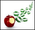
Stolen Kiss by dsidwellComment: Congratulations on the win - what was the thinking behind the green lipstick/ red apple - rather than the perhaps more obvious inverse ? Or was it just that you wanted something less obvious/ more jarring ? |
| Photographer found comment helpful. |
| 05/21/2003 06:20:36 PM |
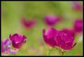
Impressionist canvasby GordonComment: I prefer these flowers because they emphasise the fragility of the subject matter. Perfect blooms don't always do that for me.
I don't always go for the most perfect flowers, because they don't always suit what I'm trying to achieve. Much in the same way that this doesn't have a textbook composition, because I thought that would be dull too, in this particular case. |
| 05/21/2003 03:03:04 PM |
|
| Photographer found comment helpful. |
| 05/21/2003 02:53:19 PM |
Fluid paintingby christoComment: Like the technique and principles you describe in the details - a more interesting final result because of how it was created for me |
| Photographer found comment helpful. |
| 05/21/2003 10:55:14 AM |
Butterfly Fantasyby dsidwellComment: I really liked this as an entry for this challenge.
I didn't even think the grass was real! |
| Photographer found comment helpful. |
Home -
Challenges -
Community -
League -
Photos -
Cameras -
Lenses -
Learn -
Help -
Terms of Use -
Privacy -
Top ^
DPChallenge, and website content and design, Copyright © 2001-2025 Challenging Technologies, LLC.
All digital photo copyrights belong to the photographers and may not be used without permission.
Current Server Time: 07/29/2025 10:27:11 AM EDT.