| Image |
Comment |
| 09/21/2002 11:57:00 AM |
|
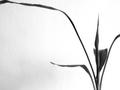
| 09/21/2002 11:58:00 AM |
Tranquilby labryntheComment: needs a bit more space to avoid cropping the ends I think - or you could have cropped it a whole lot more closely - seems stuck inbetween those two options in this case. |
 Photographer found comment helpful. Photographer found comment helpful. |
| 09/23/2002 08:26:00 AM |
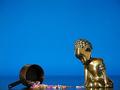
Wineglassby GordonComment: Not sure if the link will work here, but this is how it was supposed to look :) I had it pretty clearly in my head, it just took quite a bit of learning about lighting to turn this rather drab rendition into the shot I was looking - shame I did it a few days too late! Thanks for all the comments and taking the time to look.  |
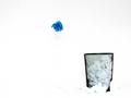
| 09/21/2002 11:07:00 AM |
Blew itby FrooberComment: funky and stark - I'd like to see a bit more detail in the crumpled paper around the bin but other than that - very clean |
| Photographer found comment helpful. |
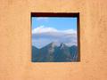
| 09/21/2002 10:53:00 AM |
Framedby lmhrComment: like it - could do with being even more 'straight on' but a good effect. |
| 09/21/2002 11:51:00 AM |
Hannahby ZeissmanComment: Fantastic - great contrast with the background - excellent expression and framing. Only issue is it seems a bit soft focused on the eyes - maybe worth experiementing with setting the focus on the eyes and reframing, if you don't already do that, or maybe different sharpening settings 10 - Gordon |
| Photographer found comment helpful. |
| 09/21/2002 10:12:00 AM |
|
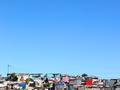
| 09/21/2002 10:04:00 AM |
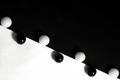
Contrastsby GraciousComment: Great idea - did you mean for the slight lack of overlap in the middle ? Seems slightly softly focused - I think I'd prefer it more crisp for such a graphic shot, maybe even with more extended contrast to make it more of a black and white than it is. |
| 09/21/2002 10:11:00 AM |
|
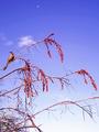
| 09/21/2002 11:47:00 AM |
Moon Birdby lisaeComment: the moon seems lost in the picture - too small to make much of an impact I think,. I like this better without it up there. |
| Photographer found comment helpful. |
Home -
Challenges -
Community -
League -
Photos -
Cameras -
Lenses -
Learn -
Help -
Terms of Use -
Privacy -
Top ^
DPChallenge, and website content and design, Copyright © 2001-2025 Challenging Technologies, LLC.
All digital photo copyrights belong to the photographers and may not be used without permission.
Current Server Time: 07/27/2025 09:08:31 PM EDT.