| Image |
Comment |
| 12/03/2002 03:52:00 PM |
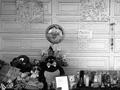
Rest In Peace Little Angels...a memorial to the murdered childrenby TerryGeeComment: It is a sad story and your picture reflects it well. The black and white does add to the feel. Perhaps if you had taken the picture from a lower (more child-like) perspective you could have further accentuated the mood of the picture ? The background wall/ panels are slightly tilted which seems to be accidental and would be worth fixing by a slight rotation. I find the balloon very centered in the frame - maybe moving it off center would have provided a more flowing composition - eye starting at the balloon, moving down and across the other memorial pieces. as it is I get stuck at the balloon and don't really look elsewhere. Hope this is useful for you. |
| 12/03/2002 03:49:00 PM |
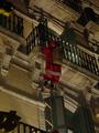
Is Santa Claus a burglar?by bcncrazyComment: Critique Club : A funny and interesting subject. You have the subject very centered in the frame, which leads to a fairly 'static' look - as he is climbing up/ down it might look better to have framed it slightly off center, probably in the upper right, and leave some space to 'climb into' this would have also let you remove the two decorations? that are blurred out on the left hand side and distracting. Exposure seems quite dark wihch works to give the feeling of night time. Mainly I think re-framing with an off-centered subject would make this have a much more dynamic feel to it and make it a stronger picture. Hope that is useful. |
| 12/02/2002 08:04:00 AM |
|
| 11/27/2002 03:01:00 PM |
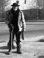
In the Shadowsby karmatComment: A good dignified portrait. Certainly better that you can't see his cardboard sign. The lighting on his face is really harsh with the shadows - not sure if you wanted that or not. Maybe taking it from a direction with either sunlight full in his face or full not in his face would have let you expose more for him ? Another thought in general - pay attention to the background - even though it can be hard to do. He has a traffic light poking out of his head. I realise this is a very difficult and emotive subject choice and is difficult to think of all this sort of stuff while dealing with just taking the picture. A very good entry. |
 Photographer found comment helpful. Photographer found comment helpful. |
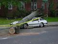
| 12/03/2002 03:42:00 PM |
Killer Stormby mrguilleComment: Critique Club Comments: Well you sure found a great subject for a journalism shot! That certainly helped a lot I think. Makes for a very dramatic and high initial impact subject. Compositionally, I think you could have framed this a bit tighter and maybe used the tree and 'do not cross' lines to bring the viewer's eye into the picture more strongly ? Perhaps if you were closer in, maybe more to the left side, then these elements would have lined up with the foreground of the picture and 'brought the eye' into the crushed car more dramatically. There is quite a lot of 'dead space' to the right of the street sign and lower right in the road, which doesn't add much - so perhaps a framing with the street sign completely showing (for a reference point - rather than just the cross street) and moving the car slightly off center to add the emphasis would help ? Otherwise this is a good entry - the exposure is a touch dark and could maybe do with being slightly brighter but a good journalistic picture. |
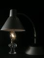
| 11/19/2002 11:24:00 PM |
Now and Thenby zadoreComment: an interesting juxtaposition of themes, with the old and new. The lighting isn't really clear enough to get the whole effect. Maybe because you used a dark lamp as well as a dark background ? |
| 11/25/2002 02:15:00 PM |
City Traffic by ndsComment: A worthy winner - the converging lines lead you straight to the 'what the!' moment at the top |
| Photographer found comment helpful. |
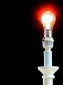
| 11/18/2002 11:27:00 AM |
Bright Idea!by crabappl3Comment: A hard exposure to get right but you've made a good attempt. The very black and very white subjects are at the extremes of what you could get away with and the silver on the bulb seems to have suffered a bit as a result. It is well composed, and the glow/ halo around the bulb works quite well. I think I might have preferred it with a shorter exposure, almost to the point of just seeing a glowing filament, perhaps ? |
| Photographer found comment helpful. |
| 11/18/2002 12:51:00 PM |
Bright Ideaby gandersComment: Lovely detail - you've got the exposure just right in this, even to the point of showing some of the filament wire. The focus doesn't seem to be quite right, though that could be the reflections on the bulb - makes it look slightly blurred unfortunately. Hard to control those reflections in this case. Good effort though. |
| Photographer found comment helpful. |
| 11/11/2002 09:11:00 PM |
|
Home -
Challenges -
Community -
League -
Photos -
Cameras -
Lenses -
Learn -
Help -
Terms of Use -
Privacy -
Top ^
DPChallenge, and website content and design, Copyright © 2001-2025 Challenging Technologies, LLC.
All digital photo copyrights belong to the photographers and may not be used without permission.
Current Server Time: 07/29/2025 08:43:32 PM EDT.