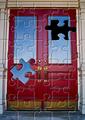
Puzzling Doorby
DougPazComment: CC: I'll split this comment into two parts. The picture, and the post processing.
The picture I like, a strong, red door with good cool contrasting blue sky reflected. It could perhaps be a touch more saturated to give more punch but a well composed shot. The handles are crisp and sharp and add some good details. Slight barrel distortion on the edges, but that is to be expected. Could have been straightened up if you had wanted with a freebie tool like PanoTools or similar, but it doesn't detract too much from what is a good shot of a door.
The filter I'm less fond of. In general, I'm a bit jaded about filters that are just applied directly to a scene. I don't really feel a whole lot of connection between the underlying subject matter and the filter that has been applied - what was the motivation of using this puzzle filter ? If there was something distinctive about the 'missing piece' then perhaps it could be more integrated - as an allusion to something being disconnected or out of place, but here it just looks gratuitous.
The selection edges around the piece are a bit ragged - perhaps some feathering of the selections would have made for a cleaner extraction of the piece, although that is quite difficult to do so you've done well.
In general I've found the photoshop filters can be really effective if used either indirectly, to a mask or adjustment layer, rather than straight out of the box onto the image, or if used in a really sympathetic way that matches well with the subject matter. I don't quite think you've pulled that off with this one. NB None of this is sour grapes because your picture beat mine by one place ;)