| Image |
Comment |
| 02/10/2003 08:55:54 PM |
|
| 02/10/2003 08:53:59 PM |
|
| 02/10/2003 08:52:55 PM |
|
 Photographer found comment helpful. Photographer found comment helpful. |
| 02/10/2003 08:51:00 PM |
Who? Where? by JeanComment: great overexposure shot - did you shoot it like this, or process it later ?
Very good either way. |
| Photographer found comment helpful. |
| 02/10/2003 08:50:30 PM |
|
| Photographer found comment helpful. |
| 02/10/2003 08:49:20 PM |
Can Nibblesby PaulkComment: I have to admit to not being able to see Waldo at all in this - though I do miss baked beans, human or not. .. are they like the ones with sausages in them, but this time bits of waldo ?
As you could crop how you saw fit, a square crop on this might have worked well ? |
| Photographer found comment helpful. |
| 02/10/2003 04:44:39 PM |
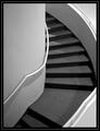
Ascensionby jmsetzlerComment: I like this , but I think the design elements would be stronger if the right hand rail hadn't been amputated. Then you'd have 3 elegant curves, the left rail, the carpet/ stairs and the right wal/ railing, all working in harmony to lead you through the scene. The tonal range is okay, the lighting is interesting, but that interuption bothers me and my eye. If those elements were more in harmony this would be a much stronger, very graphical design. What would be 3 major tonal areas are also divided up into 5, with triangles in the lower right and upper right that are competing not harmonising with the scene. The steps give just enough interest and tonal range to stop this eing boring. A good effort but needs some thought on the composition and the visual weight of shapes and relationships. |
| 02/10/2003 03:06:12 PM |
Coming out to get ya!by YomiComment: Wow! it really does seem to be coming out of the screen! 3D effects for free. Excellent - love the focus on the eyes and leaving the snout out of focus. Simply great. |
| Photographer found comment helpful. |
| 02/10/2003 03:04:44 PM |
Supportby OneSweetSinComment: might work better as B&W as the colours aren't adding anything. |
| 02/10/2003 03:03:33 PM |
Arlington Winterby BAMartinComment: The tree breaks up the pattern/ texture of this shot - I'd like to see it without that I think |
| Photographer found comment helpful. |
Home -
Challenges -
Community -
League -
Photos -
Cameras -
Lenses -
Learn -
Help -
Terms of Use -
Privacy -
Top ^
DPChallenge, and website content and design, Copyright © 2001-2025 Challenging Technologies, LLC.
All digital photo copyrights belong to the photographers and may not be used without permission.
Current Server Time: 08/05/2025 05:31:00 AM EDT.