| Image |
Comment |
| 07/24/2003 09:51:30 AM |
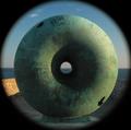
Round²by mbardeenComment: Thanks for all the comments and votes!
The border is a "flaw" in my teleconverter. This was actually shot with my polarizer (explaining the rich warm colours) and two UV filters on between my telelconverter and lens adapter. This was the only way I was able to get all of the vignetting circle into the frame.
Would you belive that I completely didn't think about the "literal representations of someone elses art" until about two days into the voting? It never even occured to me during the shooting, submission process.
Rob: I think us Brighton based photographers are going to have to get together and come up with a shooting schedule. The piers seem to make their way into many challenges, and I know for a fact that the Beachyhead lighthouse was almost in the "From Above" challenge twice.
Once again, thanks!
-Matt |
| 07/22/2003 07:20:13 PM |
The Golden Glowby tgarcezComment: I know I've seen this sculpture before. I can think of where tho.
I think the lighting is a bit flat on the sculture itself, but getting a proper exposure with the sun on it would be trying for the best photographer. 6 |
 Photographer found comment helpful. Photographer found comment helpful. |
| 07/22/2003 07:17:07 PM |
Round Midnightby pupparazzoComment: Great attention to detail on this shot. I definitiely think the framing could be tighter around the watches though. Cutting an inch of the top and left sides strengthens the shot for me.
Nice exposure as well. 8 |
| Photographer found comment helpful. |
| 07/19/2003 07:53:49 PM |
Not Your Average Supermodel (nude no 3)by SharQComment: Greets from the Critique Club:
Hi SharQ,
This is a really good nude. Everything is well lit and your contrast is very good. Technically, I think it is excellent.
I like the emotional and compositional side as well. Your model is sitting forward, engaging the camera and showing the world she is not afraid and is comfortable with her body.
The only annoyances are the missing toe mentioned by one of your commenters (not really a big deal), and the small triangle of light up in the top right hand corner.
Just all around good job! Best of luck with you future entries!
-Matt |
| Photographer found comment helpful. |
| 07/18/2003 06:18:40 AM |
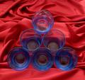
Geometryby chickadeeComment: Interesting, but I feel the background really detracts. A smooth red background would have highlited the subjects more. I do like the interaction between the glasses on the bottom and the fabric tho. |
| Photographer found comment helpful. |
| 07/18/2003 06:00:18 AM |
Study of Male in Nudeby OneSweetSinComment: Greets from the Critique Club
Hi Anna,
This isn't a shot I rated highly.. The shot seems to be lacking in drama and there's not much for the viewer to identify with. The lighting is the main cause of this, it feels bland and is unflattering to his skin tones.
The composition is the strong point of the shot. It feels like he's stuck in a box. A bit of a tighter crop at the top and bottom would further enhanced this impression, plus would have given you a stronger diagonal..
If those couple things were changed, I think this shot would have scored much higher.
Good luck in the future challenges!
-Matt |
| Photographer found comment helpful. |
| 07/18/2003 05:47:44 AM |
Am I Not Worthy For Your Kingdom?by TurbotechComment: Greets from the Critique Club
Hi Turbotech,
This is an interesting, thoughtful shot. I'm not entirely sure it raises questions in my mind, but that's beyond the scope of my critique. The technical aspects of this photo are well done. I like the composition (though it's not perfectly centered) and I really like the lighting. What I don't like is that the shot appears to be oversharpened.. I actually think a bit of a blur would make this shot feel more mysterious and add to the questioning nature - but that's just me. Apart from that, there's not much more I can say.
Good job and good luck in future challenges
-Matt |
| Photographer found comment helpful. |
| 07/16/2003 06:17:39 PM |
blue bikiniby shutterflyComment: I think I knew who took this picture, but I'm not sure why. Shutterfly?
I'm sure you've heard this from bunches of people, but I'm not sure I'd consider this nude. It is a nice photo tho, and you've done a good job with the desaturation. Seeing as mine is not really a "nude" either, I'm giving you the benefit of the doubt. -7 |
| Photographer found comment helpful. |
| 07/16/2003 06:06:38 PM |
Somnolenceby ToddhComment: I really like the combinations of textures and tones in this picture. I think they compliment eachother nicely. The white crumpled bedspread against the smooth darkness of her flesh works very well. good job. |
| Photographer found comment helpful. |
| 07/16/2003 05:54:03 PM |
Lay Lady Layby MikeOComment: I'm sorry, but this is an unflattering pose. Technically the photograph is well done, but that's not enough to make up for the pose. |
| Photographer found comment helpful. |
Home -
Challenges -
Community -
League -
Photos -
Cameras -
Lenses -
Learn -
Help -
Terms of Use -
Privacy -
Top ^
DPChallenge, and website content and design, Copyright © 2001-2025 Challenging Technologies, LLC.
All digital photo copyrights belong to the photographers and may not be used without permission.
Current Server Time: 08/02/2025 10:49:00 AM EDT.