| Image |
Comment |
| 04/26/2007 05:51:56 PM |
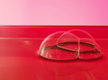
Bubbles in pink and redby jparisiComment: I like the 3 bubble collection. Vibrant red. The tilted seperation bugs be a bit - feels like a tilted horizon - I think I'd prefer it either level or more tilted. |
| 04/26/2007 05:48:53 PM |
|
 Photographer found comment helpful. Photographer found comment helpful. |
| 04/26/2007 05:47:32 PM |
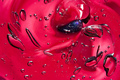
Ahhh Bubblesby WillSnapsComment: The bubbles are great - nice dof and "texture" to them. They contrast well with the background. The model's skin is too smooth...there's no distinction from when her head/chin ends and her neck begins - it's all the same tone. Her skinn is too orange me too. |
| Photographer found comment helpful. |
| 04/26/2007 05:44:30 PM |
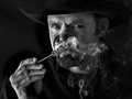
The New Marlboro Manby njsabsComment: Great lighting. If I didn't know that was a bubble I'd have a hard time making visual sense of what exactly that circle around his nose/mouth is...in fact even know it still doesn't visually seem clear to me that it's a bubble - comes out too flat or something. I think the idea is very interesting. |
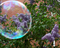
| 04/26/2007 05:39:49 PM |
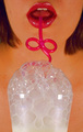
Lilac Studyby sepvComment: Oh I like how you used the bubble here! Nice composition too. |
| Photographer found comment helpful. |
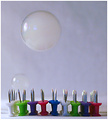
| 04/26/2007 05:39:06 PM |
Slim Chanceby LaMasComment: What a neat idea. The background is bleh - too noticeable. Maybe black or another color would have worked better. DOF could be a little deeper I thikn. Like the colors and composition. |
| 04/26/2007 05:37:27 PM |
The Big Bang by DUCATISTAComment: There's a nice story here (the picture is about something). I think the hand is over-exposed. Nice framing. |
| Photographer found comment helpful. |
| 04/10/2007 04:16:46 PM |
his majestyby PhotoDaveComment: I agree that I like the eye contact of this one over the other. Your dof is great here. The deer is clearly draws the eyes but at the same time I get the "camoflauge" feel of a deer in his native environment. |
| Photographer found comment helpful. |
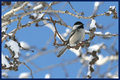
| 04/10/2007 04:13:37 PM |
lill birdby PhotoDaveComment: Great capture and dof on the chickadee. My eye keeps getting drawn to the vivid blue space left of the bird though. The open space might work better if the bird were facing in that direction but here I find it more distracting. I think I'd like a closer crop putting the bird in the bottom-right of the image. |
| Photographer found comment helpful. |
| 03/29/2007 06:55:57 PM |
|
Home -
Challenges -
Community -
League -
Photos -
Cameras -
Lenses -
Learn -
Help -
Terms of Use -
Privacy -
Top ^
DPChallenge, and website content and design, Copyright © 2001-2025 Challenging Technologies, LLC.
All digital photo copyrights belong to the photographers and may not be used without permission.
Current Server Time: 07/18/2025 02:09:10 PM EDT.