| Image |
Comment |
| 01/09/2008 09:42:28 AM |
|
 Photographer found comment helpful. Photographer found comment helpful. |
| 01/07/2008 11:23:29 AM |
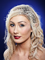
Individualityby TownleyComment: chocolate is brown...
I was afraid the brand thing would be to vague for the voters.
Sorry this scored so low. Don't let this keep you from trying.
Your just starting out and have a lot yet to learn.
Looking forward to seeing your advancement and growth in the future.
|
| Photographer found comment helpful. |
| 12/26/2007 02:25:46 AM |
|
| Photographer found comment helpful. |
| 12/20/2007 04:11:17 PM |
Alien Encounterby pointandshootComment: There is an interesting story here, but I feel the filter effects have been over done on it. I just don't feel it fits this image. |
| Photographer found comment helpful. |
| 12/12/2007 10:52:21 AM |
The Dark Sideby jackal9Comment: You got some great comments on this one and the score is pretty dang good too! Great Job! (you beat michelle, thats an accomplisment in itself!)
hehe
|
| Photographer found comment helpful. |
| 12/10/2007 12:30:04 PM |
The Ice Fairy by LalliSigComment: There must be something REALLY special about how you do things.
So the way to truly blend in, is to teach 100+ other DPCers your techniques... I will volunteer to be one!
|
| Photographer found comment helpful. |
| 12/07/2007 01:55:41 PM |
|
| Photographer found comment helpful. |
| 11/28/2007 04:35:15 PM |
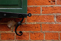
Shutter and Brickby iamkmaniamComment: I love what you were going for here. Old bricks have great texture! I also love the swirl of the shutter holder. The wad of mortar is a major distraction to the image. Also the bricks appear orange here not the red that one would expect. I imagine you are getting a lot of comments to that effect.
This has great potential. |
| Photographer found comment helpful. |
| 11/28/2007 04:30:16 PM |
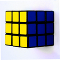
Contrasting Cubeby NullixComment: not a bad attempt. Got the colors well. 1. It doesn't feel like its in focus. 2. remove the corners where you rotated the image. I am guessing you need to adjust your monitor. 3. clean the surface the subject is setting on (black marks on the right side) I like how you rotated the image to give it a floating feel. There is also a hair floating on the top . 3. White balance adjustment or a levels adjustment would bring your background to a more white (less blue). |
| Photographer found comment helpful. |
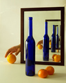
| 11/28/2007 04:24:03 PM |
Attempt to Steal Lifeby vaarComment: I have that bottle! Very nice image. I like the bevel on the mirror giving some distortion to the reflection. I'm not real fond of the yellow color cast on the entire image. The more I look at it, the more its growing on me. But I think its going to hurt the outcome. Clone out the white splotches on the background for future use. |
| Photographer found comment helpful. |
Home -
Challenges -
Community -
League -
Photos -
Cameras -
Lenses -
Learn -
Help -
Terms of Use -
Privacy -
Top ^
DPChallenge, and website content and design, Copyright © 2001-2025 Challenging Technologies, LLC.
All digital photo copyrights belong to the photographers and may not be used without permission.
Current Server Time: 08/05/2025 07:42:35 PM EDT.