| Image |
Comment |
| 10/23/2003 04:35:27 PM |
|
 Photographer found comment helpful. Photographer found comment helpful. |
| 10/22/2003 08:17:02 PM |
|
| Photographer found comment helpful. |
| 10/22/2003 08:15:35 PM |
dada that' some good cookie'sby jbruno1397Comment: Simply darling. I don\'t think there is a kid alive that can resist the bowl and spoon when done. All the stuff in your backround is distracting try and shoot with a little less clutter and it will improve it. |
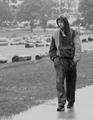
| 10/21/2003 08:22:40 PM |
road king.jpgby FlashComment: I really like the effect you have going here it is very nice. Good composition. Kind of makes me think it should be put on gift wrap. Nice image. |
| Photographer found comment helpful. |
| 10/21/2003 07:38:22 AM |
|
| Photographer found comment helpful. |
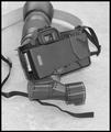
| 10/21/2003 07:30:16 AM |
Autumn Eveby amsmythComment: COuld have just a little more contrast of brightness the piece of equipment gets lost in the shadows. Would love to see more of it. |
| Photographer found comment helpful. |
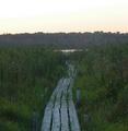
| 10/21/2003 07:28:02 AM |
restful lakeby bexforlifeComment: "Critique Club"
Not sure where to start with this other than I understand why you scored so low on this. For starters this was URBAN landscape and the discription of the challenge said it should have buildings in it. I don't see any buildings at all in your photo.
Now you do have an interesting subbject with that wooden walkway. You should try shooting it so that the walk starts at one corner of your photo and goes part way across you photo leaving the lake near the opposite side of the photo.
This could be a lot stronger as it is if it was a little brighter and you either use a haze filter or you play a little with the contrast and saturation to get rid of the gray hazy. |
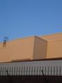
| 10/21/2003 07:22:41 AM |
Urban Skyby richyComment: *Critique Club*
This photo is very boring has nothing that really stands out to get your attenion. The colors here are only so so. You can only see part of the building and it isn't even enough to tell you what it is.
As for meeting the challenge, no not really the challenge was Urban LANDSCAPE! Meaning there should be some kind of actual landscape in the photo not just part of a building.
The strong point of your photo is the lines the building creates, could have made the photo strong if there was something to look at like a window or plant anything even a person in the photo. |
| 10/16/2003 09:10:29 PM |
Exposedby JasonComment: Clever! I've had that happen to me before too. |
| Photographer found comment helpful. |
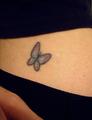
| 10/16/2003 09:08:50 PM |
My Tattoo revealed....by WILDBLUEComment: I know how hard it is to take a photo of yourself, but the focus seems soft on the tattoo. Neat color for the butterfly. |
| Photographer found comment helpful. |
Home -
Challenges -
Community -
League -
Photos -
Cameras -
Lenses -
Learn -
Help -
Terms of Use -
Privacy -
Top ^
DPChallenge, and website content and design, Copyright © 2001-2025 Challenging Technologies, LLC.
All digital photo copyrights belong to the photographers and may not be used without permission.
Current Server Time: 08/08/2025 03:36:05 AM EDT.