|
|
|
Showing 1321 - 1330 of ~1422 |
| Image |
Comment |
| 02/03/2003 02:33:49 AM | Preserved but Forgottenby RefractedComment: Should have stayed forgotten, it's an ugly picture. Sorry to sound critical, but the colors are dull and there's mold or dust all over the subject. |
| 02/01/2003 02:59:27 AM | |  Photographer found comment helpful. Photographer found comment helpful. |
| 02/01/2003 02:56:31 AM | Squared Awayby RiderGalComment: Squared away? What is the meaning of the title in relation to the photo? |
| 02/01/2003 02:53:08 AM | |
| 02/01/2003 02:50:52 AM | Evolved Squareby Swami GComment: funny! only you could get away with getting anything but a one on a shot in a "squares" photo contest with no square! |
| 02/01/2003 02:50:24 AM | fragmented ladder to the skyby ritaardComment: You know, I really like this photo, I really do. The colors are lovely and the ladder on the side gives a strange twist to the photo. I can't score it high because it has NO SQUARE anywhere in the photo. The photo itself is square, and that is all. I feel we have to stick to our challenge theme for the rules to mean anything at all. |
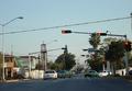
| 02/01/2003 02:45:51 AM | Chaoticby mliborioComment: Melissa, I don't like to be mean, but I won't have much good to say about this photo. I know you are capable of better, because I went to your profile. Maybe you were in a hurry and didn't have anything to submit, so you submitted this out of desperation? There is no real subject to speak of in this photo. There are traffic lights, and a very small "no left turn" sign, but they don't really grab a viewer, they don't command ones attention. The title seems all too fitting, and not in a good sense. The title should say something about the subject, our subject was supposed to be "Roadsigns", what is chaotic about the signs? I can see how the cars could be perceived as chaotic, but our theme was not "Traffic" or "Cars". I don't know what else to say except to take your time and you can do better next time. |
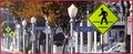
| 02/01/2003 02:28:12 AM | walk walk 40 walk no stopping no stopping no stopping no stopping walk no stoppingby spidermanComment: This seems like a great idea for a photo and you put it together pretty well. I like your decision to crop where you did, any more might distract from the main center(s) of interest. Nice colors. Some had accused you of creating a "cluttered" look, but I see it as the precise effect you were attempting, and, why would that necessarily be bad? I did agree with those who commented that the border was distracting and unattractive, it's not the border, but the color of the border that is so off. What about the ISO you chose(or did you)? Would it have been possible to use a slower ISO, or does the 500mm not allow that? Or maybe it was because you were "standing in traffic" and could not use a tripod and a slower shutter speed? I don't know, but it seems like a slower ISO might have made those most distant signs more distinct. They don't look bad, I'm just wondering if it would have been possible to make them look better. The "No Stopping" sign on the far right is cut in half, that is not very attractive. Very catchy title :) | | Photographer found comment helpful. |
| 01/29/2003 05:49:43 PM | |
| 01/27/2003 02:48:09 AM | |
|
Showing 1321 - 1330 of ~1422 |
Home -
Challenges -
Community -
League -
Photos -
Cameras -
Lenses -
Learn -
Help -
Terms of Use -
Privacy -
Top ^
DPChallenge, and website content and design, Copyright © 2001-2025 Challenging Technologies, LLC.
All digital photo copyrights belong to the photographers and may not be used without permission.
Current Server Time: 08/04/2025 02:41:45 PM EDT.
|