|
|
|
Showing 471 - 480 of ~1260 |
| Image |
Comment |
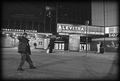
| 10/26/2006 07:01:15 AM | Cast from The Gardenby visionistComment: I'm betting that your score is suffering from having people in your image but it is easy to see that these people were not fans that attended the sporting event. This definitely conveys after the game to me and is nicely done. 7 |
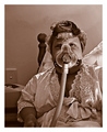
| 10/26/2006 06:40:59 AM | The A.M. Ritualby sherpetComment: Hello from the Critique Club,
For the lighting setup you choose, the post processing of this image is perfect. The shadows on the face and the lack of color gives this image a very mechanical feel and it fits well with the everyday, day in day out interaction you have with this machine. The high lighting of your face draws my focus directly to your left eye, which has the effect of personalizing your daily routine for me. There is nothing I can suggest for improving this image. That in itself tells me that your score is directly linked to how the voters related to this image. When you produce an image that conveys this much emotion and is so personal, you are bound to make some people a bit uncomfortable and they will vote accordingly. Not being a member, I did vote on this challenge but I would have given it a 10, as few pictures at DPC convey the human side of photography like this. Mine included. Excuse me as I add this to my favorites.
Feel free to PM me if you have any questions regarding this critique.
Tim
|  Photographer found comment helpful. Photographer found comment helpful. |
| 10/25/2006 06:44:13 AM | The Distinction Between Youth and Old Ageby SquishyBComment: Lila,
First, lets start out with how this image fits in relation to the challenge and the DPC game. Most voters for this challenge were expecting an image with high photographic contrast. Eight of the top ten images in this challenge were black and white or near black and white. Since your subject has a metaphorical contrast, you start off fighting an uphill battle.
Now lets look at how well you conveyed your metaphorical contrast to the voters. You have an older looking white flower that is centered in the image with pretty good focus and lots of detail. Contrasting that, you have a fresher looking yellow flower in the background that is partially cropped off and definitely not in focus. In fact, the focus on the yellow flower doesn't really provide the voter enough detail to determine if it truly is a "young" flower or a middle aged flower on its last legs, especially in the two or three seconds the typical voter will look at the image. The composition of this image doesn't help support your metaphor either, as the yellow flower looks more like background clutter than as a contrasting element to the white flower. For these two flowers to convey the age contrast suggested by your title, they need to have equal prominence in the photo, both in placement and focus. As is, without the title, I would never be able to tell that this image was contrasting an old flower to a new flower. There was a recent posting in the forums that suggested if a four year-old cannot easily tell the connection between your image and the challenge description, then you probably won't score well.
Let me finish with a few comments about what I really like about the image. First, the post processing of this image is really well done. The white flower has lots of detail and more important, texture. It would have been very easy to over sharpen this image to the point where that texture would have been lost in the detail. I also like the softness of the background. It really compliments the texture of the flower. If the yellow flower weren't there, this image would work very well with the white flower being centered and a square crop.
Watch your composition and make sure it supports the message you are trying to convey. And always, crop out those areas that don't support your message. The voters will forgive a few technical flaws if the composition and relationship to the challenge are strong.
Tim
| | Photographer found comment helpful. |
| 10/18/2006 10:55:57 AM | The Long Walkby EyesupComment: Hello from the Critique Club,
Welcome to DPC. I must admit that this image has the most detailed comments I've seen of the nearly 100 images I have critiqued. I don�t' have a lot to add, as my impressions of this image before reading the comments mirror those of the comments you received. The two items that hurt your score the most is that something doesn�t look right post processing wise and that for the majority of voters, this does not meet the challenge as a portrait. Without seeing the original image, it is hard to make suggestions as to improving the post processing. Keep trying, the composition of this image shows that you have a good eye and once you master the post processing part and learn what works at DPC, you will find your score will improve dramatically.
Feel free to PM me if you have any questions regarding this critique.
Tim
| | Photographer found comment helpful. |
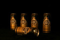
| 10/17/2006 07:51:01 AM | Tuborg Goldby saevarjoComment: Hello from the Critique Club,
Let me start off by saying I like the composition of your entry. The can laying on its side give the image a strong focus point and sets it apart from many of the images in this challenge that showed a long line of beverage containers. I also like the gold coloration of the lighting, as it works well with the gold color of the cans. So why didn't this image score better? There are a few technical issues with this image that are easy to fix. First, the image looks a little flat. If you bump up the gamma in levels and bump up the contrast, the cans end up looking a lot more three-dimensional. Second, the focus appears to be a little soft. There are several possible reasons for this but the most likely is that the image needs to be sharpened more after reducing the size to 640 pixels. Most people us Unsharp Mask to accomplish this. If you did use USM after reducing the size, you may want to run it a second time. The third issue is the reflection on the can that is lying on its side. On the upright cans, the catch light is much smaller is size and is pleasing to look at. On the tipped can, the catch light effect is very large and distracting. The size could have been reduced or eliminated by rotating the can to change the angle that the light bounced off it. And finally, the dark space above the cans is a little large. Although this may be helpful for adding words to an advertisement, the image was being judge by photographers as a photograph.
Feel free to PM me if you have any questions regarding this critique or if you have problems understanding any of my comments.
Tim
|
| 10/17/2006 07:25:02 AM | windowsby electinaComment: Hello from the Critique Club,
High contrast has to be one of the toughest challenges to enter at DPC since I joined a few months ago. What makes it so tough is that the definition of high contrast is a moving target; each person that votes has a different definition. For me, your image met the challenge strongly. The blue of the windows contrasts the white of the building and the light blue of the sky. Where is this image falls short is related to the description for the challenge "Use high contrast to create impact in your photograph." The technicalities of this image are very well done, lighting, post processing, focus; however, visually it has no impact. Forty percent of your votes were 5's. That, to me, signifies people looking for literally 2-3 seconds and saying, "this picture isn't bad (so I can't give 4 or less), but it doesn't do too much for me (so I can't give 6 or more); therefore 5". Your profile page shows that you have a good eye for composition and handle the technical aspects of photography very well. Keep shooting and good luck in future challenges.
Feel free to PM me if you have any questions regarding this critique.
Tim
|
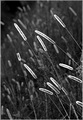
| 10/16/2006 07:23:47 AM | September Sunby treehuggerComment: Hello from the Critique Club,
Congratulations on a fine score on your first challenge entry. To start with, you did an excellent job capturing the detail in the grass using backlight. This detail, when combined with the fluorescence of the seed heads, helped you achieve the solid score you received. What kept this image from scoring higher is that many of the voters were looking for a lot more contrast then what is present in your image. Although your background is dark compared to the grass, it has a lot of gray tones to it that doesn't really covey the high contrast feel that many of the voters were looking for. Again, congratulations on a very solid score and I look forward to seeing more on your entries in the coming weeks.
Feel free to PM me if you have any questions regarding this critique.
Tim
|
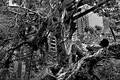
| 10/16/2006 07:00:46 AM | URBAN JUNGLEby alecnormanComment: Hello from the Critique Club,
My first impression of this image when I voted on it was that it seemed extremely busy. Now that I'm looking at it for a second time, I can see I underrated it, as probably most voters did. The black and white conversion is extremely well done and the image has a ink dot drawing appeal to it while have a significant amount of gray tone. However, the busyness makes it difficult for the eye to find a place to rest and appreciate the image quality in the short time most voters look at an image. I realize that the clutter on the left side of the image is part of the story you are trying to capture but the voters had no idea it was from the aftermath of a typhoon. Therefore, it comes across as clutter. If you would have submitted this image with a square crop with the left side of the image removed, I feel that this would have scored significantly higher. It wouldn't have told as much of the true story you were trying to tell but it would have gotten a longer look and in the end, communicated more of the story to the viewer.
Feel free to PM me if you have any questions regarding this critique.
Tim
|
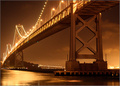
| 10/13/2006 08:02:35 AM | Midnight Falls on the San Francisco Bay Bridgeby drakejComment: Hello from the Critique Club,
Congratulations on your first 6+ score and in a 600+ image Free Study to boot. The lighting and color of this image are very well done and a pleasure to look at. The composition and perspective is also well done. The only suggestion I have for improvement would be to mask for the sky and tweak the post processing to bring out the clouds and darken the sky slightly. I think this would provide a bit more depth to your image visually. I could be accomplished fairly easily by bumping the gamma in levels, decreasing the brightness, and increasing contrast.
Feel free to PM me if you have any questions regarding this critique.
Tim
|
| 10/13/2006 07:46:47 AM | Mosportby jduffettComment: Hello from the Critique Club,
Nice job with the panning in this image. The car has considerable detail and the background blur helps provide the motion feel needed for this kind of image. The technical aspects of this image are pretty well done. I would suggest spending a bit more time in post processing to see if the detail in the hood area could be better defined. I'm not sure if the lighting, too high of contrast, or over-saturation, is the cause for the loss of detail in this one area of the car. Even with better detail in the hood, this image still might not have scored in the 6's. The problem being that the image just doesn't have enough DPC "wow" for a 600+ free study challenge. Over 40% of your votes were 5's. That, to me, signifies people looking for literally 2-3 seconds and saying, "this picture isn't bad (so I can't give 4 or less), but it doesn't do too much for me (so I can't give 6 or more). 5".
I think you achieved your goal when shooting this image of getting better at panning. You did a nice job and achieved an image you can be proud to have in your portfolio.
Feel free to PM me if you have any questions regarding this critique.
Tim
| | Photographer found comment helpful. |
|
Showing 471 - 480 of ~1260 |
Home -
Challenges -
Community -
League -
Photos -
Cameras -
Lenses -
Learn -
Help -
Terms of Use -
Privacy -
Top ^
DPChallenge, and website content and design, Copyright © 2001-2025 Challenging Technologies, LLC.
All digital photo copyrights belong to the photographers and may not be used without permission.
Current Server Time: 08/25/2025 11:53:12 AM EDT.
|