| Author | Thread |
|
|
01/06/2008 10:39:36 PM |
|
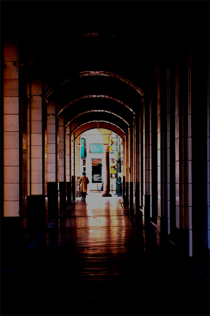
a little dark but very cool looking shot |
|
 Photographer found comment helpful. Photographer found comment helpful. |
|
|
10/20/2006 09:48:01 AM |
|
I think it is a little too dark. It is kind of hard to make out what everything is. Try lightening it up a bit next time. |
|
|
|
10/18/2006 10:55:57 AM |
Hello from the Critique Club,
Welcome to DPC. I must admit that this image has the most detailed comments I've seen of the nearly 100 images I have critiqued. I don’t' have a lot to add, as my impressions of this image before reading the comments mirror those of the comments you received. The two items that hurt your score the most is that something doesn’t look right post processing wise and that for the majority of voters, this does not meet the challenge as a portrait. Without seeing the original image, it is hard to make suggestions as to improving the post processing. Keep trying, the composition of this image shows that you have a good eye and once you master the post processing part and learn what works at DPC, you will find your score will improve dramatically.
Feel free to PM me if you have any questions regarding this critique.
Tim
|
|
| Photographer found comment helpful. |
|
|
10/16/2006 10:06:18 AM |
just a bit too photoshopped i'd say, for dpc voters.
prolly would have looked great in black/white.
the comp is more about the lines and perspective than faceless.
just my opinion, hope it helps. |
|
| Photographer found comment helpful. |
|
|
10/16/2006 09:55:28 AM |
Some constructive criticism:
Composition is ok, but feels a bit unbalanced.
The forward part of the image is a bit too dark with flat mid-tones. An s-curve could have help your mid-tone contrast some. Also a bit of contrast masking could have helped pull some details from the shadows. (Both s-curves and contrast masking are covered in the forums - the master being Bear_Music)
You might have scored a bit better with a tighter zsoom as your subject sorta gets lost in the composition. |
|
| Photographer found comment helpful. |
|
|
10/16/2006 09:13:02 AM |
it's a nice picture. Lighting and composition is OK, but it's not even close to being a portrait - faceless or not...
A portrait should tell something about the person - this picture tells something about the place. |
|
Comments Made During the Challenge  |
|
|
10/14/2006 01:15:50 PM |
?
Message edited by author 2007-09-10 20:21:19. |
|
|
|
10/13/2006 12:08:39 PM |
|
This is a little too dark, but i like the leading lines that draw you to the person. |
|
|
|
10/12/2006 12:43:48 PM |
|
Kind of lost the highlights there. Nice perspective though. Maybe bringing the subject a bit closer to the viewer might give this image more impact. |
|
| Photographer found comment helpful. |
|
|
10/12/2006 07:09:03 AM |
|
This is a supurb shot but I don't think it does much for the faceless challenge. |
|
| Photographer found comment helpful. |
|
|
10/11/2006 11:28:38 PM |
|
she is swallowed up by her environment, she can barely be seen, and these seem to be essential parts of who she is. 8 |
|
| Photographer found comment helpful. |
|
|
10/11/2006 11:04:06 AM |
|
Lovely lines and shadow in this. |
|
|
|
10/10/2006 05:59:33 PM |
|
the composition is fair, but the colors are horrible. the end of the hall is too busy to see just the person. good idea, but not captured well at all. (1) |
|
|
|
10/09/2006 09:34:06 AM |
|
It's an interesting picture, but to me, it's not really a portrait. |
|
|
|
10/09/2006 08:56:57 AM |
I'm not a technoid freak or anything but did you burn in your blown highlights? I find it difficult to deal with highlights like this and turning them a dirty grey doesnt usually help the image. Sorry for very personal opinion!
maybe a light at the end of the tunnel brightwhite would work better? |
|
Home -
Challenges -
Community -
League -
Photos -
Cameras -
Lenses -
Learn -
Help -
Terms of Use -
Privacy -
Top ^
DPChallenge, and website content and design, Copyright © 2001-2026 Challenging Technologies, LLC.
All digital photo copyrights belong to the photographers and may not be used without permission.
Current Server Time: 06/27/2026 05:29:58 PM EDT.