| Image |
Comment |
| 03/07/2007 08:24:03 AM |
|
 Photographer found comment helpful. Photographer found comment helpful. |
| 03/07/2007 08:22:10 AM |
MacIntosh Redby brenelemComment: The focus is a little soft on this image. Did you sharpen the image after resizing for the challenge? Most people run Unsharp Mask (USM) after resizing. In addition, the selective desaturtion is fairly well done in this image but it really doesn't enhance the composition all that much. |
| 03/04/2007 05:13:01 PM |
Unityby bradfdentonComment: Hello from the Critique Club:
First, let me welcome you to DPC and congratulate you on entering your first challenge. This image was refreshingly different than most of the images in this challenge. Now the question is, did you get the most out of this image. I really donΟΔÄôt think so. First, I think a tighter crop on the couple would have moved the focal point of this image to the hands instead of the cropped off heads. Try cropping on both sides to just about the outside edge of their backpacks. I would also suggest converting this image to black and white, as the bright colored safety vest in the background really distracts from the hands as well. I highly recommend the Channel Mixer conversion method used in this DPC B&W conversion tutorial.
Please let me know if you have any questions regarding this critique.
Tim
Edit: Fix link Message edited by author 2007-03-04 17:15:30. |
| 03/04/2007 04:57:57 PM |
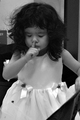
So noisy, SHHH!by ivisionphotoComment: Hello from the Critique Club:
What a lovely candid photograph of a very lovely little girl. However, there are a couple of things about this image that probably hurt your score a little bit. First, as mentioned in many of the comments you received during the challenge, this image doesnΟΔÄôt really convey the feeling of hate. Even a technically strong image will score badly if the voters think you do not meet the challenge (DNMC) description.
On the technical side, your black and white conversion is pretty good but the white of the dress could have been a little whiter to help expand the dynamic range of the image. Another problem with this image is that the focus appears to be sharper on the girlΟΔÄôs forearm than on her face/eyes.
The composition has a couple of things that could also use improvement. I glad you cropped this image to help bring the focus on the little girl. However, the cropping could not remove all of the distractions in this image, like the dark object in the lower right of the image or the object in the back with the letters on it.
And lastly, another problem with cropping this image is that it increases the amount of noise that is visible. When you shoot at high ISO because of the low light conditions, you need to use a noise reduction program before you start your post processing of the image. There are some free programs available on the web if you do a search.
Please let me know if you have any questions regarding this critique.
Tim
|
| Photographer found comment helpful. |
| 01/13/2007 07:00:56 AM |
The Ringby MAKComment: Back to comment: A creative idea for a portrait but the eye could have been a little sharper. The interesting thing about your composition is that with the eye looking up, the image conveys the ΟΔÄ€why do I have to poseΟΔÄù attitude. If the eye would have been straight forward, it would have conveyed anger or stubbornness. This is really effective compositionally and IΟΔÄôm going to give you a bump. |
| Photographer found comment helpful. |
| 01/13/2007 06:56:07 AM |
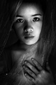
Young Mysticby alecnormanComment: Back to comment: Very nice work with the B&W conversion. The lighting is well done and the eyes are sharply focused. Giving you a bump, as I under-rated it the first time I looked at it. |
| 01/13/2007 06:54:36 AM |
The Look of Innocenceby islandpaddlerComment: Back to comment: Very nice work with the B&W conversion. The lighting is well done and the eyes are sharply focused. The only things stopping me from rating this higher is that the background has a few distractions in it. You might also want to clone out some of the catch lights in the eyes so there is only one in each pupil. |
| Photographer found comment helpful. |
| 01/13/2007 06:52:18 AM |
kidnapped by musicby sorayaComment: Back to comment: This image doesn't really say portrait to me, as the man doesn't come across as the main subject. The direction he is facing leads my eyes back to the turntables and record covers. You might consider clonging out the shelve brackets at the very top right side of the iamge also. |
| 01/13/2007 06:50:18 AM |
Thinkby bubeltrubelComment: Back to comment: I like the composition and the lighting of this image but the B&W conversion looks a bit off to me. The manΟΔÄôs skin almost looks like it might be green or some other odd color if I saw the color version. |
| 01/13/2007 06:46:52 AM |
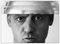
freedom of choiceby nixterComment: Back to comment: I'm betting this image is pretty close to what you were trying to achieve. However, the limited depth of view doesnΟΔÄôt work very well with the head gear, what ever it is. The lighting is pretty decent but the guyΟΔÄôs left eye looks too bright for the amount of light on that side of his face. IΟΔÄôm assuming you did a separate levels or curves layer for the eyes and processed them at the same time. |
| Photographer found comment helpful. |
Home -
Challenges -
Community -
League -
Photos -
Cameras -
Lenses -
Learn -
Help -
Terms of Use -
Privacy -
Top ^
DPChallenge, and website content and design, Copyright © 2001-2025 Challenging Technologies, LLC.
All digital photo copyrights belong to the photographers and may not be used without permission.
Current Server Time: 08/24/2025 09:46:37 AM EDT.