| Image |
Comment |
| 07/10/2007 07:51:02 AM |
tsby alexjackComment: Hello from the Critique Club,
The post processing of this image is well done and there is no doubt that this entry meets the challenge. Where this challenge entry misses the mark for me is two fold. First, there really isn't a main subject to help anchor this image besides the color. As the viewer's eyes move around the image there is nothing that holds their attention for any length of time. Second, there are so many layers to this image, the flowers, the box, and the window, that it looks cluttered. Another byproduct of not having a main subject in the composition.
I'm glad I received this image to critique, as it gave me the opportunity to take another look at your portfolio. I remember critiquing your Triptych II and I like the additions you've made to your portfolio since that critique. Feel free to PM me if you have any questions regarding this critique.
Tim
|
 Photographer found comment helpful. Photographer found comment helpful. |
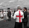
| 07/10/2007 07:36:38 AM |
THE RED CROSSby dippydazComment: Hello from the Critique Club,
The post processing of this image is wonderful and there is no doubt that this entry meets the challenge. The subtle desaturation reflects upon your vast experience here at DPC.
Where this challenge entry misses the mark for me is two fold. First, almost all of the people have their back to the camera. There is no eye contact to help hold the viewers attention. Second, there is no story here. Obviously this is some sort of event but being from the other side of the pond, I have no clue as to what is going on or why these people are gathered together.
Feel free to PM me if you have any questions regarding this critique.
Tim
|
| Photographer found comment helpful. |
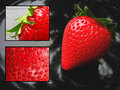
| 05/23/2007 06:32:49 AM |
Anatomy of a Strawberryby jeannybeanyComment: Jeanne,
Congratulations on breaking into the 6's. Just stopped by your profile page and saw your entry for the first time. Very nice job.
Tim |
| 05/14/2007 08:10:28 AM |
"I do so like green eggs and ham! Thank you! Thank you, Sam-I-am!"by hotpastaComment: Hello from the Critique Club,
I didn't vote in this challenge, so this critique is the first time I've seen your image. In fact, I haven't even looked through the results yet so I have no idea what the other Green Eggs and Ham entries look like. My first impression of your image is "Ok, where is the ham and what is up with the green Jell-O egg yokes". What did work here is that the breakfast plate has the look of something that would be expected more at a bistro instead of at home. That level of detail made it easy to look past the green colored ham and the Jell-O looking egg yolks. You scored about where you predicted and I enjoyed your interpretation of the theme.
Feel free to PM me if you have any questions regarding this critique.
Tim
|
| Photographer found comment helpful. |
| 05/14/2007 07:53:09 AM |
Theodor Geisel's "Design For Death"by GeneralEComment: Hello from the Critique Club,
Wow, I really don't know where to start. This is my first Critique Club assignment of a Brown Ribbon winner and it goes to someone that has been around long enough to know what to expect in relation to the image subject chosen and the expectations of the voters from the challenge topic. First, let me start by stating the obvious. Your image does depict your vision for the challenge strongly; however, the image quality and subject choice made this an easy vote low and move on entry. I also think if you would have included Geisel's pen name in the title, Theodor Geisel's, aka Dr. Seuss, "Design for Death", your image would have made more sense to the general voters (especially those outside the US).
Reading your comments, I see that the coloration was a major factor in your processing. When I think of nuke clouds I think of big white mushrooms emanating from a focal point of destruction (I've never seen a real one, only those portrayed in the movies). I wonder how your clouds would have looked in B&W with super high contrast, as the yellowish color doesn't really work for me. OK, now I’m trying to force my perception on your artistic vision. Sounds kind of like DPC doesn't it.
Feel free to PM me if you have any questions regarding this critique.
Tim
|
| Photographer found comment helpful. |
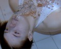
| 05/13/2007 11:42:47 AM |
symmetry underwaterby saradownendComment: Hello from the Critique Club:
First let me welcome you to DPChallenge. Kind of a rough start for your first challenge entry. I think the primary issue with this entry is that it does not look symmetrical. Symmetry is when the left side of an image looks exactly like the right side of an image (or top like the bottom), like a reflection off water or a close up of someone’s face. Your image almost has symmetry on the diagonal but the face is turned too much to one side and the bubbles trail to the right. Scores are always lower if the voters do not think the subject fits the challenge topic
The second suggestion I have for your next challenge entry is to submit a little bigger image. The rules allow for 640 pixels on the longest side of the image. Your picture is 400 pixels on the longest side. Voters also give a lower score on small images because it is hard to see the details in the image.
Now about the post processing of the image. Not knowing what software you have available, I will give you a few suggestions to try with just the most basic tools. First, there is really no color in this image that is all that wonderful. I would suggest you change this to black and white. Now the problem with using the “Convert to Black & White” function of most programs is that the images will not have enough contrast. Your image will need a bunch more contrast and also you will need to increase the brightness. Once you do this you will see that the bubbles really stand out. And the final step after resizing your image to 640 pixels is to sharpen the image. Most members use Unsharp Mask with a radius around 1. If your program doesn’t have Unsharp Mask, start with the lowest setting for sharpening that you can and bump up if possible.
Please let me know if you have any questions regarding this critique.
Tim
|
| Photographer found comment helpful. |
| 05/13/2007 11:08:26 AM |
Art Exhibitby bucketComment: Back to comment: Art is a culture of its own. Made my top three for the challenge. 9 |
| Photographer found comment helpful. |
| 05/13/2007 11:07:36 AM |
The Partisanby ladibugComment: Back to comment: Not the strongest subject for the challenge topic but still in my top three for the challenge. 9 |
| Photographer found comment helpful. |
| 05/13/2007 11:06:39 AM |
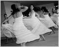
Cinco De Mayo dancersby kandykarmlComment: Back to comment: I love the motion in this image. The tilt brings a dynamic aspect to the composition that earned the only 10 I awarded this challenge. Nice job. |
| Photographer found comment helpful. |
| 05/10/2007 08:13:32 PM |
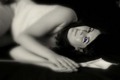
Amandaby MadukesComment: Hello from the Critique Club:
I didn’t vote in the Free Study so this is the first time I’ve looked at your image. My first impression is that the one blue eye looks really out of place. That part you realized shortly after you started receiving comments. Ok then, if the eye wasn’t blue what could you do with this image to give a different look. I think the shallow depth of focus works well in this image but the bend at the models waste draws the viewer’s attention away from the in focus eyes. If you cropped the left side of the image just past her waist, I think the focus would look more balanced. You should note that this crop will cause her elbows to be cropped just a bit also but I think it would still work. It will also crop off part of the flower stem but this will improve the image as the left end is sort of bright and the crop will make the stem blend into the background more. Now with the left side cropped you will need to crop some off the right side to bring the models eyes back to the rule of thirds position. This will take the very tip of the flower off but if it doesn’t cut into the body of the flower no one will really notice that it is gone. Give it a try and see how you like it. I always try to find a couple of ways to crop my images to see which has the biggest impact. If I don’t like the crop, I just undo the step.
Feel free to PM me if you have any questions regarding this critique.
Tim
|
| Photographer found comment helpful. |
Home -
Challenges -
Community -
League -
Photos -
Cameras -
Lenses -
Learn -
Help -
Terms of Use -
Privacy -
Top ^
DPChallenge, and website content and design, Copyright © 2001-2025 Challenging Technologies, LLC.
All digital photo copyrights belong to the photographers and may not be used without permission.
Current Server Time: 08/21/2025 05:41:36 PM EDT.