|
|
|
Showing 261 - 270 of ~1260 |
| Image |
Comment |
| 08/07/2007 08:44:53 PM | Morning Ritualby imagesbytlpComment: Hello from the Critique Club,
First let me congratulate you on a very score in this challenge. I know you were probably hoping for a 6+ but your scorer indicates that the image was technically strong and meet the challenge description well. My only suggestion for improving the image you set up would be to put a little more separation between the cup, flower, and glasses. Each object on their own could have been the main subject but with the shallow depth of focus you used, the flower and glasses became nice secondary subjects. However, by placing them somewhat behind the cup, they also act as distractions to the composition. You've done very well here at DPC in the short time you have been a member and I expect to see you in the top 10 of a challenge very soon.
Feel free to send me a PM if you have any questions regarding this critique.
Tim
|  Photographer found comment helpful. Photographer found comment helpful. |
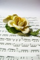
| 08/07/2007 07:53:42 PM | Beauty in Musicby mrd08Comment: Hello from the Critique Club,
First, let me welcome you to DPC and congratulate you on entering your first challenge. Your score indicates that your image was above average, meets the challenge, and the technicals (lighting, focus, post processing) were nicely done. You achieved a very nice shallow depth of focus with your kit lens and it helps the composition of this image nicely. If you compare your idea to the first place image, you can see that the competition here is pretty tough and the game requires a high degree of creativity. About the only suggestion I have for improving the image you took would be to crop a bit of the top, possibly an 8x10 crop instead of the 4x6 that comes out of the camera. This would help move the flower a bit more off center and strengthen the over all composition a bit.
Feel free to send me a PM if you have any questions regarding this critique.
Tim
PS: Nice camera ;-)
| | Photographer found comment helpful. |
| 08/07/2007 07:41:17 PM | Final Faceless Expressionby SaswaaComment: Hello from the Critique Club,
Let me start off by expressing my sympathy for the loss of your friend. You choose a very tough subject to sell in a challenge at DPC. Suicide makes people uncomfortable, as well it should. Regarding your image, I think you did a great job communicating your message. There is no emotion more extreme than taking your own life. Reading through the comments you received, I see that people were split between liking the B&W and wishing it was in color. I think the choice of B&W was a good one and served the image well. I think you might have scored a little better with a different conversion method to make it B&W. I prefer the channel mixing method explained in the DPC tutorial by fotomann_forever. This method would give you the option of adjusting between the red, green, and blue channel to make the blood show up better and to provide better contrast in the rest of the image. The more you boost the red channel above than the green and blue, the more the blood will lighten up. Give it a read and play around a bit.
If you want to send me a color version of the image, I would be happy to try a conversion or two on it to show you what could be done. Send me a PM if you have any questions regarding this critique.
Tim
| | Photographer found comment helpful. |
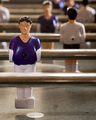
| 08/07/2007 02:37:17 PM | Time Outby fotomann_foreverComment: Hello from the Critique Club,
First, let me congratulate you on entering your first challenge. Wait, this is the first of your challenge pictures I've been assigned as a member of the Critique Club. First let me start off stating the obvious, this is not what most people at DPC would consider to be a still life. Of course you knew that going in.
Now let me explain what I like about this image and what bothers me about this image. I've spent many hours of my life playing this game and I really love how the shallow depth of focus isolates the main subject yet allows for the complexity of the game to be shown. It is a long distance from one goal to the other with a lot of obstacles and I think your image shows that well. What bothers me the most is the chopping off of the players in the back of the image. It makes the image look more snapshotish then it really is. A slightly different shooting angle or a different arrangement of the men would have been a bit more artistically pleasing to me. This is only my opinion, your mileage may vary.
Thank you for including the lighting details in your comment section. I like the effect on the men and yet minimized the glare on the steel bars. Lighting is one thing I really want to start playing around with and I will add this set up to my list to try.
Feel free to send me a PM if you have any questions regarding this critique. Now that you have your feet wet, keep entering challenges. I look forward to seeing your next entry.
Tim
| | Photographer found comment helpful. |
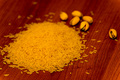
| 08/07/2007 02:20:55 PM | rice 'n nutsby GotakaComment: Hello from the Critique Club,
First, let me congratulate you on entering your first challenge. I think you will find that your score will increase as you enter more challenges. You received many comments regarding things that could be different in your image. What are missing are suggestions on how to fix them. Hopefully I can provide a couple.
First, let's start with the yellow color. It appears as if you used a standard light bulb for this image. If that is the case, then you probably had the white balance for your camera set to daylight or maybe even flash. If this was shot under sun light then you might have over saturated the image during post processing. I'm betting it was the white balance, as your shutter speed is pretty slow for sun light. Not knowing what post processing program you have, if you can correct the color temperature to about 3000, you will find that the rice will have a more natural color.
The other major comment you received was about depth of focus. You did a nice job of using a shallow depth of focus to make your image more interesting. However, the depth of focus is the only thing in this image that captures the viewer's attention. The table top makes for a busy background and the arrangement of the rice and nuts doesn�t have much excitement about it. Maybe if you put the rice and nuts into a plain bowl and found a way to make the lighting a bit more dramatic (maybe light it from one side only or directly above), the shallow depth of focus would add to your image instead of being the main subject of the image.
Feel free to send me a PM if you have any questions regarding this critique. Now that you have your feet wet, keep entering challenges. I look forward to seeing your next entry.
Tim
PS: I'm originally from Saginaw
| | Photographer found comment helpful. |
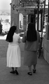
| 08/06/2007 07:20:22 AM | Sisters of Notre Dameby geoffbComment: Hello from the Critique Club,
First, let me congratulate you on entering your first challenge. Your solid 5+ score indicates that you have a pretty good image overall but that it lacks some of the "wow" that the voters at DPC crave. First let's look at the B&W conversion of your challenge entry. The nun on the left has wonderful contrast, which was easy to achieve with the white dress and black habit. However, the nun on the right blends into the shadows on the sidewalk. I would suggest taking a look at  fotomann_forever fotomann_forever's wonderful tutorial on B&W conversion. I think if you use the channel mixer method and play around different color channels, you may be able help the nun on the right become more prominent.
My other suggestions require reshooting the image. First, having faces visible would strengthen your image's connection to the voters. I would suggest shooting from across the street, as this would allow you to capture their faces and possibly avoid the bright sun in the background. With out the bright sun, you would have an easier time with your B&W conversion.
Feel free to send me a PM if you have any questions regarding this critique. Now that you have your feet wet, keep entering challenges. I look forward to seeing your next entry.
Tim
| | Photographer found comment helpful. |
| 07/23/2007 07:20:32 AM | Lochiel, South Australiaby SomeamateurComment: Mike,
This one is a little too dark to really evaluate. The lines from the clouds and road look pretty good and naturally lead my eyes to the horizon. After bumping the brightness with curves, you may want to clone out the road sign.
Tim Message edited by author 2007-07-23 18:21:20. | | Photographer found comment helpful. |
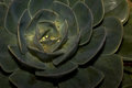
| 07/23/2007 07:15:00 AM | Floral Artby SomeamateurComment: Mike,
The strong point of this image is the composition. Moving the center of the flower off center makes this composition work. Like your Leaf Veins image, the hot spots from the light end up being the focal point of the image. More so with this one as there is very little color to grab the viewer's attention. This one may be a good candidate for converting to black and white. Then you could clone out the bright spots and bring up the contrast, making the center of the flower the natural focal point.
Tim
| | Photographer found comment helpful. |
| 07/23/2007 07:09:27 AM | Leaf Veinsby SomeamateurComment: Mike,
I like the color and composition of this image. The primary issue is the lighting. The hot spot on the upper right tends to draw my attention and hold on to it. The eyes naturally look for a place to rest and hone in on. When an image is primarily a pattern like this one, sometimes it is better not to have a resting place or focal point and allow the eye to wander through the image. However, the "catch light" effect of the hot spot I mentioned provides a focal point and it takes away from the overall effect of the image.
I would suggest that you clone out the hot spots and send this one to the printer.
Tim
Edit: Typed to fast. Message edited by author 2007-07-23 07:16:07. | | Photographer found comment helpful. |
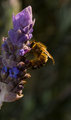
| 07/23/2007 07:04:31 AM | Polinisationby SomeamateurComment: Mike,
There are two things working against this image. First the light is primarily behind the flower, which makes the flower look flat. Second, the crop on the left side is a little tight on the flower and leaves the bee dead center in the image. If there was more space on the left, the flower would have acted as a stronger leading line to the main subject the bee. More space also would have moved the bee off center and more towards the classic rule of thirds position.
Tim
| | Photographer found comment helpful. |
|
Showing 261 - 270 of ~1260 |
Home -
Challenges -
Community -
League -
Photos -
Cameras -
Lenses -
Learn -
Help -
Terms of Use -
Privacy -
Top ^
DPChallenge, and website content and design, Copyright © 2001-2025 Challenging Technologies, LLC.
All digital photo copyrights belong to the photographers and may not be used without permission.
Current Server Time: 08/21/2025 05:41:42 PM EDT.
|