| Image |
Comment |
| 09/18/2008 10:53:27 AM |
What can go wrong?by SpongetoastComment: Back to comment: This image doesn't relate to safety very strongly. It also appears as if the horizon is tilting to the right. I also noticed that your picture size is 569 x 379 pixels. The challenges allow for 640 pixels on the longest side (569 for your image). The larger the image, the more detail that is visible. |
| 09/18/2008 10:49:52 AM |
Saftey Blanketby jdenniqueComment: Back to comment: To me, a blanket provides comfort or security, not a real strong subject for a safety challenge. On the image itself, it looks like this image was not sharpened after down sizing it for the challenge. Down sizing causes the sharpness of an image to diminish (decrease). Most people use Un-Sharp Mask (USM) after down sizing. If you have Photoshop try USM with a Radius of 1 - Amount 100% - Threshold of 3 or smaller to help the eyes of the child look nice and sharp. I also think that the composition could be strengthened a bit if some of the negative space on the left was cropped out. I would have given you a bonus point if the boy was holding a Redwing blanket instead of an Islanders blanket but it is nice to see that it is a hockey blanket.
If you have questions regarding resizing and USM, feel free to send me a PM.
Tim |
 Photographer found comment helpful. Photographer found comment helpful. |
| 09/18/2008 10:24:54 AM |
Self Protectedby rio78Comment: Back to comment: This image doesn't really fit the challenge topic very strongly. As for the image itself, the composition is a bit bland with the flower being dead center. This composition might have worked better if the lighting was more dramatic or if you could have pulled more contrast between the petals during post processing. The water drops are a nice touch, as they strengthen the composition as a focal point. |
| Photographer found comment helpful. |
| 09/18/2008 10:20:53 AM |
MADDby jovan91Comment: Back to comment and bump: The image is well done (lighting, exposure, post processing). The composition is a little weak, with both the glass and the keys centered in the image. The link to safety is weak, as the image itself doesn't sell the don't drink and drive purpose of MADD very well. 5 |
| 09/18/2008 10:18:10 AM |
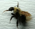
Melissophobia by AnnaXTComment: Back to comment: I don't see much in this photo that relates to safety. Regarding the image itself, the wrinkles in the background are not very appealing and the lighting is uneven, causing loss of detail in the dark areas of the insect. The focus appears to be good, with the head of the insect looking sharp. |
| 09/18/2008 10:13:50 AM |
Safe at Homeby TomComment: Back to comment: Interesting perpective and the overall composition of the image is strong. I like the focus, the lighting, and the natural looking post processing. However, the title is the only thing that convey safety with this entry. |
| Photographer found comment helpful. |
| 09/18/2008 10:11:45 AM |
Shieldedby posthumousComment: Back to comment and bump: The relationship to safety is very weak, as I'm sure that the DNMC Police are letting you know. This image is fun to look at and I'm adding it to my favorites. However, the weak link to the challenge topic only allows me to give this a 5. In a water challenge, this would be worthy of a 10 from me. |
| Photographer found comment helpful. |
| 09/18/2008 10:07:54 AM |
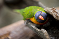
"There's Safety in Numbers"by LydiaComment: Back to comment and bump: Exceptional set up and lighting. You effectively executed your concept and produced a humorous shot for a tough challenge topic. 8 |
| Photographer found comment helpful. |
| 09/18/2008 10:05:17 AM |
Safe from Harm by mchalmersComment: Back to comment: Eggcellant lighting. I would have loved to see this with a bit less negative space on the right but that is nit picking. Nice job. |
| Photographer found comment helpful. |
| 09/18/2008 10:03:37 AM |
a protective crossroadsby tateComment: Back to comment and bump: I started this at a 7 and now bumping to an 8 beause it is one of the best non-studio shots in the challenge. Nice job. |
| Photographer found comment helpful. |
Home -
Challenges -
Community -
League -
Photos -
Cameras -
Lenses -
Learn -
Help -
Terms of Use -
Privacy -
Top ^
DPChallenge, and website content and design, Copyright © 2001-2025 Challenging Technologies, LLC.
All digital photo copyrights belong to the photographers and may not be used without permission.
Current Server Time: 08/21/2025 01:30:08 AM EDT.