| Image |
Comment |
| 07/07/2006 09:33:49 AM |
My Station-eryby RimwulfComment: A nice play on words. The hand needs more light on it to better convey your intent. It would also help if the background didn't have such a strong light source, as it draws my eyes away from the intended focus point of your entry. |
 Photographer found comment helpful. Photographer found comment helpful. |
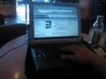
| 07/07/2006 09:33:12 AM |
I WAS THERE!!by Car54Comment: Wow, you chose some tough lighting conditions to shoot under. At first I wondered if a post card was really stationery but since you can write a message on the back it certainly is. I don't think the black and white conversion works with this photo. Maybe more contrast would help but I'm willing to bet that the post card would suffer greatly. |
| Photographer found comment helpful. |
| 07/07/2006 09:33:08 AM |
|
| Photographer found comment helpful. |
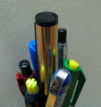
| 07/07/2006 09:33:03 AM |
THE LEADERby a_jhambComment: You need to play around with the lighting a little bit her to help give this image more definition and appeal. The background would improve considerably if it were a brighter white and the depth of focus is a bit too shallow on the pens. |
| 07/07/2006 09:32:48 AM |
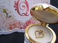
this is how he popped the Questionby Gracechild7Comment: Nice image and well composed but I don't see the connection to stationery. If your intent is that the jewelery was used in place of stationery to convey his feelings, it doens't communicate that well and I couldn't have even make that connection without the title. Sorry. |
| 07/07/2006 09:32:38 AM |
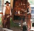
Our Write'n Paperby cyanComment: Everything about this image says tilted except the rod the coffee pots are hanging on. It looks like things should be sliding off the back of the wagon. The poll in front of the cowboy holding the write'n paper really hurts this image. Since the colors aren't very saturated, this would look better in B&W or sepia. |
| Photographer found comment helpful. |
| 07/07/2006 09:32:27 AM |
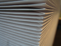
Envelopesby FromacComment: This could use some different lighting, as it looks a little flat. Maybe moving the light to the other side would help. |
| Photographer found comment helpful. |
| 07/07/2006 09:32:22 AM |
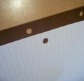
Light Slips Through Holesby right_fieldComment: Pretty effective at what you were trying to accomplish; however, the glare from the light source takes away from the main topic of this entry. |
| Photographer found comment helpful. |
| 07/07/2006 09:32:04 AM |
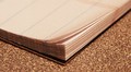
Corneredby meo729Comment: For being the main focus of the composition, the corner should be in better focus. It would have been nice to see something written in the ledger as well. |
| 07/07/2006 09:32:01 AM |
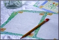
Life Unfinishedby LucidLotusComment: I like the placement of the pencil and the stationery. The image would have been stronger without the vase and with a table cloth with less texture. |
| Photographer found comment helpful. |
Home -
Challenges -
Community -
League -
Photos -
Cameras -
Lenses -
Learn -
Help -
Terms of Use -
Privacy -
Top ^
DPChallenge, and website content and design, Copyright © 2001-2025 Challenging Technologies, LLC.
All digital photo copyrights belong to the photographers and may not be used without permission.
Current Server Time: 08/21/2025 02:56:03 AM EDT.