| Author | Thread |
Comments Made During the Challenge  |
|
|
07/11/2006 06:14:51 PM |
|
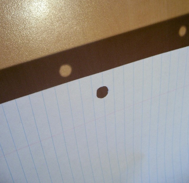
The reflection at the top is offputting and with two hole reflections you should show both holes in the paper |
|
 Photographer found comment helpful. Photographer found comment helpful. |
|
|
07/11/2006 06:56:07 AM |
|
Woooo! This makes me kinda dizzy, but at least it is clearly a piece of paper to write upn; the interplay of light and shadow, substance and absence are a bonus for the viewer. |
|
| Photographer found comment helpful. |
|
|
07/10/2006 01:42:45 PM |
Oof, the light/reflection really bothers me here, sorry.
B&W/more contrast with some rotation could have made this easier to look at; cool idea. |
|
| Photographer found comment helpful. |
|
|
07/07/2006 11:47:56 AM |
What I like: the horizontal and vertical lines are nice.
What might improve it: The glare needs to go! Also, it seems like you may have compressed the image too much. |
|
| Photographer found comment helpful. |
|
|
07/07/2006 10:50:33 AM |
|
I like the idea. I find the glare on the wall rather distracting. And I wish the paper had no lines and showed more texture. Knowing I usually crop too tightly, I think the photo would be a bit better with some cropped from the bottom. Finally, I might have played with hue and saturation a bit. This photo might be better as a sepia or b&w to emphasize the form rather than the color - which is not that interesting. |
|
| Photographer found comment helpful. |
|
|
07/07/2006 09:32:22 AM |
|
Pretty effective at what you were trying to accomplish; however, the glare from the light source takes away from the main topic of this entry. |
|
| Photographer found comment helpful. |
|
|
07/06/2006 07:40:49 PM |
|
| Photographer found comment helpful. |
|
|
07/06/2006 06:07:44 AM |
|
| Photographer found comment helpful. |
|
|
07/05/2006 05:33:28 PM |
|
You could have lighted this better -- annoying glare at top and paper looks dull and dirty. |
|
| Photographer found comment helpful. |
|
|
07/05/2006 02:28:27 PM |
|
This shot does not hold my interest. |
|
| Photographer found comment helpful. |
|
|
07/05/2006 10:45:28 AM |
|
Doesn't really inspire me |
|
| Photographer found comment helpful. |
|
|
07/05/2006 12:48:02 AM |
|
I really like the positive and negative images here. |
|
| Photographer found comment helpful. |
Home -
Challenges -
Community -
League -
Photos -
Cameras -
Lenses -
Learn -
Help -
Terms of Use -
Privacy -
Top ^
DPChallenge, and website content and design, Copyright © 2001-2026 Challenging Technologies, LLC.
All digital photo copyrights belong to the photographers and may not be used without permission.
Current Server Time: 06/27/2026 06:15:57 PM EDT.