| Image |
Comment |
| 11/07/2006 08:08:05 PM |
|
| 11/07/2006 07:27:00 PM |
Roseby JeniYComment: Excellent. I love the metalic tones. I'd definitely like to see more work featuring this model. |
 Photographer found comment helpful. Photographer found comment helpful. |
| 11/07/2006 07:17:30 PM |
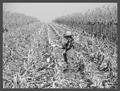
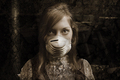
Harvest ( Son )by sallyjo1Comment: a very classic shot that brings to mind the unaltered, honest works of P.H. Emerson. I for one appreciate your approach here. I suspect though that you've received a number of comments concerning bumping up contrast. DPC likes high contrast b+w, but that doesn't mean that this isn't a fantastic shot. |
| Photographer found comment helpful. |
| 11/07/2006 07:01:58 PM |
The Odd Pairby xXxscarletxXxComment: you will get nicked by many voters for the noise...but I think it works wonderfully here. |
| Photographer found comment helpful. |
| 11/06/2006 12:06:05 AM |
Serenityby LalliSigComment: dang, so close. a fantastic image Larus, as always. grats on the top-5! |
| Photographer found comment helpful. |
| 11/05/2006 10:07:25 PM |
|
| Photographer found comment helpful. |
| 11/02/2006 04:56:11 AM |
Alone in the Atticby EvanHComment: shame it's too small, because it looks like an interesting shot and unique shot. it's always a good idea to utilize the full 640px allowed. |
| 11/02/2006 04:55:25 AM |
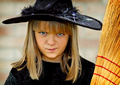
Have Broom, Will Travelby alanfreedComment: I'm nearly through with voting, and quite frankly I am really tired of kid shots. However, this is a very well captured portrait...clean and crisp. Although I will say that, even though she's dressed as a witch, I would have prefered it without the broom.
I won't hold it against you that she's a kid :) |
| Photographer found comment helpful. |
| 11/02/2006 12:25:09 AM |
Taylorby PaigeComment: tighter crop next time. utilize either the door or the wall, but using both creates a cluttered and distracting background. the graffiti on the wall begs for a grunge treatment here, which in itself wouldn't have worked due to her wardrobe. the gold of the jacket and the red of the wall do not work well together...b+w might have been able to resolve that problem. lighting is flat...just a bit of light on her face will make a huge difference.
none of that means it's a poor shot...this locale and certainly this model have potential. |
| Photographer found comment helpful. |
| 11/02/2006 12:16:06 AM |
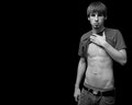
untitledby Dan_CottleComment: why the pose? sorry, but he is quite unpleasant in his arrogance.
technically very well done, however. |
Home -
Challenges -
Community -
League -
Photos -
Cameras -
Lenses -
Learn -
Help -
Terms of Use -
Privacy -
Top ^
DPChallenge, and website content and design, Copyright © 2001-2025 Challenging Technologies, LLC.
All digital photo copyrights belong to the photographers and may not be used without permission.
Current Server Time: 07/31/2025 05:45:44 AM EDT.