| Image |
Comment |
| 02/24/2003 09:24:43 PM |
Baby's First Stepsby inspzilComment: This photo seems a little washed out. Cute kitten but the body shape -- or maybe it's just the angle of the camera -- make it look almost like the kitten has a slightly deformed body. While you never know what will sell, I don't see this as an image which would be sold over and over again from the portfolio of a stock photographer. The border helps the image but doesn't redeem it. |
 Photographer found comment helpful. Photographer found comment helpful. |
| 02/24/2003 09:21:13 PM |
Modem plugby kiwinessComment: This is an excellent macro shot of a telephone plug...just like might be used in an annual report, a magazine, a textbook, etc. Very wide possibilities for use as "stock" photography. I like the yellow background, the selective focus, the sharpness where it should be sharp and the leadin line drawing the eye to the subject. Very nice work! |
| Photographer found comment helpful. |
| 02/24/2003 08:22:22 PM |
Berryliciousby SonifoComment: Nice mix of colors, very sharp focus, great exposure for both the lighter and darker objects. |
| Photographer found comment helpful. |
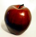
| 02/24/2003 08:21:30 PM |
1 appleby boyte1Comment: Nicely lit shot but the focus needs some improvement. The bottom of the apple has good focus but the top is slightly fuzzy. Stop down some and the image would be improved a lot. |
| Photographer found comment helpful. |
| 02/24/2003 08:19:55 PM |
Harris Hawkby scrooslooseComment: Crystal clear focus, good depth of field. For stock purposes, I would leave more room at the top of the photo (editors sometimes want room for the magazine masthead or they want to crop from horizontal to vertical and they need the room). The chain link fence is distracting but the image is powerful. |
| Photographer found comment helpful. |
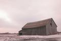
| 02/24/2003 08:17:32 PM |
In the Winter Fields ...by nathaliedooComment: This is a nice image. The sloping lines of the building on the right make me think that the building is in disrepair while the vertical building line in the center is straight as it should be. It is a fairly bleak image, with the snow on the ground and the lack of any bright colors and may be somewhat hard to "sell" in the stock world but, then again, sometimes that is what an editor wants! |
| Photographer found comment helpful. |
| 02/24/2003 06:59:21 PM |
Desert Highby magnetic9999Comment: Although this is a very nice scene, it seems to be lacking sharpness which is one thing a photo editor would be looking for. |
| Photographer found comment helpful. |
| 02/24/2003 01:58:56 PM |
Our Futureby smellyfish1002Comment: Excellent picture and I could see this used in a variety of ways to illustrate many different things. |
| 02/24/2003 01:57:52 PM |
Colorbrellaby AntithesisComment: These colors are fantastic without being garish. Nice design although I would have like a cropping to place the center a bit more to the left. Then the ribs of the umbrella would lead in to the center of the umbrella even more than they already do. I hope the spot in the upper right is on the umbrella and not in your camera. |
| 02/24/2003 01:48:52 PM |
Design by Salomonby rll07Comment: Good composition. You've left enough space that a photo editor could make this a "portrait" or "landscape" crop and still have a very usable image. Sharp enough throughout to please a photo editor, too. Sometimes, though, they don't want to see brand names. You've done a good job. |
Home -
Challenges -
Community -
League -
Photos -
Cameras -
Lenses -
Learn -
Help -
Terms of Use -
Privacy -
Top ^
DPChallenge, and website content and design, Copyright © 2001-2025 Challenging Technologies, LLC.
All digital photo copyrights belong to the photographers and may not be used without permission.
Current Server Time: 08/01/2025 09:24:54 PM EDT.