|
|
|
Showing 441 - 450 of ~473 |
| Image |
Comment |
| 01/27/2003 04:18:17 AM | Windows of Opportunityby CreativeFlyPhotoComment: Hehe.. A truly creative solution to the problem. I played around with a few goofy puns on "window" and "door" as well, but this is better than anything I could come up with. Artistically, the limited DOF and the selected sharpness (or is it Photoshop? ;) really does it for me. (9) |
| 01/27/2003 04:14:09 AM | Go Away!by myqylComment: (Critique Club)
I am nut quite sure what is going on in this image. On my monitor (well, both my monitors, actually, so I don't think it is the monitors fault), the lines look jagged. Both the cirvle on the sign, the line through it, the wooden stakes in the background... Etc. Also, I have the most serious doubts in the world if this sign was taken on f/4.0. The background - and several meters behind - are completely in focus. The only way this could have been taken with f/f is if you were standing very far away from the sign.
My tip would have to be: Go a lot closer, use your widest (i.e smallest number) aperture, and throw shte background out of focus that way. You also write that you used unfamiliar tools, and my tip for that would be.. eh.. don't ;) That is probably the reason for the jaggedness.
When all of that is whined about; Interesting composition, and great contrast in colours.. Good work. |  Photographer found comment helpful. Photographer found comment helpful. |
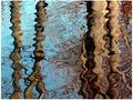
| 01/21/2003 01:11:10 PM | Gold Blend by NatashaComment: Wow, what a fabulous picture. The reflections are superb, and the lighting is spot-on. Very good. (10) | | Photographer found comment helpful. |
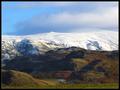
| 01/21/2003 01:06:51 PM | Winter sunsetby dazzlerComment: (- critique club -)
This is a good image, but it is slightly too 'normal' to my likings. The sun is centered in the image, which isn't particularly interesting. The reason behind this is the ideas of The Divine Proportions ( Read this, and look for the Golden Mean and Euclid) - basically, if something is placed on one of the lines that would be visible if you folded the image in three, the viewer will find the image more pleasing.
Apart from the composition, you might want to reconnsider your sharpness. It looks as though you have focussed on the water close to you - remember to set your camera to infinity - but the trees in the horizon are also out of sync. You might be able to sharpen your picture a bit using Unsharp Mask ( read this article if you are not sure what USM is).
On the other hand, I would like to commend you for your vision. The water, the sun, the horizon and - not least - the clouds really work together to make this image worth watching.
Good work, mijn vriend!
Haje |
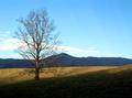
| 01/20/2003 07:17:32 PM | The Strong, Silent Typeby indigo997Comment: (- Critique Club -)
This is a very strong image indeed. The inverse diagonals of the light/dark under the tree and the clouds on the opposite side draw your image to the right of the image.
But.. uh.. there is nothing there. It might seem ironic somehow, but my eyes are actually pulled away from the tree. I think this might be the reason for why the image fails a little bit in my eyes; In an image that has such incredibly strong visual pull towards the right, you sould almost wait to find something in the intersection of shadow and light. Anything would have done. Somebody sitting with their back to the camera (a nude? A naked back, for example? An old wooden chest, perhaps? A pot of gold? Anything, really).
Technically the image is very good, but it could easily have been sharpened several degrees; I want to see the individual branchlets of that tree! (if you don't know how to sharpen an image,
have a look at this tutorial). Furthermore, a tad more contrast would also have been an option, although the clouds are already burnt out (I know you have a tremendous span in this image - bit I still believe your image is a tiny tad overexposed)
When all that bickering is done; That is a damn fine image you have there, my friend! There is a good reason for why I gave this thing an 8.
Haje Jan (SharQ) | | Photographer found comment helpful. |
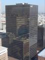
| 01/20/2003 05:08:05 PM | 30 Floors Upby debcardComment: Pictures like this one are incredibly difficult for very many reasons; For one thing, because of the perspective, get a building that is very cartoon-like (narrow at the bottom and wide at the top). This is usually a sin in architectural photography - at least if it does not look as if it is supposed to be that way. So your choices are to over-do the effect (practically impossible, because you cannot walk closer to that building) or try to counter it. Countering something like this can only be done with a Tilt and Shift lens (I wrote an article about these lenses, which you can find here), but these lenses are ridiculously expensive, and only work on SLR cameras. It is possible - to a certain degree - to correct the problem in Photoshop (but that would get your image disqualified, because I believe it probably breaks a few rules)
Barring this problem, you have a good chance at improving this image by going for a tighter crop. Get rid of that tall white bouilding to the left of the image, and you are well on your way.
The most important problem with this picture is the reflection in the window, though; I can see sheets of paper(?) and the reflection of what I think is the photographer. Neither of which pull the image in the right direction. There is a good trick you can use to get rid of these reflections though:
1 - Open the window. (probably illegal and impossible in skyscrapers, so a bad idea)
2 - Put your camera to the window. This means that your WHOLE lens front needs to TOUCH the lens. Barring the reflections from the double (or even triple) pane window, it should rid you of 97% of the reflections.
3 - Building a black box. The black box sounds high-tech, but isn't. Get a circle of black filt (or other non-reflexive textile) , and make a hole in it for your camera lens. Tape the textile to the window, and you have your own little black box. Because your lens is "touching the window" (by proxy, because of the filt), the reflections should completely disappear.
Finally, you might want to up the contrast a little bit (read a guide about that here)
I hope some of these tips will help you for further pictures out of your office window. Good luck!
Haje |
| 01/14/2003 12:14:58 PM | | | Photographer found comment helpful. |
| 01/14/2003 05:23:14 AM | | | Photographer found comment helpful. |
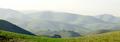
| 01/14/2003 05:20:06 AM | Seasonsby auroraComment: Wow. Now this is a landscape photograph. Amazing. (10) |
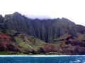
| 01/13/2003 12:40:09 PM | Kauaiby WarpComment: Lovely colours, but I haven`t got a clue what is going on on the top of the mountains, middle of the picture. Looks like clouds, but looks cropped as well. Odd. |
|
Showing 441 - 450 of ~473 |
Home -
Challenges -
Community -
League -
Photos -
Cameras -
Lenses -
Learn -
Help -
Terms of Use -
Privacy -
Top ^
DPChallenge, and website content and design, Copyright © 2001-2025 Challenging Technologies, LLC.
All digital photo copyrights belong to the photographers and may not be used without permission.
Current Server Time: 08/20/2025 07:11:57 AM EDT.
|