| Image |
Comment |
| 04/16/2004 12:17:18 PM |
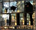
Fixer Upperby wickedpeteComment: I like the background panes with what seems like different colored glass and the way the light hits them different. The overall feeling I get from this is somewhat chaotic with no singular focal point. From bricks to reflections to background glass to what is beyond those. There is also something about the bricks that do not seem quite right, I dont know if it's the coloration or too much yellow hue shift or what. I dont dislike it, and it's not a bad shot, I'm just left feeling... confused, I guess. |
| 04/16/2004 12:12:41 PM |
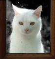
Also in Whiteby ClarneyComment: The title reminds me of the song 'how much is that doggie in the window'. The natural framing of the pane is good, although not perfectly straight, but I dont think that really matters. White subjects can be tough, and the exposure is not bad except for the hot spot near his/her right/our left ear. You still managed to get a lot of the details on the fur elsewhere, though, and that gives it a nice fluffy look. I'm assuming you desat the background also, and I think it works well to isolate the subject. I also like the rain/dirt spots on the window, it gives it more realism and atmosphere. |
 Photographer found comment helpful. Photographer found comment helpful. |
| 04/16/2004 12:08:19 PM |
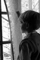
Behind the Veilby dsa157Comment: Good use of black and white to emphasize the tonal range and play of light and shadow. I like the natural light illuminating his face, it gives it a somewhat 'wonder' feel to it. The only nitpick is what I think is his hand opening up the curtain. It's not clearly defined as a hand so I partly wonder if it is something else, and also it seems to be 'growing' out of the top of his head, which makes it somewhat of a distraction. |
| Photographer found comment helpful. |
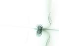
| 04/16/2004 12:00:52 PM |
The Shining Crescentby tyt2000Comment: I really like this, I think it's my fav of the challenge. I like the framing of the window, the unusual panes adds interest too. The view is great, and compositionally with foreground/background elements it really connects. The toning is great too. Not a thing I would change! |
| Photographer found comment helpful. |
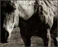
| 04/16/2004 03:07:03 AM |
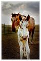
Nice To Meet Youby PedroComment: This certainly has an interesting perspective going for it. I do like the bigger horse's expression. |
| Photographer found comment helpful. |
| 04/16/2004 02:59:16 AM |
First Kiss Of Springby PedroComment: The toning is great. Good composition with the texture of the bigger horse serving as a great background. You have both the element of humor and the connection between man and beast. I dont know if it's the softness of the jaw on the guy but it's almost like some motion blur with his head, or else it's my eyes! |
| Photographer found comment helpful. |
| 04/07/2004 12:13:04 AM |
Point of viewby ivashComment: Hrm, I'm guessing mouse ball/wheel. I like the high key look, seems very suggestive too. It's different for sure. |
| Photographer found comment helpful. |
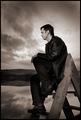
| 04/05/2004 04:09:40 PM |
Here with meby heidaComment: Hrm, I think I recognise this style, so should be interesting to see if I was right after voting is over! I like the toning, very moody and dramatic, which of course is helped by the clouds and water reflection too. He seems very thoughtful, again it adds to the broody atmosphere of the shot. I like it. |
| Photographer found comment helpful. |
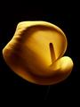
| 04/05/2004 04:05:40 PM |
Calla Lilyby edmundtansoComment: Wow, it seems to glow! Very cool lighting, textures, and coloring. Only nitpick thing I see is that it seems to float there in the center of the image. A closer crop or a stem securing it to the border may have helped the composition some, but the flower itself is very nicely done. |
| 04/05/2004 04:01:54 PM |
Week 45by PedroComment: I like the composition - it's unusual and enhances the play of light and shadow. The toning is good too. The texture of the horse's head is great, with the texture on the body a little more shiny due to the dof. I cant decide if I would prefer the whole thing in focus more or not, either way, it's a good image! |
| Photographer found comment helpful. |
Home -
Challenges -
Community -
League -
Photos -
Cameras -
Lenses -
Learn -
Help -
Terms of Use -
Privacy -
Top ^
DPChallenge, and website content and design, Copyright © 2001-2025 Challenging Technologies, LLC.
All digital photo copyrights belong to the photographers and may not be used without permission.
Current Server Time: 08/10/2025 07:18:38 AM EDT.