| Image |
Comment |
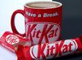
| 07/21/2004 11:45:12 AM |
Have a Breakby soheilComment: Not sure of the significance of the mixed background but it doesnt really look out of place, just different. The lighting isnt bad, the composition is fine, the focus is ok but the left hand side looks like it's fading into OOF, which isnt necessarily a bad thing but with shots like this you normally expect the entire shot to be in full focus or the depth of field more noticably shallow. |
 Photographer found comment helpful. Photographer found comment helpful. |
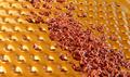
| 07/21/2004 11:39:29 AM |
Gold and Chocolateby faithrikoComment: I like the golden color of the grater and they do compliment the browns of the chocolate shavings, but to me the shavings are a little too clumped and out of focus and dont really look that appealing. Maybe one or two distinct long curls would have worked better. |
| Photographer found comment helpful. |
| 07/21/2004 11:38:07 AM |
Chocotiniby animes2kComment: I like the gradient background and the reflection of it in just the one side of the shaker. The glass is interesting and having the white kiss with the stripes almost counter the stripes on the glass is appealing. I'm not sure about the chocolate on the bottom although I could probably take it or leave it - I'm not sure how much they add, although I do like their reflection in the shaker. Focus and composition is good. Overall it's a good shot. |
| Photographer found comment helpful. |
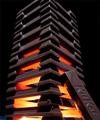
| 07/21/2004 11:34:21 AM |
Strip Teaseby redmoonComment: The focus isnt that good but this made me laugh and I like the idea of it. It all makes so much sense, chocolate is certainly seductive and sinful. The lighting is good, although a little bright on the wrapper but I think that adds to the 'atmosphere' of the shot. It does rely a little heavily on the title to 'get' it, but it's cute and funny so who cares. |
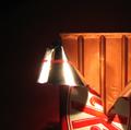
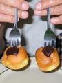
| 07/21/2004 11:31:19 AM |
Hot Chocolateby bongoComment: Neat effect and wow, what a lot of kit kats! A difficult composition to pull off but I think you did fairly well. Very punny with the title, but I dont think the title is necessary to 'get' what the image represents. Technically not the best shot, but the idea makes up for some of the minor issues. |
| Photographer found comment helpful. |
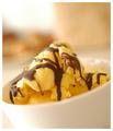
| 07/21/2004 11:28:22 AM |
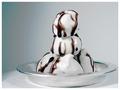
The Ice Cream Parlorby jonpinkComment: This looks like it has come straight out of a cooking book. The tilt, depth of field, and warm tones are very appealing. The light on the side of the bowl looks a little bright but I think it works with this style of image. |
| 07/21/2004 11:26:15 AM |
Chaplinby basia03Comment: Cute, my only reference to this is from the movie Benny and Joon but it made me smile to remember the scene. Without that reference I'm not sure how well it works as a photograph. The composition is fine, lighting is ok although the shadows are a little distracting, but without the context I'm sure it looks a little odd. I like it purely based on what I believe it represents. Good luck in the challenge! |
| Photographer found comment helpful. |
| 07/21/2004 11:22:49 AM |
|
| Photographer found comment helpful. |
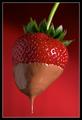
| 07/21/2004 11:19:57 AM |
Double Dipped by smokeditorComment: I like the gradient color in the background - it compliments the colors and shades of the strawberry. It's a good close up, well positioned in the frame. The touch of green breaks up the red nicely. The drip is good too, it gives it a sense of anticipation. The only nitpick is the focus - when I view it as a whole and quickly then it seems fine, but if I look at it longer then I notice the chocolate drip is out of focus and so are the green leaves. Overall I like it, probably the better of the dipped strawberry shots. |
| Photographer found comment helpful. |
| 07/21/2004 01:23:39 AM |
Black and White Confectioner's Delightby L1Comment: Quite a simple shot but a very appealing one also. I like the mix of metallic place and blue background tones as they give the shot a slightly 'cool' feel. The composition is good, the focus is fine, and it looks good enough to eat. |
| Photographer found comment helpful. |
Home -
Challenges -
Community -
League -
Photos -
Cameras -
Lenses -
Learn -
Help -
Terms of Use -
Privacy -
Top ^
DPChallenge, and website content and design, Copyright © 2001-2025 Challenging Technologies, LLC.
All digital photo copyrights belong to the photographers and may not be used without permission.
Current Server Time: 08/08/2025 11:23:41 AM EDT.