| Image |
Comment |
| 11/08/2004 04:18:03 PM |
Octoberby KaveyComment: I like the shape that the leaves make and the blend of colors is also good. The white background is nicely white but the leaves almost feel a little too isolated and just floating there. It certainly conveys the chosen month well. |
 Photographer found comment helpful. Photographer found comment helpful. |
| 11/08/2004 04:12:32 PM |
Novemberby vtruanComment: The scene itself is wonderful and has near, middle and far elements. The placement of the tree is good and the curve of the land almost mirrors the curve of the mountain. It looks like it was shot under a fairly harsh light so the lighting seems a little flat. The quality doesnt look too good as there is some noise in the blues and either it has been oversharpened, too much contrast, or just the camera's resolution. |
| Photographer found comment helpful. |
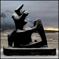
| 11/08/2004 04:08:20 PM |
November - First Snowby GautiComment: It's an interesting shot but I'm not sure what to say about it. I like the light dusting of snow on the sculpture - the white contrasts nicely with the black and it is almost like it is adding accents to the curves and details. The mountain backdrop is stunning and works well to lead the eye down to the horizon, although that appears to be slightly tilted. The muted colors except for the splash of yellow near the horizon line adds to the chilly feel of the shot. |
| Photographer found comment helpful. |
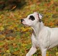
| 11/08/2004 04:05:01 PM |
Falling in November by Rando D300Comment: Wonderful lighting and depth of field! S/he just pops out of the shot. The colors are great and the white dog contrasts nicely with them. The leaf in action and the dog watching carefully is a wonderful interaction. The catchlight in the eye is great too. Only thing I'm not sure about is the composition. The cropped out feet makes it feel a little odd. Having the entire legs/feet in or even the entire dog would be good or else cropping out the legs but I cant decide if that causes it to lose some dynamics or not. Even so, it's a fun, well-shot image! |
| Photographer found comment helpful. |
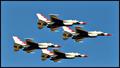
| 11/08/2004 03:59:45 PM |
Julyby karmatComment: It's a good shot but feels fairly static. You have some high-flying fast jets seemingly suspended in mid air in the middle of the shot. Dont get me wrong, I've seen shots like this a lot and I'm sure a shot like this would appear in a calendar but it's not very compositionally interesting even though their manoeuver is certainly exciting to watch. |
| Photographer found comment helpful. |
| 11/08/2004 03:56:52 PM |
Betty Crocker's Februaryby toddheadComment: A good white color without losing detail in the plate, which is very cute. The red of the sauce blends well with the white and adds a nice color contrast. The depth of field is good, the theme of hearts is good and appropriate for February. Composition is good too. Good image! |
| Photographer found comment helpful. |
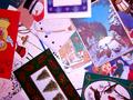
| 11/08/2004 01:38:37 PM |
Decemberby mfairbanksComment: I can certainly see the theme of December very clearly in the image but it just doesnt hold much interest for me personally. There also seems to be a color cast in the image as if you look at the what should be white areas of the cards you can see they're not quite exactly white. Changing the white point in levels would have helped correct it some and also likely brightened up the image too. |
| Photographer found comment helpful. |
| 11/08/2004 01:35:13 PM |
Octoberby charmayneComment: There seems to be a little too much dark foliage and my eyes seem to wander around looking for a central focus. The main tree with the orange leaves seem to pull my eyes the most, but it doesnt stand out enough to be enough of a focal point. The foliage to the left of that tree seems to be clumped together and fairly dark with not much detail. I would much rather see the tree and more of the water with the color of the sky reflected into it. |
| Photographer found comment helpful. |
| 11/08/2004 12:39:09 PM |
Novemberby stupidcatComment: Looks like you have good lighting and I like the warm tones although it might be slightly leaning toward red. The composition, depth of field are also good. The seal really looks like it is glowing. The subject matter doesnt interest me but I'm sure there are people who would buy a calendar with this in it. |
| Photographer found comment helpful. |
| 11/08/2004 12:35:31 PM |
Augustby KneeforuComment: It seems a tad underexposed and the colors, especially the grass, seems a little dull. A slight boost in saturation and a levels adjustment could make the image 'pop' more. The composition is good. |
Home -
Challenges -
Community -
League -
Photos -
Cameras -
Lenses -
Learn -
Help -
Terms of Use -
Privacy -
Top ^
DPChallenge, and website content and design, Copyright © 2001-2025 Challenging Technologies, LLC.
All digital photo copyrights belong to the photographers and may not be used without permission.
Current Server Time: 08/05/2025 02:09:09 AM EDT.