| Author | Thread |
Comments Made During the Challenge  |
|
|
11/12/2004 11:55:13 PM |
|
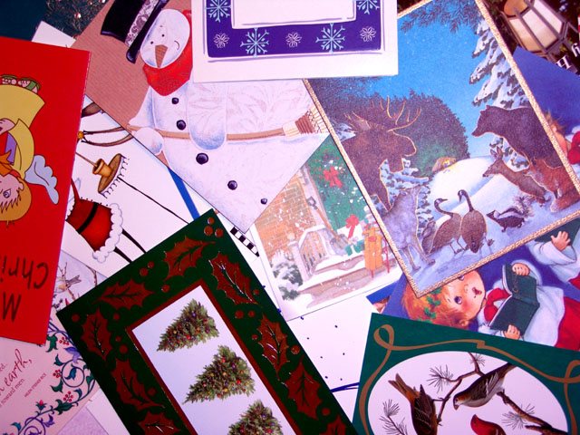
This would make a colorful calendar page! My eye tends to wander around and enjoy all the separate images. I'm wondering if you had chosen one to be a focal point if this would have been a stronger image overall. |
|
 Photographer found comment helpful. Photographer found comment helpful. |
|
|
11/12/2004 07:27:41 PM |
|
There is just not enough of a focal point of interest in the composition in my opinion. I think if you took this idea, though, and worked on the arrangement a bit, you may really get a great collage piece. The white balance also appears a little off on my monitor, giving it a blue cast througout. |
|
| Photographer found comment helpful. |
|
|
11/12/2004 07:40:27 AM |
|
The picture does say December, but the composition of the cards strewn about doesn't create much interest for me. There is no focal point as all the elements seem to carry the same weight. The result is the eye wants to move on. |
|
| Photographer found comment helpful. |
|
|
11/11/2004 06:44:52 PM |
|
Too much chaos, not very interesting as a photograph, it conveys the month, but I can't see this put on a calendar. |
|
| Photographer found comment helpful. |
|
|
11/11/2004 12:17:33 AM |
|
I like the idea for this, but the lighting or color seems to be off. I think what seems to me to be the different textures from the cards are doing something with the lighting and its making the colors seem off on most of the cards on the left and the focus feels a bit too soft also. |
|
| Photographer found comment helpful. |
|
|
11/09/2004 02:42:07 PM |
|
| Photographer found comment helpful. |
|
|
11/08/2004 01:38:37 PM |
|
I can certainly see the theme of December very clearly in the image but it just doesnt hold much interest for me personally. There also seems to be a color cast in the image as if you look at the what should be white areas of the cards you can see they're not quite exactly white. Changing the white point in levels would have helped correct it some and also likely brightened up the image too. |
|
| Photographer found comment helpful. |
Home -
Challenges -
Community -
League -
Photos -
Cameras -
Lenses -
Learn -
Help -
Terms of Use -
Privacy -
Top ^
DPChallenge, and website content and design, Copyright © 2001-2026 Challenging Technologies, LLC.
All digital photo copyrights belong to the photographers and may not be used without permission.
Current Server Time: 07/16/2026 03:39:23 AM EDT.