|
|
|
Showing 3131 - 3140 of ~3441 |
| Image |
Comment |
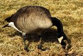
| 01/09/2006 01:09:15 PM | Wild Goose Chase on Christmas Morningby minuComment: ***Greetings from Critique Club****
I remember seeing your image while voting and telling myself that it wouldn't do well. Why? Because to many, it just doesn't meet the challenge.
I scored it fairly high myself, because I tend to let the photographer decide what fits the challenge.
You mentioned you had an image that was a zoom of just his back. Now, THAT would have fit the challenge. There are some tutorials on the site about resizing, since you had concerns about image size. They are Here.
Your photo is in good sharp focus and shows good detail. Color seems a little flat though and lighting is harsh at best, but getting a chance to shoot a wild goose doesn't happen often does it?
I'd personally like to see other images from this series. Keep working, you won't see these types of scores long, I promise.
When you see a challenge, go out and shoot specifically for that challenge. This structure helps you practice many different styles of photography and perhaps will get you to shoot in ways you had never thought about.
Hope to see more from you.
Take Care,
Leroy |  Photographer found comment helpful. Photographer found comment helpful. |
| 01/09/2006 12:00:51 PM | | | Photographer found comment helpful. |
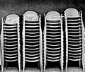
| 01/08/2006 05:41:15 PM | chairsby ZenjohnComment: ***Greetings from Critique Club***
Wow, I get to critique one of my favorite images in the challenge. You've taken something that is rather boring and made it interesting. Good Job! This is what photography as art is about.
Technically, you've created a good image here. Focus is sharp. Exposure is good and lighting is interesting. Compositionally, I doubt I'd change anything about your image.
I admire your use of high contrast black and white. I believe it makes this photo.
I really am unable to tell you much about how to improve it. Perhaps the crop is a little tight, but not so tight that it harms the image much. Perhaps you could have given it a little more pop with a low angle or high angle of view ... give the voters a little WOW to get them going.
Overall, you've created a good piece of art here and crossed 5.9 in only your second challenge. Good work! You're gonna do well here. I can't wait to see more from you.
Take care,
Leroy | | Photographer found comment helpful. |
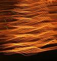
| 01/08/2006 05:28:55 PM | Floating Lightsby LeejpComment: ***Greetings from Critique Club***
You have an interesting image that fits the challenge well here. I'd be interested in your comments on how you produced it.
Technically it's a good image. Focus is sharp, lighting and exposure are good and I like the warm orange tones.
A few ponters:
The photo is a little small. You can post images here at up to 640 pixels on its longest side. Might as well take advantage of this.
I'd like to see the black area at the bottom of the image cropped. This black space catches my eye a little too much and distracts me from the rest of the image, which is quite good.
Lastly, take a few moments when you submit to enter Photographer's notes and camera settings. It helps us to see what you're doing and helps us make better critiques of your work.
Good work though, welcome to DPC. Not a bad finish on your first challenge.
Take care,
Leroy |
| 01/08/2006 04:40:46 PM | | | Photographer found comment helpful. |
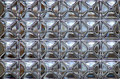
| 01/08/2006 04:06:18 PM | The Windowby CaitlynComment: ***Greetings from Critique Club***
First off, I'd like to start by saying congrats on your highest rated photo. Getting better and that's a good thing.
You hit the challenge here well and produced an image nobody could say did not meet the challenge.
As far as technicals go. Focus is good, exposure is perfect and lighting is dead on. You scored well on thise merits I'd suppose.
Now, how do we improve this photo? Well, for this particular photo it seems to be a hard thing. Perhaps creating a diagonal pattern by rotating the camera would have created more punch to the composition, but that's just my opinion ofcourse. Colored light inside the glass blocks might have added some punch, but that may have not been possible.
Only thing that really bothers me about your photo here is some artifacting. Perhaps a little too much USM or over-compression of the JPEG file.
But in the end, you recieved a respectable score and you are definitely improving, so keep up the good work. I hope to see more from you.
Take care,
Leroy
| | Photographer found comment helpful. |
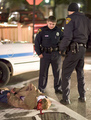
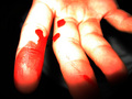
| 01/07/2006 11:18:51 PM | Injuredby MakrossComment: ***Greetings from Critque Club***
You have an interesting photo here and after reading the Photographer's Comments, it's even more interesting. So, I'm seeing your nose blood? LOL
You've got good focus and Depth of Field here.
OK, about the blood. I know it's real blood now, but when it was being voted on the fact that it is blood wasn't very obvious. As a matter of fact, it looks fake. That's probably due to a slight vit of overtweaking of the red.
You have light fall of on your finger tips and overly exposed highlights. This comes from using an onboard flash at too close range.
Now, I want to finish this critique with a reminder to read over the rules. Color Fill Layer isn't legal under Basic Rules.
Hope to see more work from you,
Leroy |
| 01/07/2006 06:45:15 PM | Sea perfection by patrinusComment: ***Greetings from Critique Club***
Now, how did I get so lucky as to have to critique the Blue? On my first day on CC, nonetheless.
Well, here I go :
It's not suprising to me you recieved the blue. You've submitted pure technical perfection that fit the challenge very well.
Focus is sharp. Lighting is perfect. Saturation is beautiful. And the gradation and variations of tones is just almost unbelievable. Very well deserved ribbon! | | Photographer found comment helpful. |
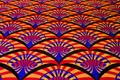
| 01/07/2006 06:21:14 PM | Cinemaby MstarkeyComment: ***Greetings from Critique Club***
I looked at this photo several times during the challenge. It caught my eye every time through. This image fit the challenge well. Really well. You gave the voters exactly what they wanted to see.
Not much I would change about your image. Focus is good and lighting is uniform (perhaps a little yellow, but it's hard to tell). Your crop is a tad off centered to the right, but I'm just being nit-picky.
I love the saturation and contrast. What can I say? You did a wonderful job with the subject. Perhaps that's why you score in the top 82%. Good job. Almost a 6.0 in your second challenge. You're gonna do well here! Hope to be seeing more of your work soon!
Take care,
Leroy |
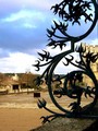
| 01/07/2006 01:48:13 PM | Conflicting Patterns : Nature and Cultureby WilltorecordComment: ***Greetings from Critique Club***
When looking at your photo, I'm puzzled. Composition is good, it fits the challenge and is mostly well exposed and your focus is dead on. You obviously knew what you were doing when taking the shot.
What puzzles me is the pixelation. Did you have troubles with resizing the image? If so, PM me and I'll point you to some tutorials.
One other thing that could have given your photo a little pop. Fill-flash in the foreground could have made the detail in the iron work and wall stand out more IMO.
Work on your resizing techniques and I believe you are on the right path to suceess here.
Leroy |
|
Showing 3131 - 3140 of ~3441 |
Home -
Challenges -
Community -
League -
Photos -
Cameras -
Lenses -
Learn -
Help -
Terms of Use -
Privacy -
Top ^
DPChallenge, and website content and design, Copyright © 2001-2025 Challenging Technologies, LLC.
All digital photo copyrights belong to the photographers and may not be used without permission.
Current Server Time: 06/22/2025 01:11:46 PM EDT.
|