|
|
|
Showing 2491 - 2500 of ~3441 |
| Image |
Comment |
| 05/01/2006 09:34:31 AM | |  Photographer found comment helpful. Photographer found comment helpful. |
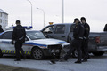
| 05/01/2006 09:33:44 AM | Police chase ended badlyby Hordur AceComment: I don't know if a fender bender involving a patrol car is particualarly news-worthy. Would help if we could see a bit of emotion on the officers' faces. |
| 04/30/2006 03:52:31 PM | Essence of Indiaby DigiFotoBuddyComment: ::: Greetings from Critique Club :::
Hi, as requested, here is an indepth critique of your submission.
First Impression - the most important one:
OK, this one one of my favorites in this challenge, so ya know I like it. :-) Detail is exceptional and model is beautiful.
Composition:
Unlike a lot of other submissions, you've gone with a traditional portrait composition. It simply works and works elegantly for your image.
Subject:
Your subject is interesting and your photo brings out her beauty.
Technical (Color, focus, and light):
All excellent. I especially like the defining light shaping the right side of the face.
To grow its vote?:
Force voters to calibrate thier monitors ;-) Seriously, I can't think of a way to improve this image.
Summary:
I love it. Excellent work and I think it should have at least broken 6 in voting.
Hope to see more from you soon,
Leroy | | Photographer found comment helpful. |
| 04/30/2006 02:12:41 PM | Ashleighby trainComment: ::: Greetings from Critique Club :::
Hi, as requested, here is an indepth critique of your submission.
First Impression - the most important one:
Lovely portrait, but a bit too much NI and a few stray hairs are distracting.
Composition:
Works well, and is pretty strong.
Subject:
Subject is clear and I love the eyes.
Technical (Color, focus, and light):
Color: Seems natural, it might have a bit of a blue cast to it (very little).
Focus is sharp.
Lighting works well for you and is very flattering to her skin.
To grow its vote?:
Neat image (or what ever noise reduction you used) seems a bit overdone. And voters are starting to not like that look.
Summary:
Lovely portrait, scale back your efforts to hide noise (skin blemishes) and you'll do well.
Hope to see more from you soon,
Leroy | | Photographer found comment helpful. |
| 04/30/2006 01:52:19 PM | What are YOU thinking?by nomad469Comment: ::: Greetings from Critique Club :::
Hi, as requested, here is an indepth critique of your submission.
First Impression - the most important one:
Nice portrait, interesting light and PoV.
Composition:
A tad tight on the right side. The border is just a bit close to the jaw. Otherwise interesting and fresh.
Subject:
Subject is "in-your-face" adding some interest to this image.
Technical (Color, focus, and light):
Color: We have some bleed from the blue background on the face that is somewhat distracting to me. Otherwise color is nice and feels natural.
Focus is sharp as a tack.
Light: The light on the face itself is well-done. However, as I mentioned some of the light from the background is spilling back onto the face. Obvious cure is to move subject farther away from the b/g.
To grow its vote?:
I think stronger catch-lights in the eyes would have added a bit to this image as would a seperation of the pupil from the iris. I'm not sure what type of light you were using, but it appears it has caused the pupil to open all the way up. Have the subject close his eyes for a moment right before shooting, if you are using constant light.
Summary:
Lovely portrait, and nice lighting. Pay a bit more attention to the eyes in portraits and I think you'd have a high scorer.
Hope to see more from you soon,
Leroy | | Photographer found comment helpful. |
| 04/30/2006 01:45:02 PM | Contemplativeby kashiComment: ::: Greetings from Critique Club :::
Hi, as requested, here is an indepth critique of your submission.
First Impression - the most important one:
Nice low-light portrait. You have a bit of noise (due to low light with a P&S) but overall a good quality portait.
Composition:
Composition is a bit irrelevant to discuss in portraits. As I see it, it either works or it does. Yours does, but I think it'd be a bit stronger if you had moved your subject to the left side of the frame.
Subject:
Clear, in-focus and well isolated from the background. And your lighting has wonderfully isolated the face.
Technical (Color, focus, and light):
Color: color is going a bit green in the shadows. I suspect that is due to the response curve of your camera in low light.
Focus is sharp.
Light: love it! Worked well for you. Only issue I have is the blown highlights in the hair at the right side of the image.
To grow its vote?:
Not actually sure. A bit stronger composition probably would have gotten you over the 6 mark as would the blown highlight area. But overall, there was some tough competition in the upper-ranks with a lot of expensive equipment.
Summary:
Well done portrait. Definitely a keeper.
To answer your question about banding: It is usually an artifact of having a large gradiant of colors. Banding is when the gradient does move smoothly from one shade to another and starts to visually seperate. I can't agree with crayon, I don't see it happening in your image. I think what he is seeing is difference in lighting that he assumes is banding. I say that because I don't see any distinct lines between shades of colors.
To see what I'm talking about try putting a posterization adjustment layer over the image and notice how the colors start to seperate.
Hope that helps and hope to see more from you soon,
Leroy | | Photographer found comment helpful. |
| 04/30/2006 02:09:49 AM | Lisaby NodeComment: ::: Greetings from Critique Club :::
Hi, as requested, here is an indepth critique of your submission.
First Impression - the most important one:
A nice portrait, but doesn't seem quite studio to me.
Composition:
The crop is just a very little bit tight for a traditional portrait. It's not bad though.
Subject:
This is just part of my template. The subject is clearly seperated from the b/g though.
Technical (Color, focus, and light):
All good, but I'd like to see a little more USM in your post process.
To grow its vote?:
Hard challenge, but I think a more solid background would have given it the studio look the voters were looking for.
Summary:
OK, it seems that I may sound a bt negative in my critiue so far. But, I like this portrait. It shows a very flattering photo of your sis with much character. All-in-all, I think you took a great photo of her.
Hope to see more from you soon,
Leroy | | Photographer found comment helpful. |
| 04/30/2006 12:03:49 AM | | | Photographer found comment helpful. |
| 04/29/2006 04:51:22 PM | Childhood revisitedby hannekeComment: ::: Greetings from Critique Club :::
Hi, as requested, here is an indepth critique of your submission.
First Impression - the most important one:
Biteme, I love you :-) Your sense of humor and creativity always intrigue me. This is awesome.
Composition:
Composition is not by the rules, but it works for this image. One distraction, however, is the doll's hand. I'd like to see it either not in the frame or more in the frame.
Subject:
Other than being quite amusing, subject is clear and intriguing.
Technical (Color, focus, and light):
Focus: Sharp, well done DoF is near perfect.
Color: I love your post-process here. Flash-tones may be a bit on the Yellow side though.
Light: Interesting and defining.
To grow its vote?:
Do something pretty and not disturbing ;-) Personally, I prefer your style over ribbon-winning style.
Summary:
Love your style, girl. Keep up this awesome work :-)
Hope to see more from you soon,
Leroy | | Photographer found comment helpful. |
| 04/29/2006 04:42:15 PM | Straight Onby rwouthuisComment: ::: Greetings from Critique Club :::
Hi, as requested, here is an indepth critique of your submission.
First Impression - the most important one:
Actually, a good attempt at the high-key look you were after. A bit of dodging on the right side of the bg, would have given it that white isolated look.
Composition:
I think I would have like it more if he were in the right side of the frame or if it weren't cropped as tightly.
Subject:
Clear and isolated from the background well
Technical (Color, focus, and light):
Color: well managed and natural.
Focus: sharp, although I think DoF is a bit shallow.
Light: I really like it. The light, considering what you are working with, is quite well managed.
To grow its vote?:
Perhaps a stronger composition and maybe something a bit more dramatic.
Summary:
Quite a lovely portrait of your son. Definitely a keeper (the photo and your son) :-) Keep up the good work.
Hope to see more from you soon,
Leroy | | Photographer found comment helpful. |
|
Showing 2491 - 2500 of ~3441 |
Home -
Challenges -
Community -
League -
Photos -
Cameras -
Lenses -
Learn -
Help -
Terms of Use -
Privacy -
Top ^
DPChallenge, and website content and design, Copyright © 2001-2025 Challenging Technologies, LLC.
All digital photo copyrights belong to the photographers and may not be used without permission.
Current Server Time: 06/27/2025 10:48:38 AM EDT.
|