| Author | Thread |
|
|
05/08/2006 09:57:30 PM |
Greetings from your own critique club.
First Impression:
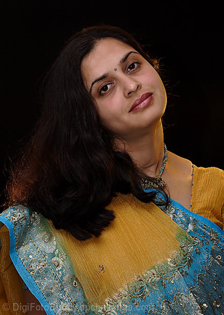
Looks professional.
Composition:
Very good. The space is filled well and with purpose. Not much more I can say other than well done.
Subject:
She looks relaxed and comfortable, something that is often missing with a lot of other portraits I've seen at DPC. Again, well done in accomplishing that.
Technical (Colour and light):
The lighting is very good. The detail is captured without any harsh transitions. The light on the hair is sufficient. However for DPC purposes you might want to have a bit more contrast so those without calibrated monitors won't ding you because it looks too dark. That one area of the hair with the brighter light does seem out of place but it's not distracting to me.
Improvement:
I really don't have any. As I mentioned above, for DPC purposes maybe brighten the hair more so that it's more visible across the board for everyone.
Summary:
Great image. I thought it was one of the best in the challenge and really I should be asking you about portrait shots rather than me critiquing yours. :)
Good luck on future challenges although I don't think you really need it.
Edited to fix spelling.
Message edited by author 2006-05-08 21:59:22. |
|
 Photographer found comment helpful. Photographer found comment helpful. |
|
|
04/30/2006 03:52:31 PM |
::: Greetings from Critique Club :::
Hi, as requested, here is an indepth critique of your submission.
First Impression - the most important one:
OK, this one one of my favorites in this challenge, so ya know I like it. :-) Detail is exceptional and model is beautiful.
Composition:
Unlike a lot of other submissions, you've gone with a traditional portrait composition. It simply works and works elegantly for your image.
Subject:
Your subject is interesting and your photo brings out her beauty.
Technical (Color, focus, and light):
All excellent. I especially like the defining light shaping the right side of the face.
To grow its vote?:
Force voters to calibrate thier monitors ;-) Seriously, I can't think of a way to improve this image.
Summary:
I love it. Excellent work and I think it should have at least broken 6 in voting.
Hope to see more from you soon,
Leroy |
|
| Photographer found comment helpful. |
|
|
04/29/2006 08:41:14 PM |
this is a really nice portrait, very colorful. but the background is a bit to dark, I think a light on the background to separate the model from it would have been nice, even on a calibrated screen the hair comes really close to blend in with the background. and I think her eyes needs a bit more sharpening, they seem a bit dull compared to the rest of the picture.
I didn't vote in this challenge, but would have given an 8. |
|
| Photographer found comment helpful. |
|
|
04/24/2006 08:40:01 AM |
You run a risk when submitting photos with darker portions on DPC. While you and I see the hair detail fine, it's not guarenteed that ALL voters will. My notebook for instance would not do the hair detail justice at all.
I gave you a 9. It's a fine portrait. |
|
| Photographer found comment helpful. |
Comments Made During the Challenge  |
|
|
04/23/2006 03:36:54 AM |
|
Good portrait. I like the lighting, pose and choice in background. Also the colors came out well. Scoring it an 8. |
|
| Photographer found comment helpful. |
|
|
04/22/2006 09:39:43 PM |
|
good attempt .but Head is tilting too much |
|
| Photographer found comment helpful. |
|
|
04/22/2006 09:27:33 PM |
|
| Photographer found comment helpful. |
|
|
04/22/2006 01:00:29 AM |
|
I like the glow on her hair (lower left, would love to see more of the red tones in her beautiful locks. |
|
| Photographer found comment helpful. |
|
|
04/20/2006 11:02:14 PM |
|
I would have liked to see more detail in her hair... there's either too much contrast, not enough light, or not enough light in the right position. |
|
| Photographer found comment helpful. |
|
|
04/18/2006 08:07:03 PM |
|
| Photographer found comment helpful. |
|
|
04/18/2006 02:58:17 PM |
|
perhaps illuminate her hair a bit more on the left to add volume and light in the photo ; its a bit dark, or low on brightness and color |
|
| Photographer found comment helpful. |
|
|
04/18/2006 07:35:58 AM |
|
Very beautiful, and such a wonderfull culture..... |
|
| Photographer found comment helpful. |
|
|
04/17/2006 10:05:51 PM |
|
| Photographer found comment helpful. |
|
|
04/17/2006 12:27:40 AM |
|
Nice portrait. A few things you could do to improve upon the processing.. the saree looks a bit over sharepened. In portrait, you would want to keep attention to face, so don't sharpen the whole image, just sharpen face ( eyes basically ) and keep the other not-so-important things normal. A bit of vignetting may also improve things here. |
|
| Photographer found comment helpful. |
Home -
Challenges -
Community -
League -
Photos -
Cameras -
Lenses -
Learn -
Help -
Terms of Use -
Privacy -
Top ^
DPChallenge, and website content and design, Copyright © 2001-2026 Challenging Technologies, LLC.
All digital photo copyrights belong to the photographers and may not be used without permission.
Current Server Time: 06/29/2026 02:24:51 PM EDT.