| Image |
Comment |
| 10/05/2004 11:02:00 PM |
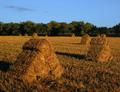
Haystacks - A Tribute to the Impressionist Masterby ColeyComment: Your contrast I think is too strong and the shot is a tad too dark. Looks like you used a polarizer in low light at the wrong angle and didn't really get the benefit of the filter. Composition is not inspiring. 4 |
 Photographer found comment helpful. Photographer found comment helpful. |
| 10/05/2004 08:39:11 AM |
The Beaconby alanfreedComment: Very nice natural color and crisp focus. Not all that interesting of a composition though. 5 |
| Photographer found comment helpful. |
| 10/04/2004 11:57:09 PM |
All the Good Thingsby mbardeenComment: Fantastic moody wide angle. The lighting is terrific and the blown out highlights in the sky simply add to the strange atomosphere of this image. Very well done. 9 |
| Photographer found comment helpful. |
| 10/04/2004 11:54:37 PM |
Awakeningby kirbicComment: What an awesome photograph! What can you say to something this good? 10 |
| Photographer found comment helpful. |
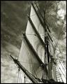
| 10/04/2004 11:44:18 PM |
Aloft by BradComment: Great wide angle really captures well the height of the mast and shows the good amount of detail, especailly of the ropes and their shadows. The tones are also terrific. 9 |
| Photographer found comment helpful. |
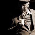
| 10/04/2004 11:40:13 PM |
An eye on the cider press.by jjbeguinComment: I really like how the deep rich and very dark shadows fragment the subjects face and shoulder as it really isolates his facial expression. 8 |
| Photographer found comment helpful. |
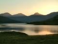
| 10/04/2004 11:36:51 PM |
Soft evening light on Loch Arkletby geewhyComment: This is just such a wonderful landscape with beautiful muted colors and really interesting looking atomospheric perspective that gives a sense of distance. Very peaceful scene. Especially love the calm and reflection of the water. It has a surreal quality about it. 10 |
| Photographer found comment helpful. |
| 10/04/2004 11:34:00 PM |
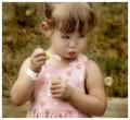
Captivatedby sherComment: A darling portrait and very good clarity, but I find the background color clashes with the dress. I also think I would have preferred you not cropping off her head. 7 |
| Photographer found comment helpful. |
| 10/04/2004 11:27:21 PM |
"Back" Cover Girlby DougPazComment: this is such a neat photograph. I can't believe how well the magazine back cover and the girl's face are aligned and blend into each other. I can see a photo like this being used in an advertisement in a woman's magazine like the one your subject is reading. Excellent work. 8 |
| Photographer found comment helpful. |
| 10/04/2004 11:05:38 PM |
Naughty .... but niceby agwrightComment: An 'in your face / in your mouth" view? I don't think I'm finding this very appealing looking as I don't like the point of view. It's got great amount of detail, but for one, the DOF is too narrow and I think you should have gotten all of it in focus. Secondly, I would have preferred some kind of contrasting background, either in color and/or another lesser subject. As it is, all this white just hurts my eyes. 5 |
| Photographer found comment helpful. |
Home -
Challenges -
Community -
League -
Photos -
Cameras -
Lenses -
Learn -
Help -
Terms of Use -
Privacy -
Top ^
DPChallenge, and website content and design, Copyright © 2001-2025 Challenging Technologies, LLC.
All digital photo copyrights belong to the photographers and may not be used without permission.
Current Server Time: 08/09/2025 11:39:10 AM EDT.