| Image |
Comment |
| 06/16/2003 12:13:28 PM |
B&W Magazine (The Joys of Summer)by SonifoComment: This is a wonderful photo and I absolutely love the composition but think it would be more effective if it were in color. I'm going to give it a high mark anyway. |
 Photographer found comment helpful. Photographer found comment helpful. |
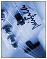
| 06/16/2003 11:17:25 AM |
guitaristby deceptiveComment: I really like the color cast and the DOF is very good, but I find that the name of the guitar is very distracting being upside down. |
| Photographer found comment helpful. |
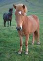
| 06/16/2003 11:10:19 AM |
The Horseby birgirComment: This shot looks to be somewhat distorted with the horses head too big in comparison with the rest of it's body. I do however, like the composition and arrangement of horses. Color could be more saturated. |
| Photographer found comment helpful. |
| 06/16/2003 10:49:02 AM |
The English Garden - Tea Rose a "Chicago Peace"by smshatsComment: Excellent focus and clarity. I also like your attempt at dramatic lighting, but I find it to be a little bit too harsh. Also, the dark shadow of another plant in the lower right hand corner, as well as, another object in the upper right hand corner are distracting. |
| Photographer found comment helpful. |
| 06/16/2003 10:36:21 AM |
NATIONAL GEOGRAPHICby MorganComment: Wonderful picture! Great color and DOF and the focus is excellent too. Only thing is I think the border is not the right shade for NG mag. |
| Photographer found comment helpful. |
| 06/16/2003 01:56:50 AM |
National Wildlifeby amandolinComment: I really would have liked to see a shot of the entire body of this creature. DOF is very good. |
| Photographer found comment helpful. |
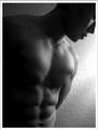
| 06/16/2003 01:42:11 AM |
Male Fitnessby imagesloyolaComment: I would think this photo to be on the cover of a fine arts mag, rather than on a fitness mag, it's just not that style. It's interesting textured wall in the background and dramatic, raking lighting bring out the textures. Only thing I don't like is the blown out highlight on the wall. Well done. |
| Photographer found comment helpful. |
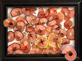
| 06/16/2003 01:34:21 AM |
Close Shave by FranziskaLangComment: This is such a wonderful photo, so easy to look at, and the lighting is great. The shapes are very interesting to look at and I also like the way two of the shavings come out over the frame. Focus is right on too! |
| Photographer found comment helpful. |
| 06/16/2003 01:28:56 AM |
Travel & Leisureby brentpaughComment: Beautiful shot of the landscape and the beautiful woman. I also like the DOF here. While I don't find the inclusion of the cell phone towers to be objectionable, I think the towel the woman is laying on is too bright, poorly laid out and very distracting and should have been removed prior to taking the photo. |
| Photographer found comment helpful. |
| 06/16/2003 01:10:39 AM |
"DOG WORLD"by melissartsComment: I dont like the angle on this shot as the dog's legs gets lost in the dark ground and I also think if you're intent was to get a silouette of the dog, that he/she should be even darker with less detail than what appears in the pic now. That would also help the blown out sky. |
| Photographer found comment helpful. |
Home -
Challenges -
Community -
League -
Photos -
Cameras -
Lenses -
Learn -
Help -
Terms of Use -
Privacy -
Top ^
DPChallenge, and website content and design, Copyright © 2001-2025 Challenging Technologies, LLC.
All digital photo copyrights belong to the photographers and may not be used without permission.
Current Server Time: 08/07/2025 08:10:55 PM EDT.