| Image |
Comment |
| 01/08/2004 11:36:35 AM |
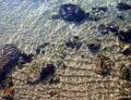
Learn To Scuba Diveby ellamayComment: Great light pattern and texture to the sand! I think the glare coming off the water has reduced the contrast and color saturation somewhat which could have been avoided by using a polarizing filter. Impressive shot otherwise. |
 Photographer found comment helpful. Photographer found comment helpful. |
| 01/08/2004 11:26:14 AM |
|
| Photographer found comment helpful. |
| 01/08/2004 11:24:19 AM |
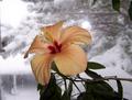
Audacityby beneschottComment: Great concept! I love the color against the backdrop of greytones, but the colors could have been more saturated. A bit dark in the leaves below. Also, the glare above the upper right petal is distracting, as well as, the leaves in the upper right. I think many of your problems could have been avoided with softer light and better in-camera cropping. One more thing is the flower is too centered. Hope this was helpful and you didn't find it too harsh of a critique. |
| 01/08/2004 11:17:42 AM |
More Runningby ZoomdakComment: Great color but contrast is a bit too high as you've lost detail in the man. Should have exposed when runner was between rocks. Also, horizon is not level. |
| Photographer found comment helpful. |
| 01/08/2004 11:14:53 AM |
Maybe This Will Be The Yearby ShannonComment: DOF is not deep enough to include the cigarette, which is an important element in this shot. Also, lighting seems uneven as evidenced by the fading of the printed message. |
| Photographer found comment helpful. |
| 01/08/2004 11:05:18 AM |
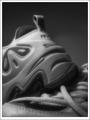
Convert these slides to digitalby cbellerComment: You certainly have your work cut out for you! Good contrast and very rich looking blacks, just the highlights in the upper left are blown out a bit too much, but not terribly so. Composition is a little busy, but well designed. |
| Photographer found comment helpful. |
| 01/08/2004 10:45:22 AM |
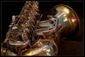
This year I learn to play saxophoneby rhipsterComment: Perhaps less of a close up shot would have had more impact for me as the reflection of your surroundings in the sax is distracting. Also, the red/pinkish highlights seem "off." |
| Photographer found comment helpful. |
| 01/08/2004 04:10:06 AM |
|
| Photographer found comment helpful. |
| 01/08/2004 03:56:09 AM |
Lighten Upby ImagineerComment: Brilliant! Nicely done abstract. Like the composition and then colors. |
| Photographer found comment helpful. |
| 01/08/2004 03:51:15 AM |
Broken Promisesby ozaibakComment: Nice high key image with good contrast. Image is a little flat for me with your choice of desaturation and shadows could be a bit softer as well. Lighting appears too harsh, but I guess that's all part of high key images. Composition is well balanced. |
| Photographer found comment helpful. |
Home -
Challenges -
Community -
League -
Photos -
Cameras -
Lenses -
Learn -
Help -
Terms of Use -
Privacy -
Top ^
DPChallenge, and website content and design, Copyright © 2001-2025 Challenging Technologies, LLC.
All digital photo copyrights belong to the photographers and may not be used without permission.
Current Server Time: 08/11/2025 05:51:22 PM EDT.