| Image |
Comment |
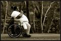
| 03/21/2004 07:59:55 PM |
Mobilityby jmsetzlerComment: Wonderful portrait that tells a story that is not often told. I have to give you alot of credit for entering a photo of a side of life that most people don't want to see. I love the toning and coloring and how the woman stands out against the background. Border is very appropriate for his subject. Good job. |
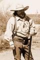
| 03/21/2004 07:54:35 PM |
Cactus Jackby tfaustComment: Wonderful portrait! Your subject really matches with the costume and with the setting very well. ( I hope it is a costume...lol). Also, I love the sepia you've used and with the slight overexposure, this picture really has an old time flavor to it. |
 Photographer found comment helpful. Photographer found comment helpful. |
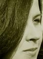
| 03/21/2004 10:34:51 AM |
Monicaby AlexysComment: I love the composition with the sweeping curve of her hair but I don't find the green/gold toning to be all that flattering. Also, the light is a bit too strong on the nose and left cheek. You can see every wrinkle and pore on her face. |
| 03/18/2004 02:09:04 AM |
"Phenomenolgy of Spirit"by RoosterComment: This beautiful woman with lovely flowing locks I'm sure has raised the spirits of many a man but I'm trying to figure out what embodiment of spirit she is expressing in the image. Is that spirit determination and will?; is it religious in nature?; Is it strength of character? Her look is void and so it's hard to tell and I am left with the only clue I could find, which is what appears to be a religious shawl that she is clutching. What significance this has I'm not sure but the lines of the cloth give a strong graphic element, probably the only strong point in the image. Her clothes are plain and she also suffers from being half in light and half in shadow, as well as, being underexposed and a green cast to her face. I would have preferred to have seen her wear some sort of religious or cultural/ethnic garb instead of the sweatshirt she is wearing and to have her hair brushed better. |
| Photographer found comment helpful. |
| 03/18/2004 12:11:01 AM |
Puzzled!by RtwoComment: Is the uneven and graded lighting the reason for the monitors being of different color temp? |
| Photographer found comment helpful. |
| 03/17/2004 11:57:18 PM |
Outside Looking Outby instepsComment: Beautiful woman and I love the way you've framed her in the window and with the tree. I do find this image to be too busy. Though I would imagine this to be your intention, I don't like her distant stare as I find it to be almost vacant, as if she's not looking at anything in particular. Also, she is wearing too much black that is all blending together. |
| 03/17/2004 11:39:58 PM |
So much to learn.by dickwilhelmComment: Very cute...I love her! Her red hair is awesome. Photographically, you have mixed lighting that is casting yellow on most of your subject. (looks like daylight mixed with incandescent lighting). Her hands are of two different colored tones and I wish there were more light shining on her cute face. |
| Photographer found comment helpful. |
| 03/17/2004 11:34:47 PM |
expression of self...by theodor38Comment: I like this portrait alot as I find the subject compelling and interesting to look at...especially his hair, which imo carries the picture. The lighting is too harsh and you've lost detail in parts of the face and shoulders. Also, not too crazy about the green color of his eyes, as they look unnaturally colored. I don't think the background works here as the color doesn't match the eye color and it's print is somewhat distracting. |
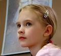
| 03/17/2004 11:28:28 PM |
Krissieby vtruanComment: This is a lovely portrait of a beautiful young lady and I love the concept here of having the painting in the background to which the subject is set against. I do, however, think there are improvements that can be made. First, I'm wondering if the painting has real relevence to the subject, in terms of, likeness or some kind of similarity. Also, I don't like the fact that the head of the subject in the painting was cut off. I do love the pose of your litte woman, and she is darling, but I would have preferred crisper focus on her face (it appears that the focus is better on the side of her face) and I also would have preferred that she wasn't wearing the shiny chrome barrette and red pony tail holder, both of which I find distracting. And also (sorry this is so long :), I think she should be wearing a colored blouse that matches better with the painting above and a color more subdued than the one she is wearing, which is bolder and does'nt match her lipstick or the painting. I hope this helps. 8 |
| Photographer found comment helpful. |
| 03/17/2004 11:02:19 PM |
The Missusby redmoonComment: The overhead lighting has left unsightly shadows under her nose and chin. Some fill light could have been used to lessen them. In addition, I find your background to be too plain |
| Photographer found comment helpful. |
Home -
Challenges -
Community -
League -
Photos -
Cameras -
Lenses -
Learn -
Help -
Terms of Use -
Privacy -
Top ^
DPChallenge, and website content and design, Copyright © 2001-2025 Challenging Technologies, LLC.
All digital photo copyrights belong to the photographers and may not be used without permission.
Current Server Time: 08/13/2025 10:48:24 PM EDT.