| Image |
Comment |
| 01/13/2006 11:44:05 AM |
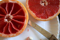
Breakfast Timeby kittenfcComment: Good idea and composed decently. A ceramic rather than a paper plate would be nore appealing. The left grapfruit top is well focused but little of the rest of the image is. A higher f/stop (narrower aperture) would allow all to be in focus. If it was your intention to make the rest of the composition soft focused than a wider aperture and shallower DOF would have worked better. |
 Photographer found comment helpful. Photographer found comment helpful. |
| 01/13/2006 11:39:06 AM |
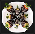
New Year's Resolution: Recipe for Disasterby MeeraComment: Excellent composition and arrangement. Black background with a white plate works very well. You might want to try and bring out the red color of the strawberries more even though there isn't a lot. More bright red with the chocolate would make the composition even better. The image appears just a bit soft focused. Message edited by author 2006-02-08 07:41:01. |
| Photographer found comment helpful. |
| 01/13/2006 11:27:32 AM |
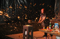
Gallagher's Apple Sauceby SunnieeComment: You certainly caught the moment on this one! Very hard to capture a shot like that. Unfortunately the general overal image quality is not especially good. Looks like it was shot at too low a shutter speed as seen by the fact the Rice Krispies box is well focused but the man is not. If you wanted to capture motion blur then you would have needed a longer exposure time. This is in between in that no-man's land for exposure time. |
| Photographer found comment helpful. |
| 01/13/2006 11:19:51 AM |
Valentine Chocolate-Cherry Torteby NstiG8trComment: Color, lighting, depth of field are all fine. General technical quality is good and background is OK. One suggestion would be to turn the torte such that the point of the heart is pointed directly at the viewer and edgepoints of the holder are level much the way a horizon would be made level. |
| Photographer found comment helpful. |
| 01/12/2006 07:52:49 PM |
Red Beautyby DrakeComment: Cecent colors and floral arrangement. The image appears slightly out of focus but not soft focused. |
| 01/12/2006 07:52:38 PM |
Twinkle, Twinkle, Little Star....by KitaComment: Great color choices... Most people associate primary colors like blue, red and yellow with color bursts. Image quality is generally good but the DOF may be a bit too shallow. A couple silver balls on the bottom and right look slightly out of focus. Taking at a narrower f/stop would fix that. The star is not quite "level" and should be straightened much like a horizon would be straightened. |
| Photographer found comment helpful. |
| 01/12/2006 07:44:12 PM |
Chromatic Eruptionby kteachComment: Well composed, especially wit the white pencil pointed strait into the camera in the center of the frame. Creating way to display a color wheel effect. Subtle use of black in the background to make the colors stand out. The black rectangles are angled enough to be obviously purposeful for artistic effect but some viewers may suggest they should be straight. |
| Photographer found comment helpful. |
| 12/21/2005 07:07:44 PM |
|
| Photographer found comment helpful. |
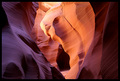
| 12/11/2005 02:08:47 PM |
Study in: Light, Form, Textureby tfaustComment: Fantastic slot canyon image... You did a terrific job composing and processing it. Great and deserving score. Wished I'd have went up with you on that trip... love that area. You Da Best! |
| Photographer found comment helpful. |
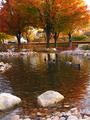
| 11/13/2005 01:05:26 AM |
Ducks in Fallby abbykiddComment: Would be an exceptional composition if taken without the cars present and the horizon was level. |
Home -
Challenges -
Community -
League -
Photos -
Cameras -
Lenses -
Learn -
Help -
Terms of Use -
Privacy -
Top ^
DPChallenge, and website content and design, Copyright © 2001-2025 Challenging Technologies, LLC.
All digital photo copyrights belong to the photographers and may not be used without permission.
Current Server Time: 08/15/2025 11:17:16 AM EDT.