| Image |
Comment |
| 05/30/2007 03:46:10 PM |
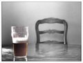
Halfway Thereby lunachickenComment: Positives:
No beer drinker could disagree with the choice of color left for this selective desaturation composition. It is a perfect metaphorical choice that gives the viewer something to think about, particularly with the empty chair.
Technicals:
Composition is fine. The black and white tones are well rounded.
The toughest thing in color desaturation is getting the color boundaries right. In this case you had some problems, the color border does not look natural and the color left at the top of the glass is more distracting than not. The whole upper part of the glass above the beer level is particularly unnatural looking. Part of that might have been due to the lighting but probably not much.
Some folks may have thought the line in the table in the foreground was a distraction as well.
The Challenge:
Meets the challenge in a more meaningful way than most of the challenge entries. Voters no doubt gave you credit for that. Its the technical flaws that hurt this image more than anything else and garnered it a below average score.
Suggestions:
Probably the easiest thing would be to desaturate the top of the glass. The color up there is not very good to begin with and getting rid of it would no doubt correct everything wrong with the top of the glass.
To get a color border right you first need to measure the pixel width of surrounding boders. Just count the number of pixels wide the borders are. You may have to go to a 300%-400% view to see the pixels. You will want to set brush feathering compatible with that width when doing the color boundary.
If you could somehow do something with color and hue changes to give the beer a nice golden head that would work GREAT, but I suspect that would be to difficult to get right and look natural.
OK... I'm done with this one... bottoms up, everyone! |
 Photographer found comment helpful. Photographer found comment helpful. |
| 05/30/2007 03:14:46 PM |
Whats your sign?by tjbel05Comment: Positives:
Good selective desaturation concept and the tall framing works well.
Technicals:
You did a good job with the color boundaries, they look pretty natural and the colors don't appear oversaturated. You did well with black and white tonality. Sharpness is centered on the signs as it should be. (You'd be surprised how often we see images where that main subject is not properly focused)
The wire near the top of the sign is a distraction. The composition might be just a bit off with the positioning of the background tree.
The Challenge:
Duh! Meets the challenge all right. LOL!!! Does so with an appropriate use of selective desaturation to make a point.
Voters scored this smack dab in the middle of the road with a 5.4 score matching both the challenge average score given and DPC's overall average score given for all challenges.
Voters thought yours average for the challenge. I scored it a "7" which in my scheme of things means I think it is average as well. So in that regard I pretty much agree with the voters. For me, an image that meets the challenge and doesn't have any serious technical flaws will get an average score of "7" or it will get a higher score it does more than that. It is rare for me to find an image that flat out does not meet the challenge.
Suggestions:
Photography 101 - Always clone out distracting wires!
You can try some of the DOF suggestions I made above to see if you can achieve the effect you want.
Since you will have to re-take the picture to do that anyway then also try moving further to the right and recompose the shot. The reason for that is better placement of the background tree. Moving the sign more to the right of the tree will result in a better composition of image elements. Looks like you can position the sign right in front of the more distant branches to its immediate left so you still have the main part of the house unobstructed and the big tree will be further right.
Getting closer to the sign would be a good idea to and perhaps even necessary for shallower DOF. |
| Photographer found comment helpful. |
| 05/30/2007 02:22:57 PM |
The Lone Red Flowerby kellyrc01Comment: Positives:
A decent floral desat in a soft focus mode with a supportive black and white background.
Technicals:
The black and white treatment has good tones and full range from pure black to pure white without under or over exposed areas. The color boundary to the B&W is well done. Nice idea to put a red flower with white ones... makes the desat part a lot easier to do.
Interesting this image is so softly focused given it is taken at f/20, perhaps this is because you were in macro mode or possibly camera motion suring the 1/60th second exposure. It has those spotty areas that look slightly out-of-focus which is incompatible with actual distance that we sometimes see with digital images. Not sure how that happens but think it is an artifact of digital image capture.
The red is a little too intense for the composition. Looks like you might have saturated it in post processing. The reddish refelction on the white flower below the red acts as a distraction.
The composition is on the weak side, kinda snapshot-like.
The Challenge:
It meets the challenge but most voters probably thought it a gratuitous floral image so voted it lower. Voters probably wanted to see a reason for the use of desat and did not find it in this composition. Others probably felt it lacked the ever popular "wow" factor so voted it lower for that as well. Some voters may have thought the reddish reflection off the white flower below the red one was color bleeding and marked it down as a technical error. All those reasons combined are probably why it scored below average.
I scored this image 6. That means I felt it was below average but not a "failure". I felt the image was OK but the red was to intense and the reddish reflection on the white flower was a distracting flaw. In my opinion your picture is not "bad". If it were I'd have given it an even lower score than the average DPCer did. I usually vote the "bad" pictures lower than other DPCers and the "good" ones higher.
Suggestions:
Here are some things you might try. Reduce the overall saturation of the red flower so it doesn't hit the viewer over the head then use selective color to darken just the blacks in the red flower to give it more contrast and definition. Clone out the red color from the white flower.
Another thing you might consider is cropping it differently to center the red flower at one of the rule of thirds(ROT) intersection points for greater visual impact. Cropping a lot from the left side to position the red flower centered on the upper left ROT intersection might look quite nice. |
| Photographer found comment helpful. |
| 05/30/2007 01:13:02 PM |
May the road rise to meet you.by JewellyComment: Positives:
Touching capture of a little girl in dreamland with a proper selective desaturation choice to emphasis her imaginative play.
Technicals:
Overall technicals are good. Depth of field, sharpness, composition and lighting are all good. It shows none of the usual digital artifacts we are used to seeing in submissions. You handled the color boundary well for this image.
The blue bow on top of her head, though supporting the theme, acts more distractive than not.
The Challenge:
129th out of 554 is a good placing in such a large challenge. You were .4 above the challenge average. Voters like this image but feel it is not top tier. The image cannot be faulted for technical quality so "wow" factor probably played a roll in a lower score. Many voters were probably jaded to selective desaturation by the time they voted on this one.
Unsure, but some voters might have thought having your model on a wall was not a good idea.
Suggestions:
You might try desaturating the top bow to eliminate that as a distraction. The wings support the main theme well already.
Consider some serious dodge and burn on the girl herself, possibly using a "vivid light" brush, to give her more "depth" and draw more attention to her. Lightening her hair and locally increasing the contrast on her dress would look nice.
Another thing you might consider to support a dreamlike theme would be an offset vignette centered on the girl. |
| Photographer found comment helpful. |
| 05/29/2007 11:27:10 PM |
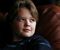
I M A G I N Eby stevieianComment: Positives:
Pose, capture and lighting angle are the strengths of this composition.
Technicals:
Color is fine. Lighting angle is good but the right side of the face is a little overexposed and flat looking. Use of noise reduction is good for producing a soft look but may be overdone.
Its a small thing but the wrinkles in your model's shirt is a slight distraction.
The Challenge:
Meets the challenge for a color portrait and scored almost right at the average for the challenge. Voters felt this was an average portrait. Probably the two things that held it down in scoring is the overexposure of the face and the slight overuse of noise reduction.
Suggestions:
The most noticeable oversmoothing is on the leather couch or chair he is sitting in. One thing you might try is to apply noise reduction on a separate duplicate data layer then add a mask to that duplicate layer and paint out the the oversmoothing in the chair. That way you retain the smoothing of the face without getting unnatural smoothing in the chair. It is the best of both worlds. :)
You can try this and I don't guarantee it will work but you can add a 50% greyscale layer and then burn in the right side of his face to bring back more detail if it is there. There are other things you can do with the original that would also retain detail in her face assuming it was in the original and just lost in post processing.
Remember to get clothes properly placed when doing portraits. That is worth checking once, twice and three times after each pose change. :) Message edited by author 2007-05-30 13:24:34. |
| Photographer found comment helpful. |
| 05/29/2007 10:51:14 PM |
splat ... !!by vikasComment: Positives:
Racket ball is a very fast game and hard to capture. You did a great job with this capture. Very well composed and captured sports image with good technicals.
Technicals:
What is most amazing about this image is that you could get such great clarity and good stop action at f/4.2 in a 1/60th of a second exposure.
Sharpness, color and exposure are all very good. Composition is excellent.
The vertical corner of the wall behind your racket ball model is a significant distraction. There are a couple cracks or something in those walls as well behind the player that cause minor distractions.
The Challenge:
Obviously meets the Sports II challenge and not only that it is just one fine capture.
You finished over .4 above the challenge average and almost .6 above the overall DPC average. Voters thought this image good but not a top level performer.
Voters were probably bothered by the vertical corner of wall behind the player. Other than that there is nothing wrong with this image. I wasn't bothered by that line so scored it "10" myself. I still like it and don't see any reason to change my score.
Suggestions:
In basic you can't do this but clone out the vertical corner and other two lines near the player's head and you may find the image even more appealing than it already is.
This would make a great stock image. Some folks might think looking like stock is a bad thing. I'm not one of them. |
| Photographer found comment helpful. |
| 05/29/2007 09:25:43 PM |
The Tee Shotby BHusemanComment: Positives:
Perspective and moment of capture are fantastic and are the strengths of this composition.
Technicals:
Black and white tones and contrast are good. Sharpness borders on being overdone and might just barely cross the border in the area surrounding the club head.
The brightness and color of the ball is overexaggerated for selective desat and has an unnatural look about it. That is not good given it is the main subject.
The Challenge:
Yup, meets the challenge. Voters get the idea about keeping your eye on the ball and it is a nice clean hit but the technical implementation of the desat detracted greatly from the composition. Unfortunately the overdone yellow color and unrealistic color border hurt it a lot in voting. Other than that is is very nicely done. I scored this a three because of the very gawdy color on the ball.
Suggestions:
As would be true in many of the submissions backoff on the overall color saturation and it would have made for a better selective desaturation entry. Also consider reducing the sharpness of the grasses surrounding club a little. |
| Photographer found comment helpful. |
| 05/29/2007 09:06:53 PM |
See No Evilby okiesisiComment: Positives:
Well setup and executed image. Very nicely done. Colors not overworked. Overall superb technical quality.
Technicals:
A very challenging image for desaturation. It was done much better than the majority of submissions. Tough boundaries are especially natural looking.
Though done well, you may have retained to much color in the composition in to many areas.
Lighting and contrast are decent though there is nothing in the lighting that specifically draws a lot of viewer interest.
The Challenge:
You got nailed by the lack of a "Wow" factor, not technical quality. Not saying that is right, just saying it is something DPC voters are perpetually searching for. Counted cross stitch just doesn't get voter juices flowing. LOL!!!
It is possible that so much color remained that it harmed it in voting. Voters generally expect just the main subject colored in selective desaturation. The use of color in several different areas might have been confusing.
Suggestions:
You might consider removing all color from the image except the 'see no evil' stitched frog and the needle and thread next to it. The bundled thread and other frog on the package could be left black and white. Color in those areas might be overdoing it. |
| Photographer found comment helpful. |
| 05/29/2007 08:24:19 PM |
Makeup Artistby muckpondComment: Positives:
The concept, pose, technical quality and execution of this image is exceptional. It has a very professional look.
Technicals:
Sharpness, contrast, framing/crop and background are all very, very good. It is especially nice how you have the bright background highlighting help bring out the detail in your model's hair. Putting on blush and your model's reaction to it is great.
The blush red is a to intense for the desat. The greenish overtone around the eyes acts as a major distraction. The edging around the blush itself looks slightly unrealistic.
The Challenge:
Conceptually you are right on with the concept and choice of selective desaturation. The color draws attention to itself. Color is a bit intense for the desat and that worked against it in voting.
.3 above the challenge average was actually pretty decent for DPCers given the major middle of the road scoring dished out for this challenge. The fact the average commenter gave it a 7 is a tribute to the quality of the image. DPCer's hearts were in the right place if not their scores.
Suggestions:
Just one... reduce the saturation of the blush red to reduce it's overall intensity. And get rid of that greenish color cast at the edges of the eye. That alone would have had a major impact and improved scoring greatly. Outside that this image is super. |
| 05/29/2007 07:09:27 PM |
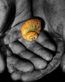
remember seek (forgetting find)by mkComment: Positives:
Nice high short range contrast, particularly with the fingerprint and hand lines. Details are exceptionally well captured.
Technicals:
General technicals are very good. Given the high contrast, the sharpness is exceptional with the fine detail you captured. Brightness and lighting are right. The middle finger of the top hand is oversmoothed compared to the rest of the composition.
The boundary of color and BW is done very very well, considering how narrow it is.
If applied, dodge and burn is applied properly. If it was and I can really tell for certain that means you did an even better job. :)
The Challenge:
You scored almost .5 above the challenge average and by DPC standards that is pretty good. For this challenge that means voters liked this image a lot more than the others.
I only scored this image 6. For me that is actually scoring it lower than the group did. The reason for that is I felt the color in the shell was to intense for the composition. There was also a question in my mind as to the meaning of the colored parts of the image. There wasn't one for me. Both contributed to a low score. It is fairly rare for me to score an image so close to the group average. I'm usually far on one side or the other. :) Think I voted this image low.
Suggestions:
Just one... you might consider backing off the overall color saturation on the shell to make it more muted. The brightness of the yellow overwhelms the BW portions of the image. |
| Photographer found comment helpful. |
Home -
Challenges -
Community -
League -
Photos -
Cameras -
Lenses -
Learn -
Help -
Terms of Use -
Privacy -
Top ^
DPChallenge, and website content and design, Copyright © 2001-2025 Challenging Technologies, LLC.
All digital photo copyrights belong to the photographers and may not be used without permission.
Current Server Time: 08/02/2025 08:44:53 PM EDT.