Greetings from the Critique Club
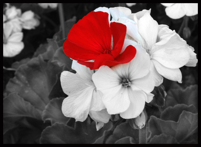
My first impression looking at this photo was that the red flower didn't really belong. So I wasn't surprised to see your comment that you placed it there. It looks unnatural. But that isn't really important; photos, even flower photos, don't necessarily have to look natural. It depends on what message the photographer wants to get across. And this photo is attractive. The red flower does stand out, and makes the viewer wonder why it's there. There is no correct answer; the viewer gets to decide for himself. That's a hallmark of good art.
Now I want to disagree with Steve's critique a bit! Don't be frustrated by our disagreement; this is all subjective, and that's what makes art interesting!
I like the highly saturated red. The color amidst the gray already draws attention to it, and the intensity, well, intensifies this. I think it works very well. And I also like the reddish reflection; it helps the red flower blend in. Cloning it out makes the red flower look even more unnatural. (Of course, if that's your goal, go for it!) But there is a very light bluish hue on the petals behind and above the red flower that looks out of place; I do suggest removing it. (I would recommend using a layer mask on a hue/saturation layer rather than cloning to do this.)
While the soft focus is certainly fitting, these flowers have such a wonderful texture that I would prefer it sharper. A bit of sharpening to bring out the details would really enhance this.
But I do agree with Steve's recommendation to crop off the left side. That would better balance the composition. |