| Author | Thread |
|
|
05/31/2007 10:24:42 AM |
|
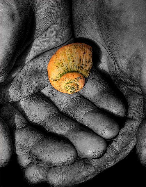
Ummm...I love this. I was one of the two 10's you received. I actually like the color of the shell the way it is. I like it better then the re-edit. :) |
|
 Photographer found comment helpful. Photographer found comment helpful. |
|
|
05/29/2007 11:40:37 PM |
ok since you didn't smite Melethia I just want to say I think this shot sucks...
there...ok, I am going to press post now...
maybe preview...no post, then edit...wait post no edit...
I forget what was I going to edit...
Message edited by author 2007-05-29 23:41:44. |
|
| Photographer found comment helpful. |
|
|
05/29/2007 09:33:39 PM |
I like the shell in the desat.jpg version much better...that would have been enough to bump my score from a 6 to a 7. I do like the composition.
(
Not that you:
a. Asked
b. Care
3. Don't already know that
g.
) |
|
| Photographer found comment helpful. |
|
|
05/29/2007 07:09:27 PM |
Positives:
Nice high short range contrast, particularly with the fingerprint and hand lines. Details are exceptionally well captured.
Technicals:
General technicals are very good. Given the high contrast, the sharpness is exceptional with the fine detail you captured. Brightness and lighting are right. The middle finger of the top hand is oversmoothed compared to the rest of the composition.
The boundary of color and BW is done very very well, considering how narrow it is.
If applied, dodge and burn is applied properly. If it was and I can really tell for certain that means you did an even better job. :)
The Challenge:
You scored almost .5 above the challenge average and by DPC standards that is pretty good. For this challenge that means voters liked this image a lot more than the others.
I only scored this image 6. For me that is actually scoring it lower than the group did. The reason for that is I felt the color in the shell was to intense for the composition. There was also a question in my mind as to the meaning of the colored parts of the image. There wasn't one for me. Both contributed to a low score. It is fairly rare for me to score an image so close to the group average. I'm usually far on one side or the other. :) Think I voted this image low.
Suggestions:
Just one... you might consider backing off the overall color saturation on the shell to make it more muted. The brightness of the yellow overwhelms the BW portions of the image. |
|
| Photographer found comment helpful. |
|
|
05/29/2007 05:03:16 PM |
Originally posted by Melethia:
I guess I thought it kinda cliche and the "in color" portion too much in color to the point where it almost looks pasted in. |
Agreed and agreed! I did a re-edit with seconds to spare and forgot to desaturate the shell the way I had the first time around.

I think I would have liked that better. I find selective desaturation overall to be so gimmicky that I had a hard time coming up with anything at all that would work, let alone something not mega cliche. Alas.
And I could never smite a Melethia. ;) |
|
|
|
05/29/2007 04:54:25 PM |
|
I, umm, gave this a 5. Why? I guess I thought it kinda cliche and the "in color" portion too much in color to the point where it almost looks pasted in. Detail in the hands is good, lighting is good. Technical elements, in other words, are just fine. Please don't smite me now. |
|
| Photographer found comment helpful. |
Comments Made During the Challenge  |
|
|
05/27/2007 11:14:40 PM |
|
great detail in the hands |
|
| Photographer found comment helpful. |
|
|
05/23/2007 07:51:15 AM |
|
Interesting textures & color. |
|
| Photographer found comment helpful. |
|
|
05/22/2007 09:49:00 AM |
|
| Photographer found comment helpful. |
|
|
05/22/2007 08:36:09 AM |
|
really nice shot here, I'm thinking though the lighting could be improved by using two sources, maybe still have one stronger than the other but two would balance the viewer's eye a little. |
|
| Photographer found comment helpful. |
|
|
05/21/2007 10:07:08 AM |
|
Lovely detail, not too sure about the subject, good luck |
|
| Photographer found comment helpful. |
|
|
05/21/2007 10:01:11 AM |
|
Great shot! I really love the textures and composition. Selective desaturation works well for this image... Good luck ;) |
|
| Photographer found comment helpful. |
Home -
Challenges -
Community -
League -
Photos -
Cameras -
Lenses -
Learn -
Help -
Terms of Use -
Privacy -
Top ^
DPChallenge, and website content and design, Copyright © 2001-2026 Challenging Technologies, LLC.
All digital photo copyrights belong to the photographers and may not be used without permission.
Current Server Time: 06/28/2026 08:44:10 PM EDT.