| Image |
Comment |
| 05/30/2005 03:02:26 PM |
annaby peeteComment: Exceptionally well posed image. Very professionally done and technically a superior photographic image. Should be a ribbon winner. |
 Photographer found comment helpful. Photographer found comment helpful. |
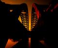
| 05/30/2005 02:58:27 PM |
Prideby ergoComment: Great pose and good lighting on your model. I'm sure women will have no difficulty seeing the beauty in this one. Hormones will surely be released. LOL. The wall shadows are distracting as well as the darkened area on the left side of the image. I'd recommend positioning your model several feet in front of your background in order to soften the shadows so they do not compete with the model for attention. Despite that this is one of the best images in the challenge. |
| Photographer found comment helpful. |
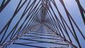
| 05/18/2005 11:24:31 PM |
Geometry in Steel by NeilComment: Congrats on your first ribbon. It is a beautiful shot. That Google maps satellite linking using natural language input for searching is really cool. I'd never seen that before. |
| Photographer found comment helpful. |
| 05/18/2005 10:00:45 AM |
|
| Photographer found comment helpful. |
| 05/17/2005 07:36:06 PM |
Looking Beyondby booneComment: This is an excellent concept. However, the overall low technical quality of the image hurts it more than anything else. Focus is very soft and the colors seem dull. The deep blue spot near the center is a distraction.
There are several things you might try to make this better. One is to take the original picture with the largest f/stop you can. Even if you have to use a tripod it is worth the effort. This will help have better focus. Next, I would work with colors in post for both brighter better colors and more contrast to give the image more visual impact.
Artistically speaking there are two things you might try. One would be to frame or crop the image such that both lower tower legs end exact on each corner. This will level your center triangle better and be better balanced. Another artistic thing you might try is instead of centering tower in the middle of the frame you frame the top of the tower at any of the rule of thirds intersection points. That would give the image a more interesting perspective. |
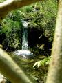
| 05/17/2005 07:24:33 PM |
Hidden Paradiseby SJCarterComment: Though it is not a hard and fast rule but if you are creating a natural framing in a picture as you have here that should be in clear focus. Your framing with the tree branches does not work very well. A good example of this type of framing is "Secret Garden" which is the blue ribbon winner in the outside looking in challenge. |
| Photographer found comment helpful. |
| 05/17/2005 07:16:02 PM |
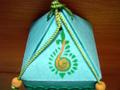
Pyramidby radharamComment: This image exhibits a common problem with autofocus cameras. Notice that the background is in sharp focus but the main subject is out of focus. That is because the camera focused on the background instead of the main subject as I am sure you intended. The reason might be because there is a lot of physical space taken up by the background and the camera was fooled into thinking that is what you wanted to have in focus.
This problem can be minimized if you make sure there is a lot of distance between the background and the main subject. In this case you could have done that by taking the picture from table level instead of this angle. |
| 05/17/2005 07:09:29 PM |
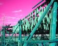
Fishy buisnessby phooztComment: It is always good to try new things and take chances with pictures. There are cases where changes in hue can improve an image and transform it into a work of art. Unfortunately, it did not work in this case. This picture is probably much better in it's original form. I'd chalk this one up as a learning experience. |
| Photographer found comment helpful. |
| 05/17/2005 07:04:02 PM |
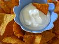
Snack Timeby paintintheneckComment: Concept and color are not bad, but poor focus hurts this image and will result in a very low score. Look closely at the upper left and right sides of the blue bowl and you can see that the chips there are in clearer focus than the rest of the image. Looks like the camera tried to focus in the wrong place. This might be because you were shooting to close with macro mode turned on. Proper focus is the single most fundamental thing you want to achieve in every picture you take. |
| Photographer found comment helpful. |
| 05/17/2005 06:56:43 PM |
is a my triangel for snif it the dinerby MAKComment: I'll apologize later if I am wrong and will give a proper review of this image, but this appears to be an obvious attenpt for the "brown" ribbon. It has all the hallmark features... lousy title, ill conceived out-of-focus image and is purposely resized small. |
| Photographer found comment helpful. |
Home -
Challenges -
Community -
League -
Photos -
Cameras -
Lenses -
Learn -
Help -
Terms of Use -
Privacy -
Top ^
DPChallenge, and website content and design, Copyright © 2001-2025 Challenging Technologies, LLC.
All digital photo copyrights belong to the photographers and may not be used without permission.
Current Server Time: 08/18/2025 10:49:25 PM EDT.