| Image |
Comment |
| 06/17/2005 03:06:55 PM |
Midnightby glodaComment: What a gorgeous image! Exceptionally well done. Great expression, color and motion. Kudos to you! |
 Photographer found comment helpful. Photographer found comment helpful. |
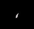
| 06/17/2005 03:05:47 PM |
Mirage in the Land of Darknessby lovebirdComment: Abstract, for sure. When it is not immediately obvious what an image is or what it's message is about it generally will not score well in a DPC challenge. Inobvious art can and does challenge the viewer to think which is good, but you have to give the viewer something concrete to think about.
Most DPCers will no "get" this image and the score will show it. Additionally, object is very, very small compared to the size of the frame. |
| Photographer found comment helpful. |
| 06/17/2005 03:00:52 PM |
Light in the Darknessby ckempfComment: Nice image of candle light. Except for the yellow hue that is at least partly generated by the camera there really isn't anything major wrong with this image. It just doesn't have lots to draw the attention of the viewer. |
| 06/17/2005 02:52:27 PM |
Pennyby sevensecondsComment: Abstracts, particularly where the the effects are photographic and not "real" generally do not do well with DPC voters and it will show on a very low score for this image.
To the casual viewer it looks more like the shutter was tripped by mistake and that it would nomally be a throw away image. |
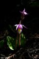
| 06/17/2005 02:49:35 PM |
Out of darkness came beauty.by jimsappComment: It is a flower image and sure to suffer voter backlash for those that feel people shoehorn flowers into every DPC challenge and feel they should not in this one.
The angle chosen for this shot is close to a "snapshot" angle and that could hurt voting too. You might consiider a strait-on shot from flower level. The lighting on the top of the petals of the foreground blossom are overexposed. The background does not add a lot to the composition either so you might want to consider a tighter crop to highlight the flower better. |
| 06/17/2005 02:45:46 PM |
Headby emitComment: Good concept. The head is probably a little soft focused for many voters but it is not terribly overexposed. You might cconsider around 10-20 percent burning in on the bridge of the nose, upper lip and chin. |
| 06/17/2005 02:43:28 PM |
The Emissaryby ADGibsonComment: Simple and nicely done. Looks like there could be a slight bit of smoothing caused by noise reduction, but just may be the nature of this particular image. The image has interest for the casual viewer. |
| Photographer found comment helpful. |
| 06/17/2005 02:41:57 PM |
Night Falls by NovaTigerComment: Ah, Hah!!! The Oregon GTG did manage to get a submission from the shots taken there. The big question is whose is it? Have to eliminate Zoomdak because it is a two word title and it is not Italian. That still leaves a number of other culprits. :)
Anyway, nice image with great reflections and the color, though enhanced, is not overly done. Composition is good with the possible exception of the seagull feather on the left. It was probably put there for composition in the image but one might question if it adds much to the composition. It makes the viewer ask why it is there. Just looks stuck in the ground for no apparent reason. The haloing on the few small bright edges on the rocks should be removed. |
| Photographer found comment helpful. |
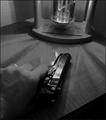
| 06/17/2005 02:34:44 PM |
"Desperation"by tfarrell23Comment: Conveys the idea of a dark prospect. Would the inclusion of a ring indicate considering murdering one's spouse, perhaps? :)
The perspective of this image is fine, but it is unclear what the device at the top of the frame is. That acts as a distraction for the viewer. It looks as though noise reduction software was applied to the image and left overly smooth patches on the skin and table. The tiny whit speck on top of the hand should be removed.
Generally speaking, though, the technical quality of the image is decent and the way the light and shadow is distributed is interesting. Guns seem prevelent in DPC images and voters are jaded to seeing them and that may have a negative effect on your score. |
| Photographer found comment helpful. |
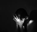
| 06/17/2005 01:33:40 PM |
Afraid of the Lightby leteneleComment: A very interesting try at using a single, strong directed light to highlight your subject. It adds a harshness and seems to fit the feeling that something awful has happened. The shadow behind the subject is a little distracting and backlighting from above and behind to the back of the head might add more interest to the composition. |
| Photographer found comment helpful. |
Home -
Challenges -
Community -
League -
Photos -
Cameras -
Lenses -
Learn -
Help -
Terms of Use -
Privacy -
Top ^
DPChallenge, and website content and design, Copyright © 2001-2025 Challenging Technologies, LLC.
All digital photo copyrights belong to the photographers and may not be used without permission.
Current Server Time: 08/24/2025 06:38:46 AM EDT.