| Image |
Comment |
| 06/20/2005 08:12:57 AM |
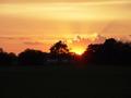
A Sunsetby EvanHComment: Sunset is a good choice for this challenge. It is the gateway to night. The rays provide viewer interest and the golden color is nice. The sun itself is not washed out.
Compositionally you usually place the horizon near one of the rule of thirds horizontal lines. Here you have placed it in the middle. That leaves a lot of uninteresting darkened space in the foreground. If there were something of viewer interest down there that would be OK, but there is not. You might consider having the sky take the top 2/3rds of the frame where there likely is more interesting things for the viewer to see.
By far the most interesting part of the composition is near the sun. There appears to be a lot of less interest at the edges of the frame. You might consider cropping from just left and below the big tree to right of the rightmost big ray and just above it. Then you would include only the most intersting parts of the sunset in the composition and leave out the rest that adds very little. If you could have done it by zooming in when you took the picture that would have been best. |
| 06/20/2005 08:02:17 AM |
Hmmm! Liquid darkness after a day's workby p2jvrComment: Colors are good and natural. Overall it is a nice image and a pleasant change from the darker themes of most of the images. The clarity of the hands and beer cans and bottles is good. Choosing to capture a toast is a great idea. It implies a fun twist on the "dark" (dark beer, that is) challenge theme.
Compositionally the wall with the flower holder may not be the best choice for a background. It has too much non-dark beer related interest that draws the viewer's attention away from the main subject. A less busy background would be worth considering.
Though the rest of the exposure is very good the white of the table cloth is overexposed and almost hurts the eye to look at. It is very distracting to the rest of the image. The spillage on the lower right looks more like dirt than the result of having a good time. |
 Photographer found comment helpful. Photographer found comment helpful. |
| 06/20/2005 07:49:51 AM |
Black pieces conducted by the shadowsby greslizzzComment: B&W is a good choice for the darkness challenge topic. Perspective is fine. Including the piece shadow is a nice touch. Greys are generally OK and you have a good black point set. Many images do not have good black points set in this challenge.
Compositionally there seems to be a lot of wasted space left and right of the chess pieces that could be removed from the composition.
The biggest issue with this image that will hold the score back is the focal plane. This image is focused on the far wall. A common problem with autofocus cameras is they sometimes focus where you don't want them to. That appears to be the case here. Even if done purposely most voters will think it is a focusing error. The queen, which occupies the dominent position in the frame, is not in proper focus. A confusion for the viewer is that the king, which is better focused but is located right behind the queen. The viewer has to study the image too hard to figure that out. That may have been your intention but most viewers will not "get it" if it is and score it lower because of it. |
| Photographer found comment helpful. |
| 06/20/2005 07:38:22 AM |
Cornered and Aloneby mesmerajComment: A curious attempt at the challenge theme. Photographically done generally well and placement of your subject near the edge of the frame is a good idea. Lighting, though in a dark place, is good and muted color in a grey place works.
The viewer is going to ask themselves questions. Why is the subject dressed the way she is? What has made her feel cornered? Why is she huddled in that particular location? These are questions that the image itself does not seem to lead the viewer to think of plausible answers.
The "thing" left of center frame and left of the girl's shoulder has such a prominent position in the frame that viewers regard it as a major element of the composition. It's relationship to the girl is unclear and therefore some voters will think of it as a distraction rather than supporting the image in a significant way. Message edited by author 2005-06-22 02:27:08. |
| Photographer found comment helpful. |
| 06/20/2005 07:27:14 AM |
Fighting Daylightby ttibbyComment: Certainly a subject worthy of the challenge topic. The image has no serious hot spots and the greyscales are generally good. B&W is a good choice for this subject.
The border takes up a considerable percentage of image real estate and may be considered distracting to some viewers because there is no obvious way it supports the main subject.
Technically there are a couple aspects of this image that will keep it's score lower. The image is low contrast. This is made even more pparent by your black border. You should set a black point for it or darken blacks using selective color black adjustment or channel mixer slider adjustments. Perhaps you used low cotrast on purpose. If so, it will not work with most voters.
The image is presented from the "snapshot" perspective. It appears to have been taken simply while walking by. A different perspective like ground level may have been more interesting to the viewer and connected better to the theme of being down and out. Consider a closer crop to more closely highlight the person themselves. |
| Photographer found comment helpful. |
| 06/19/2005 07:46:08 PM |
Nowhere to Hideby AchinxComment: Good solid black background supports the challenge theme well and the color is fine. You use DOF to highlight the main subject and draw the viewers attention.
The message of this image will be obscure at best to most voters and they will score it lower as a result. Great images often raise provocative questions in the veiwer's mind but this seems to raise questions that most viewers won't care about. They ask, "Why is the ball with the word "Hudson" on it the main subject and why should I care about it? Why is it on a ball in the first place? Why does it need a place to hide? It does not engage the viewer to want to understand why or speculate on answers.
On the technical side this is a generally well done image. Clarity of the main subject is excellent. The bright spot by the "n" is only slightly overexposed.
For added interest you might consider repositioning the ball on the rightmost rule of thirds vertical line centered on the intersection point with the lower rule of thirds horizontal line. You would remove unneeded and distracting foreground bluriness and give it a right facing appearance that is more pleasing to the human eye. |
| Photographer found comment helpful. |
| 06/19/2005 07:11:22 PM |
Flash!by CoozComment: Greyscale tones and focus are good. Photographs of photographers taking pictures generally do not fare well at DPC but they have been top performers in some challenges.
Like a well told story everything in the image should tie together to a singular theme or related themes and not contain elements that do not support it. In your image the viewer that notices the rings will wonder what purpose they serve in the composition. The reversed name Nikon at the top will be a distraction for most viewers.
Some viewers may feel you are flaunting the challenge topic with this image and will vote it lower. The composition is OK but nothing really unique or special.
On the technical side there does not appear to be a true black point for this image. It is rarely a good idea to include overexposed areas in any image but I understand why you did here. It is still a technical flaw though. Message edited by author 2005-06-22 02:20:18. |
| Photographer found comment helpful. |
| 06/19/2005 07:00:12 PM |
Balancing in the Darknessby whatdewucComment: The darkened bacground against the lighted performer will be understood by most voters as meeting the darkness challenge. The detail in the darked area is visible but not enough to identify exactly what is going on there and tends to draw the eye away from the main subject. This will be interpreted as distracting by some viewers. Especially distracting is the blue dot in the center. You might consider making some or more of the darkeened area brighter to show what is back there or make it totally black all together to remove it as a distraction.
The general image quality of your main subject is not especially good. Colors seem oversaturated and the focus is very soft. This will likely lower your overall score. |
| Photographer found comment helpful. |
| 06/19/2005 06:53:35 PM |
I´ts my favorit time to take pictures....by Aron5109Comment: Wonderful color, lighting and use of the rule of thirds. The black background support the challenge theme. General technical quality is excellent. The expression you captured is terrific.
The lighted items on the left showing up in the black area are indistiguishable as to what they are or what their purpose might be so would be viewed as distractions by most voters.
Despite that this is one of the top images in the challenges. Kudos for your great capture. Message edited by author 2005-06-22 15:58:55. |
| Photographer found comment helpful. |
| 06/18/2005 12:32:38 PM |
Calm before the Stormby ltaylorComment: Rayed sunlight fits the concept of the challenge. The main attractive feature to the image are the light rays. The fit to the challenge will be stronger for some voters more than others.
The general image quality technical quality is OK though not top of the line clarity. Cloud definition is good but the slow shutter speed you used allowed the bird in flight to be a little out of focus. Due to a slightly shallow depth of field the barbed wire fence in the foreground is also out of focus. That, unfortunately acts as a distraction to the overall composition.
There is enough light in on the ground that you can see the white barn, but you can't see it well enough to see a lot of detail. Generall viewers are all or nothing that situation.
If you used color adjustment to just darken just black then you could accomplish two goals. One, you would make the the ground horizon a deeper silhouette. There will still be white left in the barn but it will be more muted. Two, darkening the clouds will have the effect of making the rays a more pronounced feature in the image. You might want to try that out to see if it works. It night not hurt to use color adjustment to bring out more of the yellows and golds on the horizon line. |
| Photographer found comment helpful. |
Home -
Challenges -
Community -
League -
Photos -
Cameras -
Lenses -
Learn -
Help -
Terms of Use -
Privacy -
Top ^
DPChallenge, and website content and design, Copyright © 2001-2025 Challenging Technologies, LLC.
All digital photo copyrights belong to the photographers and may not be used without permission.
Current Server Time: 08/18/2025 10:30:42 AM EDT.