| Author | Thread |
|
|
06/22/2005 04:19:06 AM |
|
This was particularly rewarding with some very useful comments being made. Thanks for all those who took the time and trouble. It helps. |
|
Comments Made During the Challenge  |
|
|
06/21/2005 11:49:35 PM |
|
Now that's what I'm talkin about!!! Good to see the wife's having one too! |
|
 Photographer found comment helpful. Photographer found comment helpful. |
|
|
06/21/2005 10:15:42 PM |
|
Yum. The best kind of darkness. |
|
| Photographer found comment helpful. |
|
|
06/21/2005 02:16:15 PM |
Cheers!
Nice product shot. |
|
| Photographer found comment helpful. |
|
|
06/21/2005 06:28:47 AM |
|
i think it would have been better without the bottle and the cans in the back, at least without the smached can |
|
| Photographer found comment helpful. |
|
|
06/20/2005 08:02:17 AM |
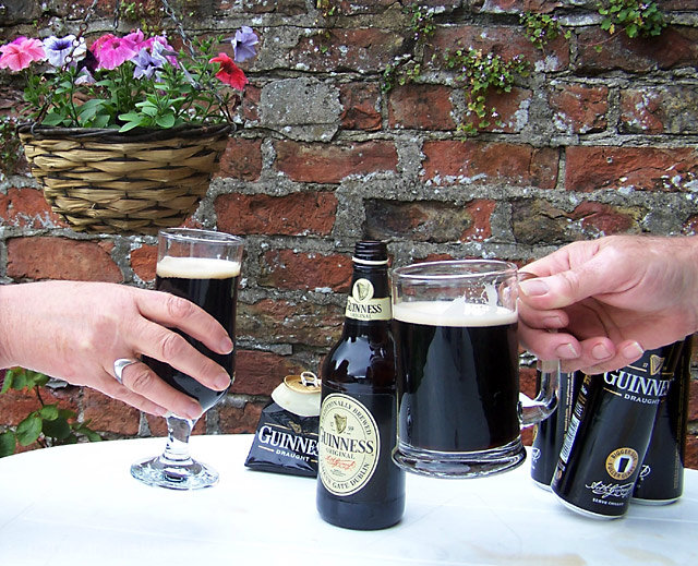
Colors are good and natural. Overall it is a nice image and a pleasant change from the darker themes of most of the images. The clarity of the hands and beer cans and bottles is good. Choosing to capture a toast is a great idea. It implies a fun twist on the "dark" (dark beer, that is) challenge theme.
Compositionally the wall with the flower holder may not be the best choice for a background. It has too much non-dark beer related interest that draws the viewer's attention away from the main subject. A less busy background would be worth considering.
Though the rest of the exposure is very good the white of the table cloth is overexposed and almost hurts the eye to look at. It is very distracting to the rest of the image. The spillage on the lower right looks more like dirt than the result of having a good time. |
|
| Photographer found comment helpful. |
|
|
06/19/2005 10:47:52 AM |
|
lovely fresh viewpoint. I thing the can on the right should be more obvious balance of photo out IMO but still a good shot |
|
| Photographer found comment helpful. |
|
|
06/18/2005 07:41:45 AM |
|
This is my husband's idea of darkness as well!! nice shot |
|
| Photographer found comment helpful. |
|
|
06/17/2005 10:46:33 PM |
Balance feels off. Nice Clear focus,
Beer of my choice love that guinness.
|
|
| Photographer found comment helpful. |
|
|
06/17/2005 11:56:47 AM |
|
i'd take down the hanging basket next time - it distracts from the gunniess! |
|
| Photographer found comment helpful. |
|
|
06/16/2005 10:39:55 PM |
|
I dont know how anyone can drink that stuff. HORRIBLe! |
|
| Photographer found comment helpful. |
|
|
06/16/2005 08:13:14 PM |
|
Don't like the hanging basket in the corner but love that your shot isn't like the other 99%. Well composed. looks like ya spilled some in the bottom left. PARTY FOUL!!! |
|
| Photographer found comment helpful. |
|
|
06/16/2005 07:38:03 PM |
|
Yeah, that stuff is dark for sure, Pretty nice image also....7 |
|
| Photographer found comment helpful. |
|
|
06/16/2005 07:23:20 PM |
|
MMM. I thought about Guiness when this challenge came up. Very nice job. If not for the spots on tablecloth, it could be an ad. |
|
| Photographer found comment helpful. |
|
|
06/16/2005 06:28:15 PM |
|
I'm glad someone other than myself looked at the 'darkness' challenge as being something other than a pessimstic description. Well done! |
|
| Photographer found comment helpful. |
|
|
06/16/2005 10:01:11 AM |
|
| Photographer found comment helpful. |
|
|
06/15/2005 11:14:38 PM |
|
I can't give the guinness a bad vote. |
|
| Photographer found comment helpful. |
|
|
06/15/2005 07:25:50 PM |
|
Beautiful crispness, the white seems just a shade blown out on the left side and the shadows on the right unbalance it as well, if it was toned a bit down on the left and brightened a bit on the right I think it'd be perfect. The colors work really well together, the white with the darkness of the guinness and the rust color of the brick is nice. I think as another suggestion I would crop the image at the top right below that first flower, or if possible swap in a basket with ONLY greenery, no colorful flowers, they distract my eye away from the subject and the colors don't quite match the look of the rest of the image. Other than the fact that guinness is soooo gross tasting, I've no other comments! :) Very nice. I gave a 6 |
|
| Photographer found comment helpful. |
|
|
06/15/2005 12:51:56 PM |
|
I'll take some of that liquid darkness! Great shot. |
|
| Photographer found comment helpful. |
Home -
Challenges -
Community -
League -
Photos -
Cameras -
Lenses -
Learn -
Help -
Terms of Use -
Privacy -
Top ^
DPChallenge, and website content and design, Copyright © 2001-2026 Challenging Technologies, LLC.
All digital photo copyrights belong to the photographers and may not be used without permission.
Current Server Time: 06/30/2026 02:29:55 AM EDT.