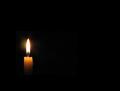
DPChallenge: A Digital Photography Contest You are not logged in. (log in or register
 
Browse Settings
Currently viewing:
Registered UserArtifacts

Show comments:

Per page:

Order:

Comments:


Comments Made by Artifacts
Pages:   ... [116] [117] [118] [119] [120] [121] [122] ... [319]
Showing 1181 - 1190 of ~3187
Image Comment
Dark Recording
06/20/2005 03:08:37 PM
Dark Recording
by monnone

Comment:
This is a very photograph. Lighting is good and the depth of field works nicely. Composition is fine and the technical quality is better than most images in this challenge.

Some voters will think this image is being shoehorned into the challenge just to have something to submit and may vote it lower because of that.

It is a very good image that will likely get a score lower than it deserves.
Photographer found comment helpful.
Darkness........  of her eyes !
06/20/2005 03:05:33 PM
Darkness........ of her eyes !
by kbhatia1967

Comment:
Great framing of those penetrating eyes. Nice concept for this challenge and has high viewer interest.

There are some technical issues that will affect the final score.

The eyes are not level. That acts as a distraction to the typical viewer. They should be rotated counterclock a degree or so.

The lighting is unbalanced. Either you want to darken the image so the the eye on the left is in darker shadow to enhance that effect ot add lighting so that both eyes have similar lighting. In this version the right side of the nose is a little overexposed. This image appears to be in that grey area where the photographer could not decide which way they really wanted to go.

The red dot has some tiny white specks that are distracting to the viewer that should be removed.

The image focus is soft. From this distance it would seem that you either want to have it in razor sharp focus to see all the tiny fine detail clearly or you would want to do something to make the soft focus seem more mysterious or foreboding.
Photographer found comment helpful.
Alone
06/20/2005 02:53:11 PM
Alone
by holdingtime

Comment:
Certainly meets the challenge. You've capture darkness well.

There are a couple things that will hold down the score of this image. One is that the theme of alcholism is well represented in this challenge and voters will become jaded with it.

Just because of the theme this image would probably be better if it were converted to B&W. The color in this image does not add much to your message and B&W generally works better for images of this type.

The stairs are not level and that acts as a distraction. If that were intentional then you would need a steeper angle to be meaningful to viewers.

It looks like this image was taken with flash. In that case it might be better if you had stepped to the right slightly so the flash would illuminate the left as well as the right sides of the image. This could have been done purposefully, but will not look like it to casual viewers unless you move the flash further to the left to increase the shadow length.
Photographer found comment helpful.
Nearing Dark
06/20/2005 02:42:03 PM
Nearing Dark
by pirate_mafia

Comment:
Meets the challenge well.

There are a few technical factors that will hold down its score. The area betwen the clouds is grossly overexposed and will be distracting to most viewers. The overall general image quality is not particualrly good and the focus is very soft. Even though the image appears to be in color there really isn't much thee and would be better if it were straight black and white. Lastly, the image size is small and those images generally are voted lower by viewers.
Enveloped In Darkness
06/20/2005 02:38:17 PM
Enveloped In Darkness
by crik

Comment:
Nice minimalist interpretation of the challenge topic. The flame is not badly overexposed and the mid-tones (what few there are! LOL) are good. Nice solid black background.

There is really nothing wrong with this image photogaphically speaking at all. Its score will depend on how appealing voters find your minimlist interpretation.
Photographer found comment helpful.
where there is darkness, there is light
06/20/2005 02:35:28 PM
where there is darkness, there is light
by snuggles0089

Comment:
This sounds harsh and I am sorry but there is not a lot of good things to say about this image. There are many things that will contribute to a very, very low score.

Please accept what I say as an attemt to help and not just trash your image because I'm an evil guy.

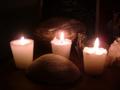
The image has very low contrast and lacks the impact of a properly contrast adjusted image. An autocontrast adjustment would improve this image a lot.

Most viewers will understand your message but will not think your way of communicating it is particularly interesting and that will affect it's score in a negative way. There are plenty of candle entries in this challenge and voters will become jaded with them.

The flames in your candles are overexposed. That should be corrected. The angle you took this at is what you might if you were just taking a snapshot. Taking a different perspective, like shooting from tabletop level or from directly above would add considerable interest to this image.

The viewer will ask why the items are in the composition. You need to provide an answer for them in the composition or giive them fun reasons to speculate. You do neither and that will hurt it's chances in voting.

This is a color image but the colors are drab and uninteresting. You need to use saturation and other color enhancement techniques to bring out the colors.

But by far the biggest flaw with this image is focus. Focus is the most fundamental adjustment in photography. When that is wrong an image score will plummet like a lead zepplin.

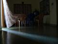
You image is simply out of focus. Autofocus cameras are easily fooled in low light situations and based on the fact that the picture in the background appears to be in sharpest focus it is likely yours was focused for infinity and that is why the focus is so bad. This does not look purposeful in any way.

I hope this is helpful and does not frighten you off from working to improve your photography and enter more challenges.
Blue Darkness
06/20/2005 02:16:27 PM
Blue Darkness
by tcrock41

Comment:
Like in all things, simplicity is a virtue in photography. This is a very clean image with no distracting elements. It has an appealing perspective and good angles. In mono-color images blue tends to score highest in DPC challlenges.

The blue color here, though, seems muted and gives the image a low contrast quality that many viewers will not find appealing. If you brightened it a lot more and make the blue color shimmer it will have a lot more appeal to voters and get a higher score.
Photographer found comment helpful.
Shadow
06/20/2005 02:11:22 PM
Shadow
by jmcotter

Comment:
Very intersting photograph. Shadows always invite speculation as to the object that casts them. That is the strength of this image.

There are some technical issues that will hold down the score of this composition. The shadow is really the main subject and most interesting element of the picture. It is unclear what the better focused items on the far left are and foreground are. Because of that they are a distraction and probably should either be removed from the composition or better highlighted so viewers can more easily identify and relate them to the main subject. The edge of the wall on the left does not add much to the composition either. You might want to consider a tighter crop of the image.
Where there is Darkness, there is Light.
06/20/2005 02:05:05 PM
Where there is Darkness, there is Light.
by herculesksp

Comment:
The idea is good, especially with the movement of the drapes and the shadow lines in the room.

A photograph is like a well written novel. Pictures should only contain items that support the central theme of the image like text supports the storyline of the novel. If there is storylines that go nowhere or do not tie back with the main story then the novel is not very good.

The same is true of a photograph. In photography elemets that do not support the theme of the image are called distractions and there are several in this image that will cause it to get a lower score.

The electrical wires and whatnot on the wall on the right is a major distraction and so is the television set in the background. The things above the drapery on the far wall do not add to the composition at all. A viewer may wonder what purpose the chairs serve and why is there a blue one in the middle. They will also wonder what the furniture half hidden in the background is for. All this distracts the viewer from your wonderful shadow lines.

This requires some work but you could improve this image dramatically by removing all the distractions from the room and take EXACTLY the same picture. Only this one would be a minimalist interpretation of your theme.

In that picture you would remove all the furniture, the electrical plugin thing on the wall, the TV and chairs and the whatever it is above the far drape. If you cropped out the door on the left so that only the flowing drape can be seen and cropped out the edge of the wall on the right you would have a much improved photograph that viewers will easily understand and score much better.
Photographer found comment helpful.
Solace in Darkness
06/20/2005 01:47:51 PM
Solace in Darkness
by pidge

Comment:
This is an acceptable idea for this challenge.

It is easy to see why this image required validation. It looks as though you have rigged the image to reposition it on the image by adding a huge border or something.

However, that is not the real issue. If you had simply increased the contrast so there would be no small greyish square containing the candle it would not have shown up at all and nobody would have questioned the entry. That is a major image flaw and a big distraction for the viewer that will cause it to get a low score.

Message edited by author 2005-06-22 07:48:38.
Photographer found comment helpful.
Pages:   ... [116] [117] [118] [119] [120] [121] [122] ... [319]
Showing 1181 - 1190 of ~3187


Home - Challenges - Community - League - Photos - Cameras - Lenses - Learn - Help - Terms of Use - Privacy - Top ^
DPChallenge, and website content and design, Copyright © 2001-2025 Challenging Technologies, LLC.
All digital photo copyrights belong to the photographers and may not be used without permission.
Current Server Time: 08/17/2025 07:47:55 PM EDT.